National Geographic imagined new coastlines (and the cities that would go under) if…
Nathan Yau
-
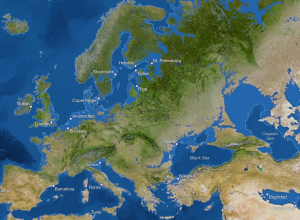
Estimated coastlines if the ice melted
-

Roomba traces
We’ve seen what happens when you turn on a Roomba and track its…
-
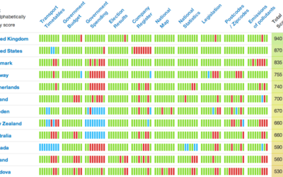
Global status tracker for open government data
The Open Knowledge Foundation launched the Open Data Index, so you can see…
-
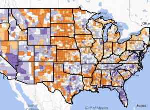
Six decades of U.S. migration
We know that millions of Americans move to different counties every year, and…
-
Cancer data for the U.S. released
The Centers for Disease Control and Prevention released their most recent cancer data…
-
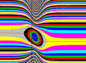
Accidental aRt
There comes a time late at night when your screen grows fuzzy and…
-
Future of Statistics livestream
The Simply Statistics unconference just started a few minutes ago. Tune in live…
-
U.S. Open Data Institute
With a $250,000 grant from the Knight Foundation, Waldo Jaquith pushes forward with…
-
Beauty of mathematics
Betrand Russell: “Mathematics, rightly viewed, possesses not only truth, but supreme beauty —…
-
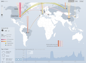
Digital attack map
A Distributed Denial of Service (DDoS) attack attempts to disable a site or…
-
FlowingData Job Board, October 2013
Looking for a job in data science, visualization, or analytics? There are openings…
-
Monty Hall xkcd →
Nice one, xkcd.…
-
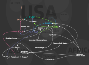
Evolution of western dance music
A quick animated look on the evolution of western dance music, a mixture…
-
Degrees of separation between athletes from different sports
You’ve probably heard of the six degrees of Kevin Bacon. The idea is…
-
Members Only
How to Display Text in R
Text can provide much needed context to traditional visual cues and can be used as a visual cue itself in some cases.
-
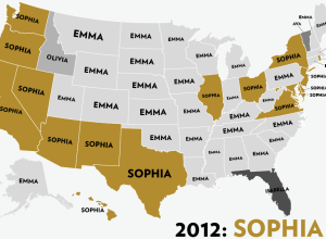
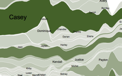
Most popular girl names by state
Reuben Fischer-Baum looks at the most popular girl names by state, over the…
-
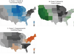
Regional personality
Peter J. Rentfrow, et al. studied personality clusters across states using data from…
-
Responsive maps with D3.js
A challenge these days with visualization is that a piece might look great…
-

My data point
It’s been continuous tracking and monitoring for the past couple of days and…
-
R plotting package ggplot2 ported to Python
Those who use the ggplot2 package in R and do everything else in…
Recently for Members
Second Edition
 Visualize This: The FlowingData Guide to Design, Visualization, and Statistics (2nd Edition)
 Visualize This: The FlowingData Guide to Design, Visualization, and Statistics (2nd Edition)
New tools, refined process.
Browse by Chart Type See All →


