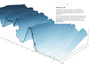
People like to poke fun at 3-D charts, mostly because they don’t work…
Nathan Yau
-
3-D chart for economy’s future
-
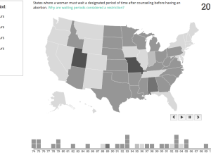
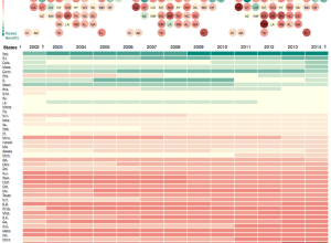
Abortion policies, over time and by state
For a class project, Katie Kowalsky, Dylan Moriarty, and Robin Tolochko examined changes…
-
The Elements of Data Analytic Style
The Elements of Data Analytic Style by John Hopkins biostatistics professor Jeff Leek…
-
Members Only
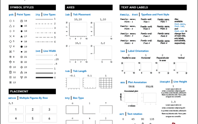
R Cheat Sheet and Guide for Graphical Parameters
You can customize graphics in R with
par(), but the docs are mostly text and just organized alphabetically. Here is a more visual reference, categorized by what you can change. Plus, a one-page printout. -
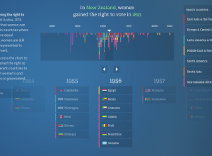
Equality for women and girls, 20-year report
In their continued work on the No Ceilings project, Fathom describes the current…
-
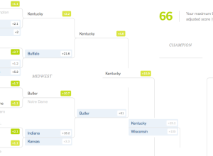
NCAA bracket game that rewards risk-taking
Unlike traditional bracket-picking, the Upshot’s bracket game has a twist. You still want…
-
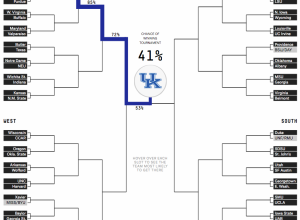
NCAA tournament bracket predictions
March Madness starts this week in the states, which means it’s time for…
-
Wearable data objects that represent air pollution
For the most part, air pollution is invisible, so Stefanie Posavec and Miriam…
-
Convert Adobe Illustrator files to HTML and CSS
For the folks who have to make graphics for all devices under the…
-
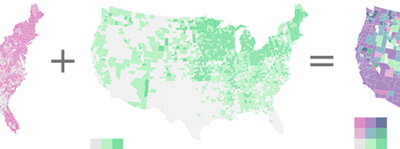
Bivariate choropleth how-to
Your standard choropleth map shows geographic areas colored by a single variable. You’re…
-
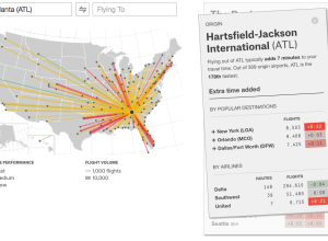
Find the fastest flight between airports
Flight arrival and departure times are often thought of in terms of “on…
-
Health data breaches and fines
Sisi Wei and Charles Ornstein for ProPublica highlight reported data breaches to the…
-
Mathematics of love
Mathematician Hannah Fry talks about love in terms of three “mathematically verifiable” tips:…
-
Multi-layered storytelling with visualization
Quick and simple. It is a common theme in visualization that preaches clarity…
-
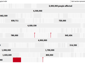
Decline of workers’ compensation
Workers’ Compensation, a promise to pay medical bills and some of your wages…
-
Algorithmic search for a girlfriend
Sharif Corinaldi moved from New York to Berkeley for graduate school and was…
-
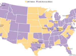
Girl Scout cookies differ by region
The Girl Scouts, known for their annual cookie sales, uses two bakers. These…
-
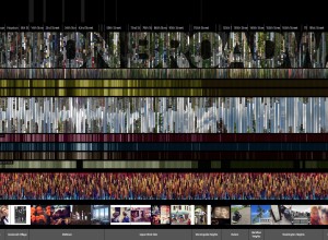
On Broadway shows city life through data cross-sections
On Broadway, by Daniel Goddemeyer, Moritz Stefaner, Dominikus Baur, and Lev Manovich, provides…
-
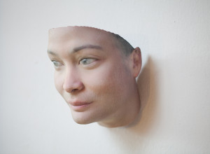
Face sculptures using DNA from chewed gum
In her 2012 piece Stranger Visions, Heather Dewey-Hagborg used DNA found in public…
-
Dater’s Index
By Emily McDowell, this recounting of dates initiated by the internet is funny.…




 Visualize This: The FlowingData Guide to Design, Visualization, and Statistics (2nd Edition)


