The Census Bureau director Robert Santos announced his resignation on Thursday:
Santos —…
Nathan Yau
-
Census Bureau director resigns, 2025 edition
-
See wind data on Mars through tele-present wind
With the art installation tele-present wind, David Bowen displays data collected by NASA’s Perseverance rover mission.
-
Members Only
Visualization Tools and Resources, January 2025 Roundup
Here are things you can use, poke at, and learn from that bubbled up this past month.
-
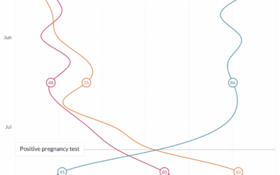
Stress of growing a human, charted
Maggie Appleton is growing a human, and as you might expect, pregnancy can…
-
Quarter century of self-portraits
Noah Kalina has been taking a picture of himself every day for 25…
-
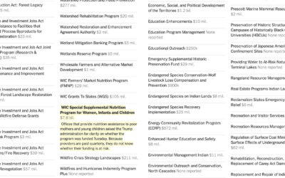
Federal programs under review
A spreadsheet of 2,600 grant and loan programs circulated to federal agencies, alongside…
-
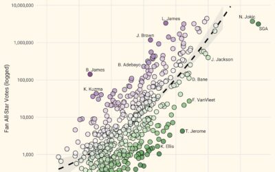
Overrated NBA all-star votes
NBA all-star voting is mostly for the fans, which means some players can…
-
Plain text box scores
New to me, Plain Text Sports shows box scores for the major sports…
-
Cozy game about cozy games
Cozy games are casual games that give you a warm, fuzzy feeling when…
-
Fastest-growing and most destructive fires
Using satellite data, researchers analyzed the growth rate of 60,000 fires in the…
-
Work Cohorts
See how many people are in various work cohorts, given education, annual income, weekly hours, and commute time.
-
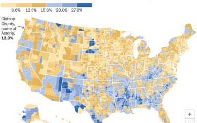
Astoria, not the single-parent capital of America
In Kindergarten Cop, one of Arnold Schwarzenegger’s greatest works, a mother welcomes the…
-
Private school demographics
Private schools cost extra. So as you might imagine, the demographics, often tied…
-
Members Only
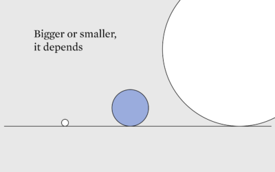
Better or Worse, More or Less
Comparisons, also known as the thief of joy, are unavoidable, so we might as well make fair ones that consider context.
-
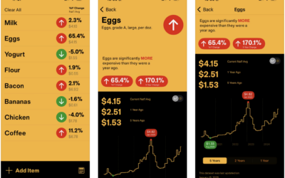
With InflataCart, your grocery list plus inflation data
If you shop at the grocery store regularly, you’ve felt prices increasing, especially…
-
Geolocating photos automatically
GeoSpy is an AI tool that geolocates outdoor photos. It’s currently pitched as…
-
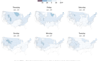
Tracker for freezing temperatures
The forecast for the contiguous United States this week is cold, and below…
-
Falling in love with a chatbot
Possibly related, Kashmir Hill for The New York Times tells the story of…
-
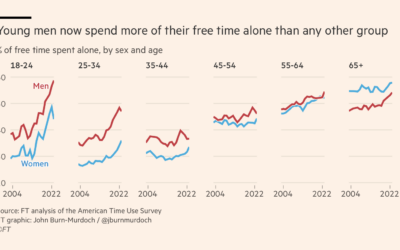
Young and alone
John Burn-Murdoch, for Financial Times (paywalled), breaks down data from the American Time…
-
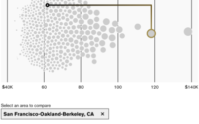
Where you would feel richer and poorer
New to me, Bloomberg has an interactive by Claire Ballentine and Charlie Wells…






 Visualize This: The FlowingData Guide to Design, Visualization, and Statistics (2nd Edition)


