When members of the House of Representatives miss a vote, it is customary…
Nathan Yau
-
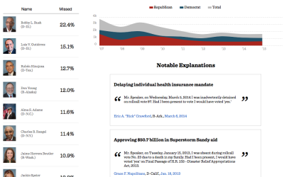
Missing votes in Congress
-

Average of faces in things
You’ve likely seen projects that take the average of people’s faces, but you…
-

Pale Blue Dot motion graphic
Joel Somerfield created this motion graphic to Carl Sagan’s Pale Blue Dot monologue.…
-
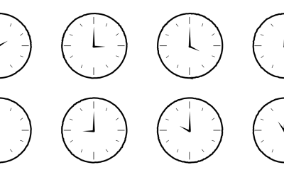
Counting the Hours
Every day is a bit different, but here is a wideout view of how Americans spend their days. Compare with your own time use.
-

Motion graphics in Keynote
As an experiment, Linda Dong used Keynote, typically for your everyday slide presentations,…
-
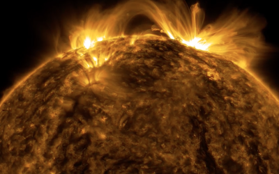
The Sun in ultra-HD
Daang, NASA. Using images of the sun taken in space, NASA constructed this…
-
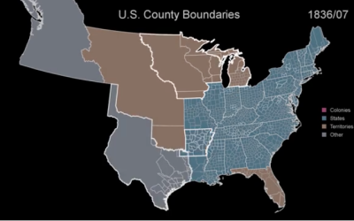
US boundary evolution
We saw a similar video of boundary development over the centuries before, but…
-
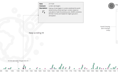
Past and future predictions of when the world will end
Wikipedia has a list of predicted dates for when apocalypse strikes, because of…
-
Link
rchess →
An R package for chess move generation and validation.
-
Members Only
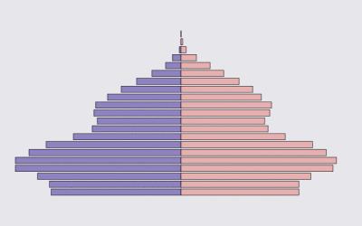
How to Make an Animated Pyramid Chart in R
Make a bunch of charts, string them together like a flip book, and there’s your animation. Sometimes good for showing changes over time. Always fun to play with.
-
Meat and cancer
Why we should make a note but not freak out about it.
-
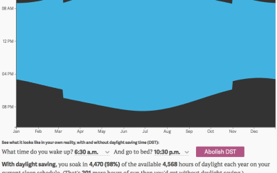
Daylight you get from daylight saving
We recently fell back an hour with the end of this year’s Daylight…
-
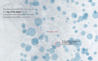
Melting Greenland
This map-centric piece from the New York Times is good. They keep refining…
-
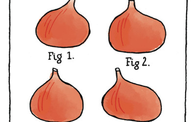
Fig diagram
From Gemma Correll. I am amused.…
-
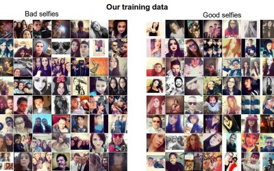
Neural Network for selfie analysis
To introduce Convolutional Neural Networks, Andrej Karpathy looked at millions of selfies, left…
-
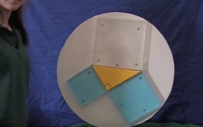
Pythagorean theorem water demo
This is years old, but it still tickles the neurons every time. It’s…
-
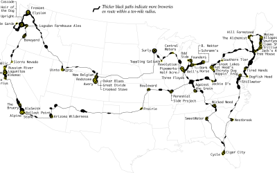
Top Brewery Road Trip, Routed Algorithmically
There are a lot of great craft breweries in the United States, but there is only so much time. This is the computed best way to get to the top rated breweries and how to maximize the beer tasting experience. Every journey begins with a single sip.
-
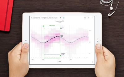
Vizable, for data exploration on an iPad
Vizable is a free iPad app from Tableau Software that helps you explore…
-
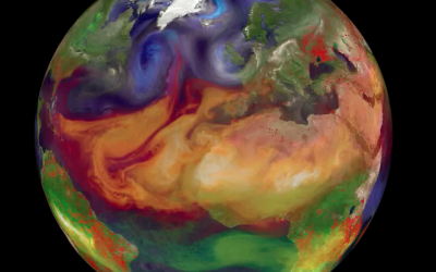
Particles swirling in the atmosphere
Gavin Schmidt shows different types of particles that swirl around in our atmosphere:…
-
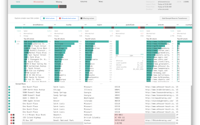
Trifacta Wrangler to format and clean data
Data wrangling — formatting and cleaning — is a sore spot and stumbling…
Recently for Members
Second Edition
 Visualize This: The FlowingData Guide to Design, Visualization, and Statistics (2nd Edition)
 Visualize This: The FlowingData Guide to Design, Visualization, and Statistics (2nd Edition)
New tools, refined process.
Browse by Chart Type See All →


