Moving your data from the digital screen to something more physical isn’t as tricky as it seems. Here’s how I did it.
Nathan Yau
-
Members Only
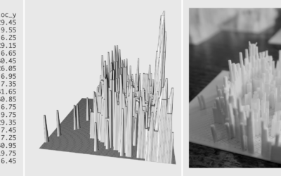
3-D Printing: How to Prepare the Data in R
-
Tweeting a map of every Census tract in the United States
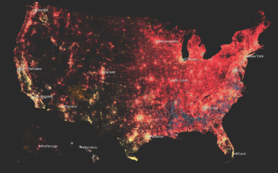
By Neil Freeman, the @everytract bot on Twitter, as the name suggests, is…
-
Using statistical models to win almost $1B in horse-race gambling
I think this is what statistics is truly for.
-
People relationships in data analysis
Roger Peng discusses the importance of managing the relationships between people — analyst,…
-
Mapping a diverse but segregated America
Aaron Williams and Armand Emamdjomeh for The Washington Post delve into diversity and…
-
A game to better understand the wisdom (and madness) of crowds
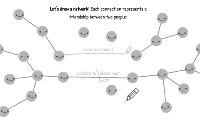
You’ve probably heard of the wisdom of crowds. The general idea, popularized by…
-
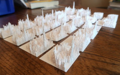
Data, R, and a 3-D Printer
We almost always look at data through a screen. It’s quick and good for exploration. So is there value in making data physical? I played around with a 3-D printer to find out.
-
Visualization for an audience
Jonathan Corum, the Science graphics editor at The New York Times, talks about…
-
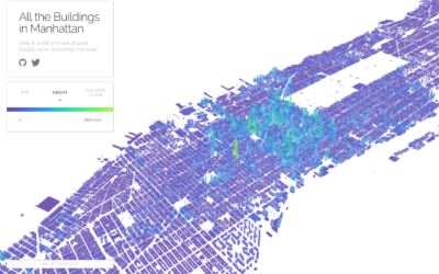
All the buildings in Manhattan in 3-D map
Taylor Baldwin mapped all of the buildings in Manhattan using a 3-D layout.…
-
Is the hot hand in basketball real?
With Numberphile, Lisa Goldberg discusses her research with Alon Daks and Nishant Desai…
-
Get all caught up with The Avengers using this timeline
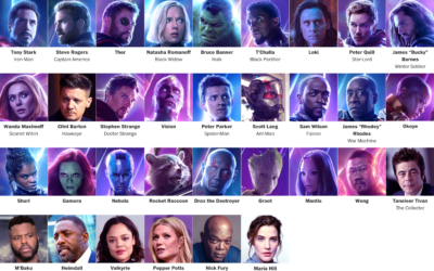
It’s been a decade since the first Iron Man movie, and some 30…
-
Building a robot boyfriend
When it comes to robots and love, the concept typically deteriorates to subservient…
-
Waiting Game, through the steps of asylum seekers
Sisi Wei for ProPublica and Nick Fortugno of Playmatics made a game to…
-
Knitters and the neural network-trained machine
Janelle Shane, who likes to play with output from neural networks, teamed up…
-
Here’s what you get when you cross dinosaurs and flowers with deep learning
Neural networks have shown usefulness with a number of things, but here is…
-
Umpire strike zone changes to finish games earlier
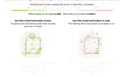
When watching baseball on television, we get the benefit of seeing whether a…
-
Abstract: The Art of Design, with Christoph Niemann
Abstract: The Art of Design kept popping up on my Netflix recommendations list…
-
Visualizing Differences
Focus on finding or displaying contrasting points, and some visual methods are more helpful than others. A guide.
-
Shapes we make, seen from the sky
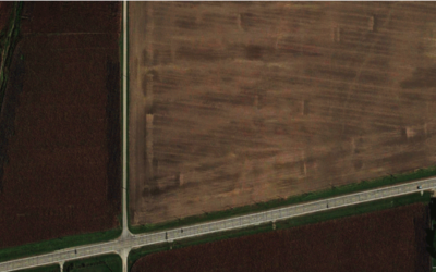
Look from the above at the shapes and geometry we use for cities,…
-
Algorithms drawn as IKEA furniture instructions
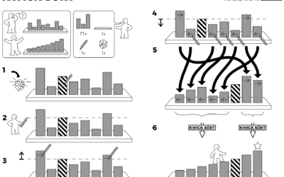
Learning algorithm steps can be a challenge when viewed only through code or…





 Visualize This: The FlowingData Guide to Design, Visualization, and Statistics (2nd Edition)


