DOGE is taking agency data in an effort to compile a master database…
Nathan Yau
-
Ignoring citizens’ privacy to build a centralized database and track people
-
Comic Sans map
The Comic Sans Map by Vole.wtf is proof that if you make enough…
-
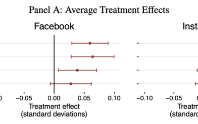
Research suggests less Facebook and Instagram is better for your emotional state
The National Bureau of Economic Research studied before-and-after effects of about 20,000 users…
-
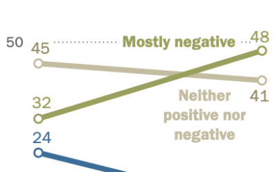
Teens noting negative effects on people their age
Pew Research, in their ongoing surveys on teens and social media usage, highlight…
-
Halt of data collection that measures American society
As data provides ways to more accurately estimate how things are going, the…
-
List of NOAA datasets to be discontinued
If you use NOAA data, now seems like a good time to download…
-
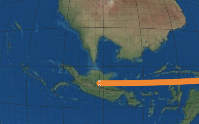
Snake (the game) on a globe
The goal of Snake is to direct a snake towards food, and each…
-
Kurt Vonnegut, Shape of Stories illustrated with charts
New to me, a couple decades ago, author Kurt Vonnegut delivered a lecture…
-
American Crying
People cry for different reasons and some tend to cry more than others. What makes people cry the most?
-
Members Only
Breaking Out of Chart Software Defaults
Defaults are good for quick and disposable charts. However, when the audience extends beyond yourself, it’s time to customize around purpose.
-
Asymmetric Monstrosity map projection
Part amusement and part learning exercise, the “asymmetric monstrosity” by Daniel Huffman is…
-
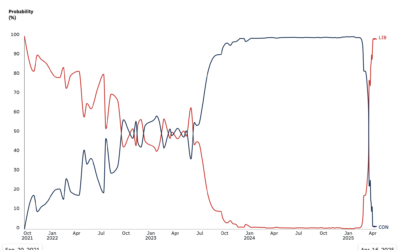
Sharp flip in probabilities of parties winning Canada election
Since early 2024, polls showed near certainty that Conservatives in Canada were going…
-
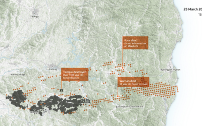
Reach of a deadly wildfire in South Korea
South Korea experienced its largest and most deadly wildfire last month in Uiseong…
-
DOGE possibly extracted data from National Labor Relations Board, whistleblower discloses
DOGE engineers were at the NLRB for a week but didn’t specify what…
-
Decline in European travelers to U.S.
These charts will shock you I am sure. Travel to the United States…
-
Members Only
Line Chart with Decorative Neon Accents
We do it because things that glow in the dark are awesome, including line charts.
-
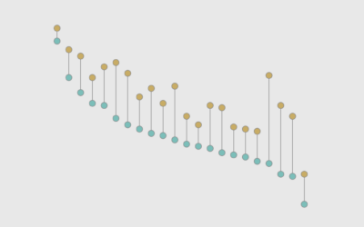
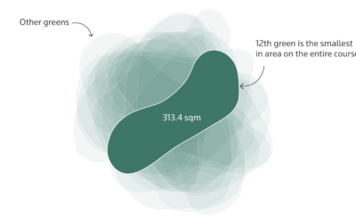
Most difficult holes at Augusta
The 12th hole at Augusta National Golf Club, where the Masters is held,…
-
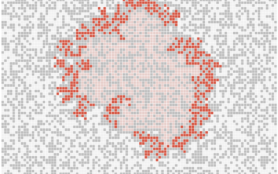
Viral outbreak simulations
To demonstrate outbreak possibilities of, say, the measles, Aatish Bhatia and Francesca Paris,…
-
When measles infects an unvaccinated child, illustrated
If you are not vaccinated against measles, you will most likely catch it…
-
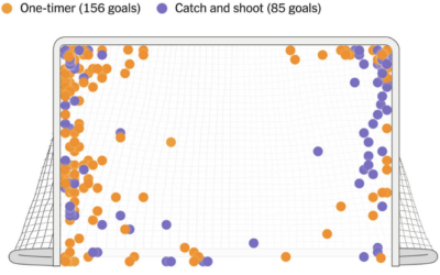
Alex Ovechkin’s spot on the ice and shot preference
Alex Ovechkin passed Wayne Gretzky’s all-time goals record with number 895. For The…









 Visualize This: The FlowingData Guide to Design, Visualization, and Statistics (2nd Edition)


