North Drinkware molded Half Dome in the bottom of a hand-blown pint glass…
Nathan Yau
-

Elevation data molded in the base of a pint glass
-
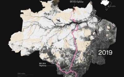
Mapping tree loss in rain forests over time
Bloomberg mapped tree loss between 2000 and 2019 in Brazil:
“What we have… -
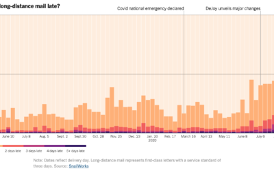
Tracking the mail
With mail-in ballots looking to be more common than ever this year, NYT’s…
-

Voting guide for your state
The Washington Post provides another straightforward voting guide, based on where you live…
-

Disappearing animals as a matrix of dots
Reddit user WhiteCheeks used dot density to show population counts of various animals.…
-
Members Only

The Process 106 – Self-Imposed Visualization Constraints, for Focus and Fun
Constraints usually seem like a bad thing. Less freedom. You can’t do exactly what you want to do. You’re limited. But sometimes constraints can lead you towards unexpected paths.
-
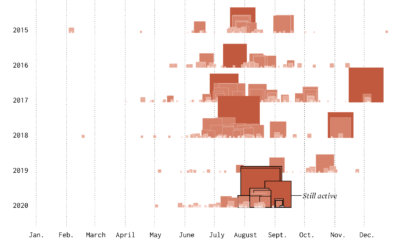
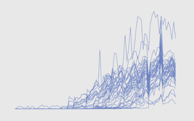
Timeline of California Wildfires
The wind was blowing smoke and ash from wildfires further up north from where I live. The sky turned an eerie orange. I wondered about past fires and made the chart below.
-
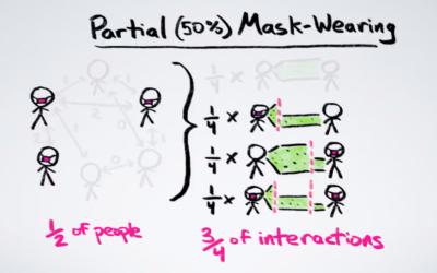
Math behind wearing masks
The math behind wearing a mask can seem unintuitive at times. Minute Physics…
-
Telling stories in visual, data-driven essays
For The Pudding, Ilia Blinderman rounds out his three-part series on creating visual,…
-
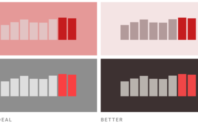
Picking the right colors for your charts
Picking colors for your charts can be tricky, especially when you’re starting a…
-
Design your own election scenario
As we have seen, small shifts in voting behavior of various demographic groups…
-
Members Only

The Process 105 – Piecing Together the Basics
You gotta walk before you crawl. Wait a minute.
-
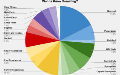
Wanna know somefing?
From Reddit user wequiock_falls, “What I’m about to learn about after my kid…
-
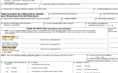
Multiple Causes of Death
There’s a 6 percent figure from the CDC that could be easily misinterpreted. Here’s what it means.
-
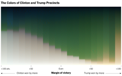
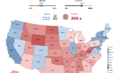
Red-blue electoral map and the green-gray in satellite imagery
For NYT’s The Upshot, Tim Wallace and Krishna Karra looked at how the…
-
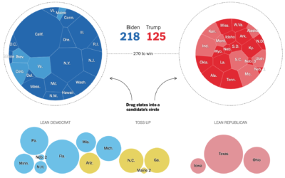
Choose your own election outcome
The election is full of what-ifs, and the result changes depending on which…
-
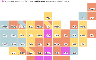
How to vote in each state
Each state is handling mail-in voting in a certain way with varying timelines…
-
Members Only
How to Untangle a Spaghetti Line Chart (with R Examples)
Put multiple time series lines on the same plot, and you quickly end up with a mess. Here are practical ways to clean it up.
-
Audit advanced data science course online
Jeff Leek and Roger Peng started their course Advanced Data Science at Johns…
-
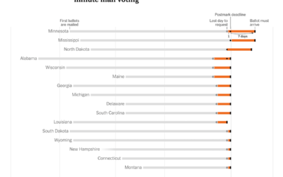
Time for last-minute mail voting
The New York Times provides a state-by-state chart timeline for voting by mail:…
Recently for Members
Second Edition
 Visualize This: The FlowingData Guide to Design, Visualization, and Statistics (2nd Edition)
 Visualize This: The FlowingData Guide to Design, Visualization, and Statistics (2nd Edition)
New tools, refined process.
Browse by Chart Type See All →


