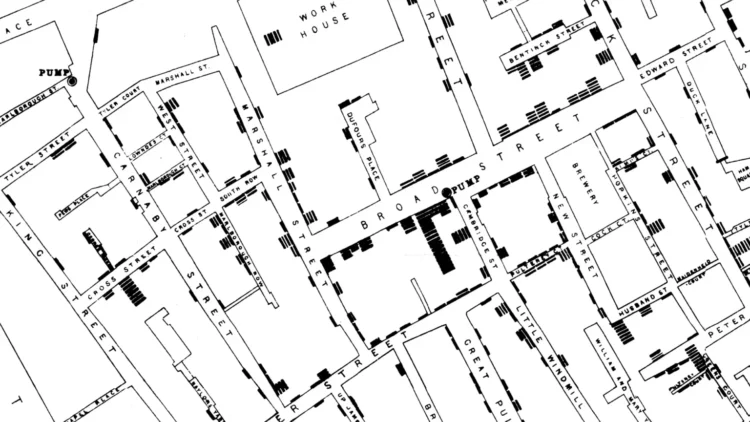
Many visualization folks recognize the cholera map as a vital tool that John Snow used in the 19th century to figure out the source of the disease. Joshua Stevens explains why that wasn’t what happened, as the map was made five years after Snow’s published conclusions.
The famous map centered on Broad Street did not lead to an ‘a-ha!’ moment, nor was it the way in which Snow came about the truth behind cholera’s transmission. Simply put, the map played no role in the discovery of how cholera spread, the decline of the disease, or the removal of the Broad Street pump.
[…]
Snow did not use a map to arrive at his conclusion. Instead, he holistically assessed the symptoms of patients, how they used and consumed water, and the conditions and municipal treatment of the water supply. He described how various sources of water smelled and even tasted, the water’s clarity, and whether upon drying it left behind residue. In this way, Snow systematically formed a hypothesis and used data to support his argument. With each step, the haze and mystery gave way and the truth began to emerge.


 Visualize This: The FlowingData Guide to Design, Visualization, and Statistics (2nd Edition)


