Best Data Visualization Projects of 2020

I’ll be honest. I thought about skipping the picks this year. Then I felt that’s no way to finish up 2020. So, here are my favorite visualization projects in no particular order. Of course there was one topic that weighed most heavily, but there were also some other interesting works along the way.
Best Chart Loosely Based on Data to Demonstrate an Idea
Flatten the Curve
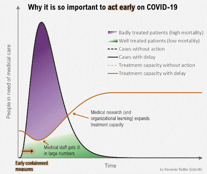
In the early part of March, we rallied around “flatten the curve”, because the healthcare system was going to buckle if we didn’t. We had to slow the number of people in the hospital at the same time.
Rosamund Pearce for The Economist made the first recent version. It was based on a graphic (pdf) by the Centers for Disease Control, all the way back from 2007. Other versions then popped up, including the animated version above by Alexander Radtke. It almost seemed like we were doing it for a while. [See the Project / On FlowingData]
Runner-up — “What does ‘level two’ mean – and why does it matter?” by Toby Morris for The Spinoff [See the Project / On FlowingData]
Best Demonstration of Virus Spreading with Simulation
Why outbreaks like coronavirus spread exponentially, and how to “flatten the curve”
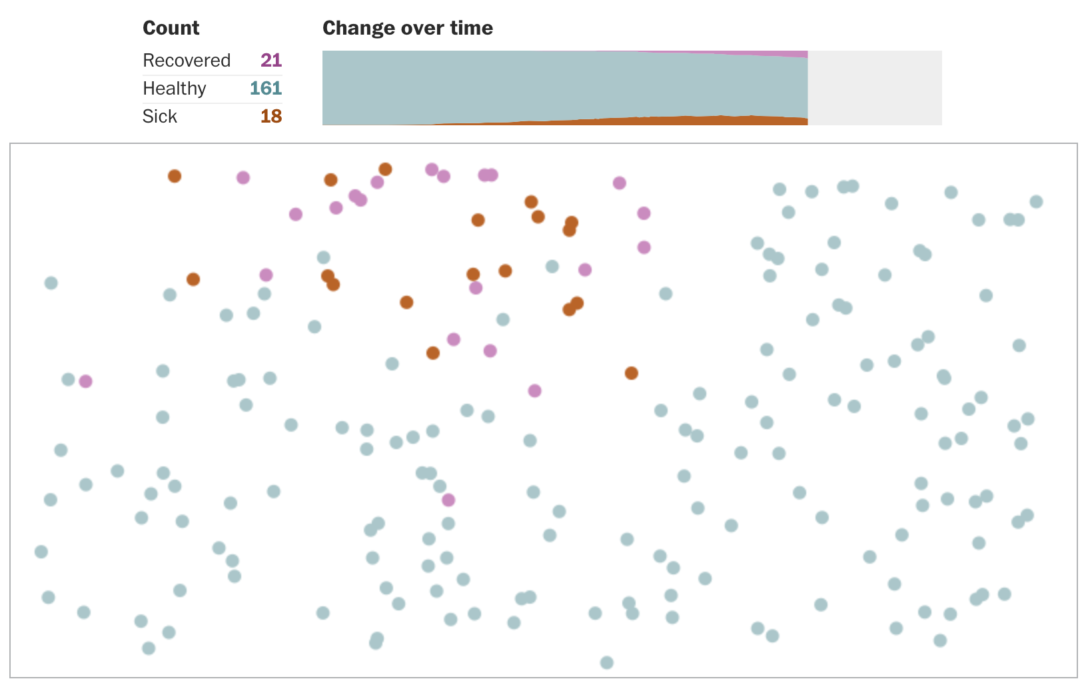
While we rallied around flattening the curve, it was clear that a lot of people didn’t know what that actually meant. For The Washington Post, Harry Stevens used a simulation of a simplified version of the virus to demonstrate. The curve became less of an abstract statistical exercise and more of a practical goal. [See the Project / On FlowingData]
Best Visualization of Masks Working
Masks Work. Really. We’ll Show You How

With debate around the usefulness of masks, many took on the task of showing that masks are effective in slowing down the spread of the coronavirus. For The New York Times, Or Fleisher, Gabriel Gianordoli, Yuliya Parshina-Kottas, Karthik Patanjali, Miles Peyton and Bedel Saget put together this stellar piece zooming into the fibers of a mask. [See the Project / On FlowingData]
Runner-up — “Why Masks Work Better Than You’d Think” by Minute Physics and Aatish Bhatia [See the Project / On FlowingData]
Runner-up — “A room, a bar and a classroom: how the coronavirus is spread through the air” by Mariano Zafra and Javier Salas for El Pais [See the Project / On FlowingData]
Best Close-to-Real-Life Visualization of the Virus Spreading
How the Virus Got Out
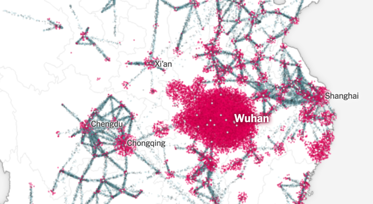
By the end of March, more data was becoming available and it was growing more clear where the virus came from and how it spread. For The New York Times, Jin Wu, Weiyi Cai, Derek Watkins, and James Glanz traced the path back to the beginning. [See the Project / On FlowingData]
Runner-up — “Anatomy of Singapore’s outbreak” by Manas Sharma and Simon Scarr for Reuters [See the Project / On FlowingData]
Best Compilation of Livestreams
Reconstructing seven days of protests in Minneapolis after George Floyd’s death
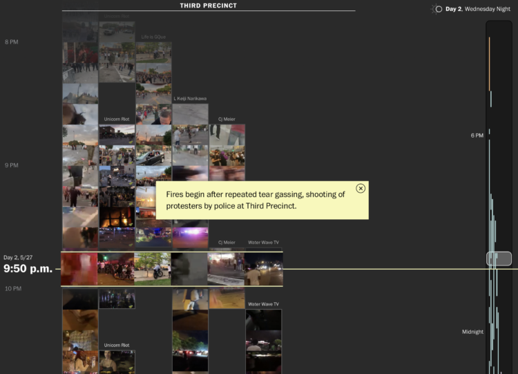
There were days of protests in Minneapolis, but it was difficult to know what was happening for those looking in from the outside. In a collaboration between Holly Bailey for The Washington Post and Matt Daniels and Amelia Wattenberger for The Pudding, live video streams were spliced together to lend some continuity. [See the Project / On FlowingData]
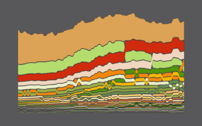
Best Traditional Chart Recurring Over and Over and Over and Over Again
The Line Chart
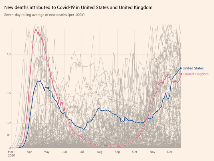
Have more line charts been published, looked at, obsessed over, and referenced in a single year ever?
We craved change. We wanted to see how things were getting better (but they got worse) over time. We wanted to compare against other time periods, other groups, and other geographies.
John Burn-Murdoch for Financial Times posted his daily Twitter threads on counts around the world. Our World In Data published similar views.
We saw change in customer visits to businesses; there was unemployment for different groups; there were charts showing excess deaths; and comparisons to the 1918 pandemic. There were many more. [The Line Chart On FlowingData]
Runner-up — Variable-width bar chart. It had a bit of a moment this year, but it was up against stiff competition.
Best Generated Map that Looks Like a Real Map
Meander
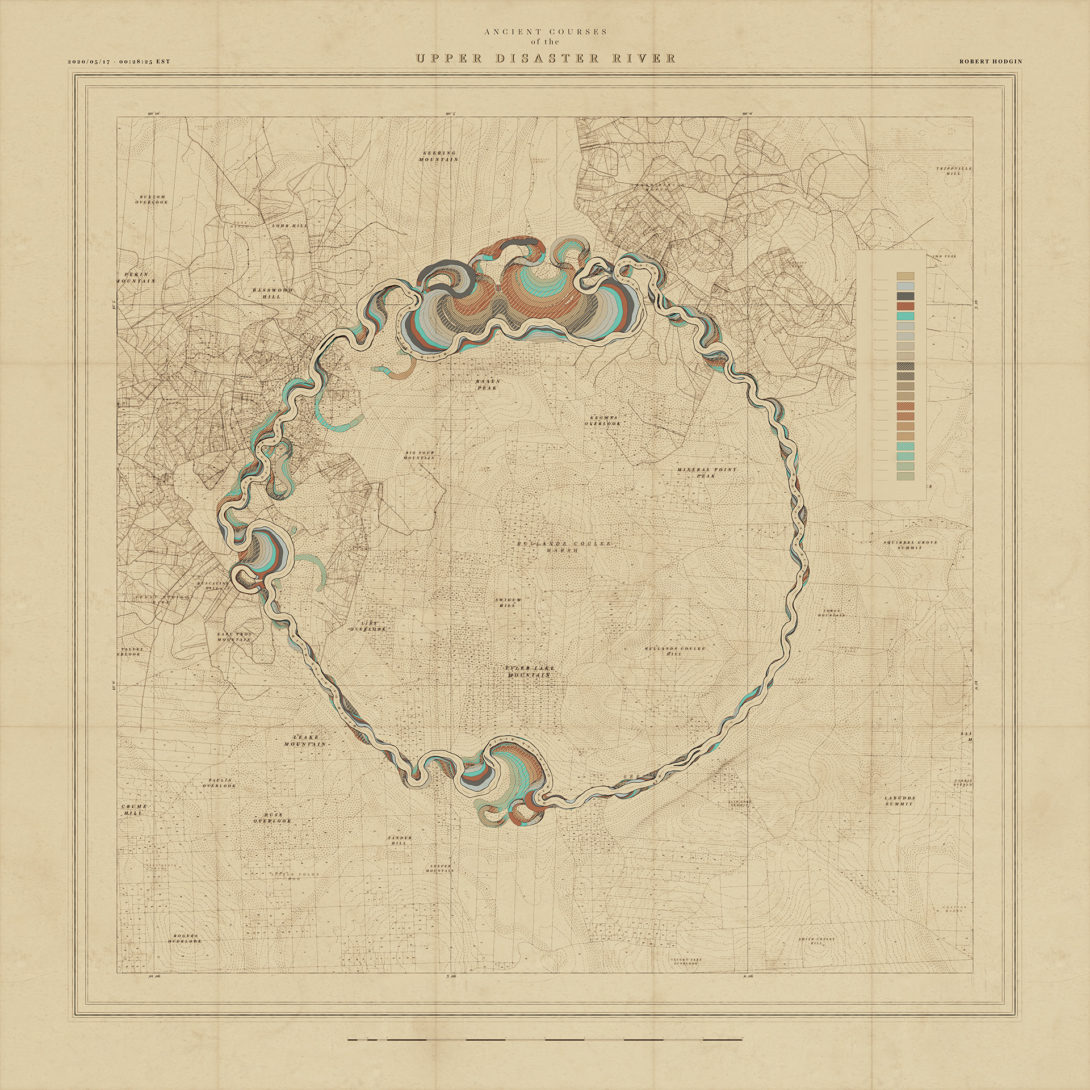
Robert Hodgin created a procedural system to make fictional, vintage maps. Just look at it. Beautiful. [See the Project / On FlowingData]
Best Use of Physical Object to Show Data
The California Pint

Beer and data joined together for the ultimate glass. North Drinkware has since made other points of elevation. [See the Project / On FlowingData]
Runner-up — “A Million Dollars vs A Billion Dollars, Visualized: A Road Trip” by Tom Scott. [See the Project / On FlowingData]
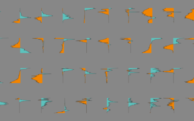
Best Abstraction of a Traditional Chart
stoxart

I thoroughly enjoyed these cute illustrations mid-August. Stock market fluctuations became the backdrop for peaks and valleys. [See the Project / On FlowingData]
Best Customizable, Single-task Map Tool Thing
Peak map

Rewind back to January, a simpler time. Andrei Kashcha made a simple-to-use tool to make ridgeline maps of anywhere in the world. He followed that up with a tool to make street maps of anywhere in the world. [See the Project / On FlowingData]
Honorable Mention
The Covid-19 Data Behind the Charts
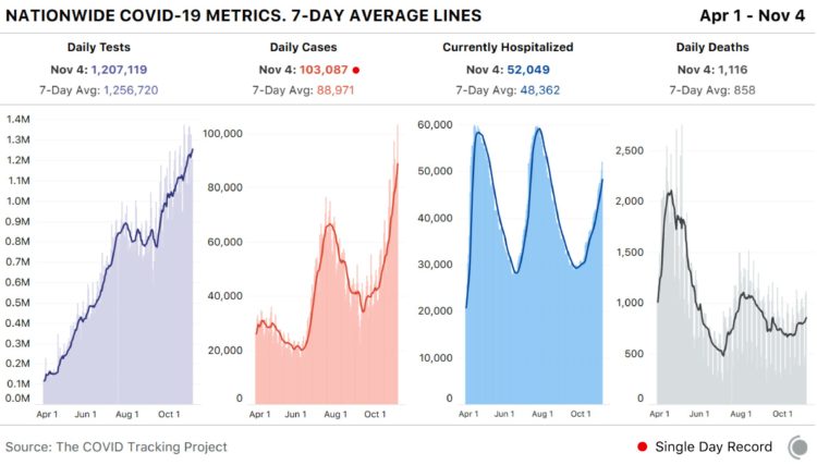
While not a visualization project per say, I argue that if there’s no data the chart dies. Data is part of the visualization. For whatever reason, some governments could not provide a reliable dataset to gauge how we were all doing. Thankfully there were sources like The COVID Tracking Project, the Johns Hopkins Coronavirus Resource Center, and Our World In Data. [See the Project / On FlowingData]
Here are all of the picks from previous years: 2008, 2009, 2010, 2011, 2013, 2014, 2015, 2016, 2017, 2018, and 2019.
Become a member. Support an independent site. Make great charts.
See What You Get