People show up unannounced at John and his mother Ann’s home in South…
2019
-
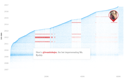
When geolocation makes everyone think you stole their phone
-
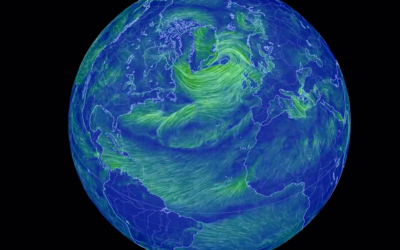
One-year time-lapse of the weather
Along the same lines as last week’s one-year wind time-lapse, Weather Decoded provides…
-
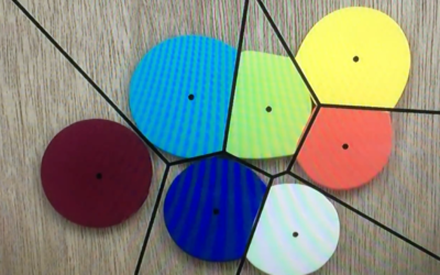
Voronoi diagram from smooshing paint between glass
[arve url=”https://www.youtube.com/watch?v=yDMtGT0b_kg” /]
It feels like magic. I think there’s a magic trick… -
Members Only

Repetitions, Data Analysis as Brainstorm
Compelling visualization doesn’t just conjure itself out of nowhere. The ideas come from somewhere, and oftentimes they build off previous ones.
-
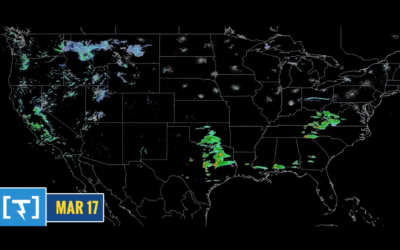
Time-lapse of all the wind in 2018
Using the same National Weather Service data that powers his live-ish wind map…
-
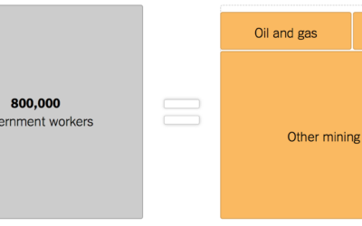
Government shutdown, other industries provided for scale
As the shutdown continues, 800,000 government workers wait for something to happen. The…
-
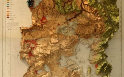
Vintage map with modern 3-D elevation
This vintage recreation by graphic designer Scott Reinhard fills all the right checkboxes…
-
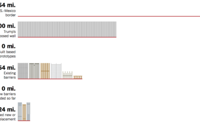
Border wall progress chart
Denise Lu for The New York Times provides a quick overview of the…
-
List of visualization best-of-year lists, 2018
The end of a year is always a good time to look back…
-
No such thing as raw data
Nick Barrowman on the myth of raw data:
Assumptions inevitably find their way… -
Members Only

Avoiding D3, Using D3, and Why I Use D3
D3.js can be used for a lot of things, and for some people it’s too much to deal with.
-
Applying for a PhD program in visualization
Niklas Elmqvist provides a detailed guide for finding and a visualization PhD program:…
-
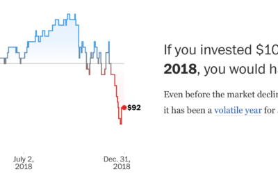
Context to the stock market rise and falls
The stock market is in a state. So finicky the past few months.…
-
Fake internet
Max Read for New York Magazine describes the fake-ness of internet through the…
Recently for Members
Second Edition
 Visualize This: The FlowingData Guide to Design, Visualization, and Statistics (2nd Edition)
 Visualize This: The FlowingData Guide to Design, Visualization, and Statistics (2nd Edition)
New tools, refined process.
Browse by Chart Type See All →


