Tutorials
Visualize your data like an expert with hundreds of practical how-tos for presentation, analysis, and understanding.

How to Make an Animated Donut Chart in R
There are "better" ways to show proportions over time, but sometimes you just want an animated donut.
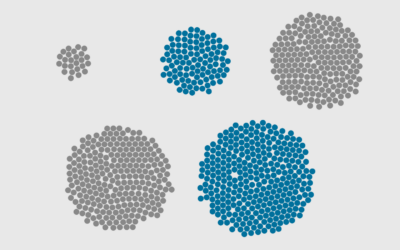
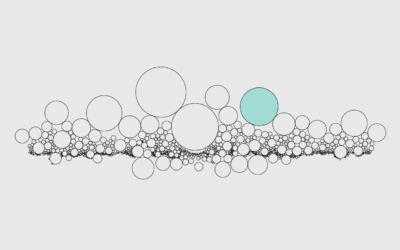
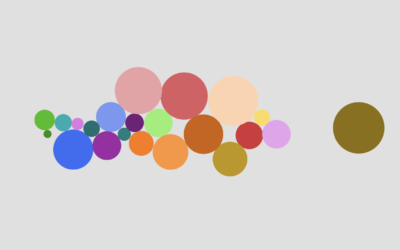
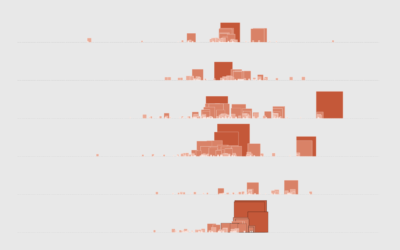
How to Make Bubble Clusters in R
Represent individual counts with grouped units to make data feel less abstract.
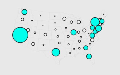
How to Make Cartograms in R
While the reshaped geography doesn't work all the time, the use of size to show data can be more intuitive in some cases.
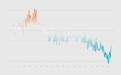
How to Make a Line Chart with a Color Gradient in R
Use color to reinforce or add another layer of meaning to a regular line chart.
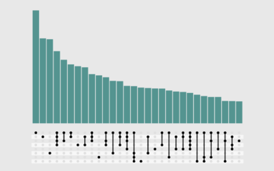
How to Make UpSet Plots in R, with ggplot2 and ggupset
A more readable alternative to Venn diagrams for when you have more than a few sets.

A Quick and Easy Way to Make Spiral Charts in R
Now that we've discovered another way to annoy chart snobs, here's how you can make your own spirals.
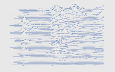
How to Make Frequency Trails in Excel
Also known as ridgelines, use the method to create a compact visualization where you can easily identify major patterns and outliers.
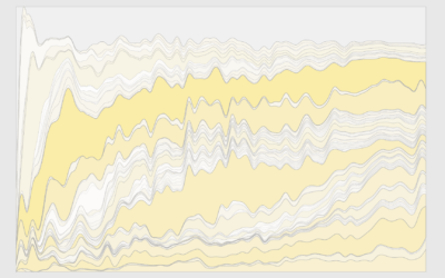
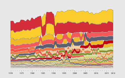
How to Make a Custom Stacked Area Chart in R
You could use a package, but then you couldn't customize every single element, and where's the fun in that?
How to Make Print-ready Graphics in R, with ggplot2
You don't have to use illustration software to polish your graphics. If keeping everything in R is your thing, this tutorial is for you.
How to Use Packed Circles in R
Adjust coordinates, geometries, and encodings with packed circles to make various types of charts.
How to Make Alluvial Diagrams
Here's how to do it in R from start to finish, plus editing in illustration software. Make design choices and trade-offs for more readable charts.
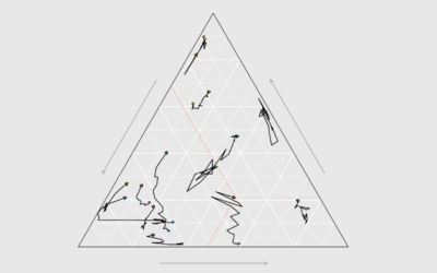
How to Make Ternary Plots in R, with ggplot2
When you want to compare between three parts of your data, ternary plots might be a good option. Here is how to make them.
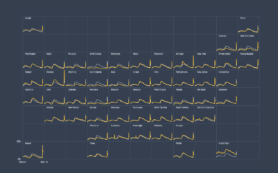
How to Make Small Multiples in Excel
Also known as trellis charts, lattice chart, or whatever you want to call them, the technique lets you compare several categories in one view.
How to Make an Animated Beeswarm Chart
Beeswarm charts are useful to highlight individual categories or entities. Animating them can help highlight change over time.
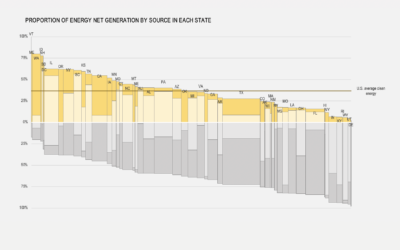
How to Make Marimekko Charts in Excel
Marimekko charts, or mosaic plots, allow you to compare categories over two quantitative variables.
How to Make Symbol-based Glyph Charts, with R Examples
Using geometric shapes as an encoding can provide another dimension to your charts.
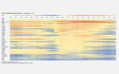
How to Make a Heatmap in Excel
Heatmaps quickly translate data tables into a visual form, making them a great tool to explore a new dataset.
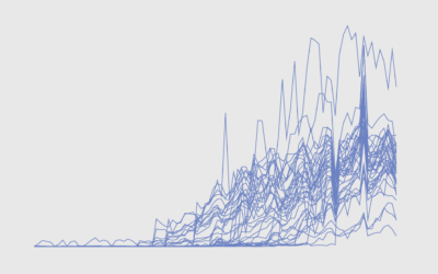
How to Untangle a Spaghetti Line Chart (with R Examples)
Put multiple time series lines on the same plot, and you quickly end up with a mess. Here are practical ways to clean it up.