Reviews

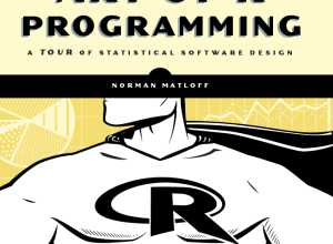
  • Book: The Art of R Programming

    November 16, 2011 to Reviews  •  Share on Twitter  •  Comments (4)

    R, the favorite computing language of a growing number of statisticians, is friendly enough that you can get a lot done without being an expert programmer, because there are a lot of packages and built-in functions that can take care a lot of the grunt work for you. Learn how to use a function, prepare your data, and you get some output. However, as you use R more, whether it's for analysis or just for graphics, there comes a point when there isn't a package or function that does exactly what you want.

    Norman Matloff's Art of R Programming is for those who want to learn to write their own software in R. This is an R programming book that starts from the beginning — running R, vectors, lists — to the more advanced such as simulations, object-oriented programming, and debugging.
    Continue Reading

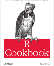
  • Review: R Cookbook from O’Reilly

    April 26, 2011 to Reviews  •  Share on Twitter  •  Comments (18)

    R can be confusing when you're first starting out, especially when you don't have any experience in programming. There's a lot of documentation online, and package developers do a decent job at providing examples on how to use their work in your code, but that stuff is not always easy to find. It's easy if you know the name of the package or function you're looking for. However, most of the time you just know what you want to do—like sort a data frame or test a regression model—and not the name of a package.

    The R Cookbook by developer Paul Teetor might be your answer.
    Continue Reading

  • this was 1984

    Review: Beautiful Visualization – Looking at Data through the Eyes of Experts

    I finally got a chance to take a closer look at O'Reilly's most recent edition to their "Beautiful" series, Beautiful...
  • Review: Atlas of Science, Visualizing What We Know

    November 3, 2010 to Reviews, Visualization  •  Share on Twitter  •  Comments (82)

    Network tree diagram

    Katy Börner, professor of information science, catalogs visualization and science in Atlas of Science: Visualizing What We Know.

    Cartographic maps have guided our explorations for centuries, allowing us to navigate the world. Science maps have the potential to guide our search for knowledge in the same way, helping us navigate, understand, and communicate the dynamic and changing structure of science and technology. Allowing us to visualize scientific results, science maps help us make sense of the avalanche of data generated by scientific research today.

    At first glance, without reading anything, it looked a lot like a general scientific visualization book. Sort of like the opposite of Data Flow. Where the visuals lack in aesthetics, they make up for with richness in data and detailed explanations of what you're looking at. There are a lot of network diagrams, some geographic maps, and a handful of traditional statistical graphics.
    Continue Reading

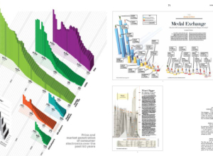
  • Review: Data Flow 2, Visualizing Information in Graphic Design

    June 8, 2010 to Data Art, Reviews  •  Share on Twitter  •  Comments (3)

    Review: Data Flow 2

    Note: The review copy I received is in French. Unfortunately, I only understand English. So this review is actually my impression of Data Flow: Design Graphique et Visualisation D'Informations as a picture book with titles, which in a way it kind of is anyways.

    Last year, the first Data Flow was published, featuring the data graphics of some fine designers. You can read my review of it here. Basically, if you liked the first Data Flow and could use some more inspiration, you'll probably like this second edition. The two are really similar in layout and in the way the graphics are split up. The title is exactly the same, save the 2.
    Continue Reading

  • Review: indiemapper makes thematic mapping easy

    April 28, 2010 to Mapping, Reviews, Software  •  Share on Twitter  •  Comments (10)

    Review: indiemapper makes thematic mapping easy

    It's finally here. Indiemapper brings easy and flexible thematic mapping online. I've been looking forward to this app ever since I got a glimpse of what was to come over a year ago, through the eyes of Indieprojector. The guys at Axis Maps have taken the core functionality of advanced GIS, simplified the work flow with a well-designed interface, and made it it super easy to create beautiful maps.
    Continue Reading

  • Review: We Feel Fine (the book) by Kamvar and Harris

    We Feel Fine, by Sep Kamvar and Jonathan Harris, is a selection of some of the best entries from the database of 12 million emotions, along with some insights into the growing dataset.
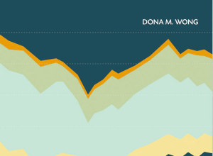
  • Review: The Wall Street Journal Guide to Information Graphics

    February 18, 2010 to Infographics, Reviews  •  Share on Twitter  •  Comments (13)

    Add another book to the growing library of guides on how to make information graphics the right way. Dona M. Wong, former graphics director of The Wall Street Journal and now strategy director for information Design at Siegel+Gale, provides the dos and don'ts of data presentation in The Wall Street Journal Guide to Information Graphics.

    First Impressions

    Given Wong's background, you can make a pretty good guess about the examples used. They're not graphics from The Journal but they do look a lot like them. The book description also makes a point of highlighting that Wong was a student of Edward Tufte, which was a big hint on what the book is like.
    Continue Reading

  • Data.gov.uk Homepage

    Data.gov.uk versus Data.gov – Which wins?

    Back in May last year, the US government launched Data.gov as a statement of transparency, and the Internet rejoiced. Just a couple of weeks ago, Data.gov.uk launched. How do the two compare? Here's my take.
  • Review: Now You See It by Stephen Few

    Now You See It by Stephen FewStephen Few of Perceptual Edge and author of Information Dashboard Design has a new visualization book on the shelves: Now You See It: Simple Visualization Techniques for Quantitative Analysis. It's 300+ information-packed pages on how to interpret your data using proper visualization tools.

    About the Book

    If you liked Few's first book, but want something more in depth on the analysis side of things, then this is probably the book you're looking for. What this book is not is a picture book for some light coffee table reading. Now You See It is for those who really want to dig into their data.

    The book is split into three main parts with the bulk of the content in the first two:

    1. Building Core Skills for Visual Analysis
    2. Honing Skills for Diverse Types of Visual Analysis
    3. Further Thoughts and Hopes

    The first part places a good bit of emphasis on what visualization is and how you should approach it, while part two gets into specific types of data such as time series, rankings, distributions, and correlations.

    There are tons of examples throughout with a graph or chart on just about every page, and while Few specifies the software (e.g. a lot of Tableau) used to create each visualization, it's worth pointing out that Now You See It isn't a guide on how to use a specific type of software. Rather it teaches the principles of good visualization that transfer over to whatever tool you're using.
    Continue Reading

  • Review: RoamBi, Seeing Your Data on the iPhone

    June 29, 2009 to Reviews, Software  •  Share on Twitter  •  Comments (1)

    RoamBiThis is a guest review by Peter Robinet of Bubble Foundry, a web design company that specializes in building websites for Web startups.

    What It Is

    RoamBi is a free data visualization application for the iPhone by MeLLmo. You download datasets to the app and it creates visualizations so you can drill down into the data. The app is pitched as a mobile business tool for viewing sales reports and the like, but the sample visualizations included with the app suggest another possibility: RoamBi could easily be a killer app for statistics-minded sports fans, such as sabermetrics devotees!
    Continue Reading

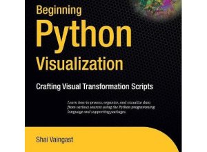
  • Review: Beginning Python Visualization

    June 19, 2009 to Reviews, Software  •  Share on Twitter  •  Comments (69)

    Python is a powerful programming language that's good for a lot of things. I mainly use it for data scraping, parsing, munging, etc, and more recently, for the Web, and I've left visualization up to other languages.

    But why not use Python for visualization too? That way you can have everything in one language and all the gears can fit together a little easier. Beginning Python Visualization (BPV) by Shai Vaingast is a guide to help you do this.

    While you might need a little bit of programming experience to fully make use of this book, Vaingast provides plenty of examples and explanations for you to easily learn how to use Python's visualization options.
    Continue Reading

  • Review: Data Flow, Visualizing Information in Graphic Design

    March 16, 2009 to Data Art, Reviews  •  Share on Twitter  •  Comments (265)

    Review: Data Flow, Visualizing Information in Graphic Design

    Data Flow: Visualizing Information in Graphic Design isn't an Edward Tufte book. It's not an instruction manual nor is it a guide to analytical and statistical graphics. Rather, Data Flow is a showcase of visualization and infographics with a hard focus on aesthetics and form.
    Continue Reading

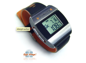
  • Get a Good Night’s Sleep with SleepTracker Pro [Review]

    October 23, 2008 to Reviews, Self-surveillance  •  Share on Twitter  •  Comments (4)

    I've had sleep troubles for as long as I can remember. When I was in grade school, I used to stay up late (well past 10pm) listening to my Sony Walkman. I later got a 10-inch black and white television in my room from my mom's college years. My sleep schedule only got worse in high school when I made my first big purchase with money that I had earned cutting vegetables and washing dishes in a restaurant - a beautiful 19-inch color television, with a remote! Now that I have to jump across time zones quite a bit, my sleep patterns have a hit an all-time low, so I was of course excited to receive my SleepTracker Pro in the mail a couple of weeks ago. I've been using it ever since.

    Tracking Your Sleep Patterns

    The SleepTracker Pro is a watch that measures your movements while you sleep and wakes you up at an optimal time so that you wake up feeling refreshed instead of cranky and incapacitated. The premise is that the SleepTracker wakes you up when you're in an almost-awake state. When you're in deep sleep or in one of your REM cycles, your body is paralyzed, which explains why it's so hard to get up sometimes, so SleepTracker monitors your movements to wake you up when you're not in a state of complete floppiness. You can later transfer the data to your computer - which is of course a feature I love.

    Pros

    Within the first few days of using my SleepTracker, I noticed an immediate difference. I was waking up feeling refreshed and ready to take on the day. It felt weird getting out of bed right when my eyes opened. I was so used to laying there for an hour not wanting to get up.

    Also - and this is probably obvious - I enjoy transferring my nightly sleep data to my computer and looking at my sleep patterns. Sometimes my wife works nights, so I can see the almost-wake states when she comes in really early in the morning. I also see the times when my cat manages to open the bedroom door and jump on my face.

    Cons

    While advantageous, the SleepTracker could use a few improvements:

    • The SleepTracker looks like something from the 80s. It's a big watch.
    • It only stores one night's worth of data, so if I forget to transfer data to my computer on a day, I lose it.
    • The Windows-only user interface is somewhat limited as far as visualization and insight goes.
    • A few times the vibration/alarm wasn't enough to wake me up.

    Overall Sentiment

    I might never wear the watch during the day, but I will gladly put it on every night when I go to bed. The manual emphasizes changing your habits to get a good night's sleep, which is a good point - and can probably be said for all types of self-surveillance. It's not meant as a cure all. You can't sleep 4 hours or drink a gallon of coffee before going to bed and expect to feel refreshed the next morning. Trust me. I tried. Uh, not the gallon of coffee part. I definitely noticed a difference though when I went to sleep at a decent hour.

    The SleepTracker Pro retails at $179, which might be too much for some, but I guess it just comes down to how much you value a good night's sleep. Personally, I'm happy with it and the new source of personal data isn't too shabby either.

    Has anyone else had any experiences with the SleepTracker?

  • toolbox-thumb

    Putting Analysis Online With StatCrunch and Covariable [Review]

    Are online statistical tools sufficient to analyze our complex datasets?
Copyright © 2007-2012 by FlowingData. All rights reserved.