Here’s a fun interactive by Duc-Quang Nguyen. Upload an image and get back…
Data Art
Finding the beauty in numbers.
-
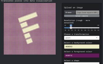
Transform an image into a pixel-ly visual
-
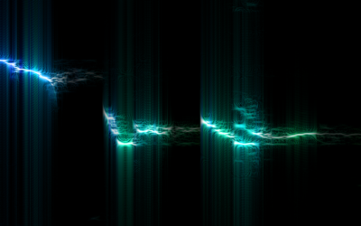
Bird song sonographs show distinct drawing patterns
These sonographs of bird song, in contrast to the sounds from traditional instruments,…
-
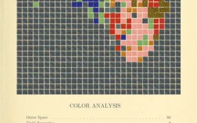
Generate a color analysis by uploading an image
Mel Dollison and Liza Daly made a fun interactive that lets you upload…
-
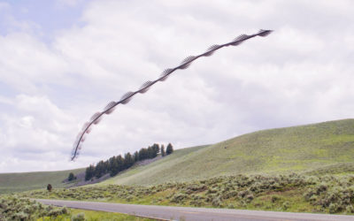
Bird flight patterns captured through long-exposure photography
For several years, Xavi Bou has been using long-exposure photography to capture stills…
-
Sonification of Covid-19 deaths
This is interesting:
What does 425,000 Covid deaths sound like? I was inspired…
-
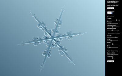
Snowflake generator
Vivian Wu made a snowflake generator. Adjust parameters such as growth, kaleidoscoping, and…
-
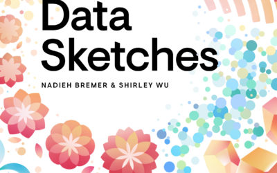
Data Sketches, the book
Data Sketches was a one-year visualization collaboration between Nadieh Bremer and Shirley Wu…
-
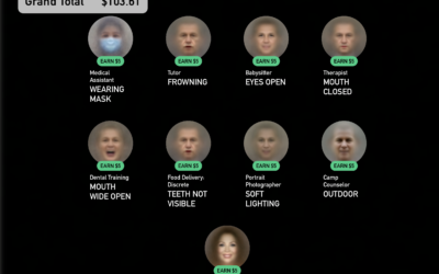
A game where you get to be a faceworker and mess with an AI system
Kyle McDonald, in collaboration with Greg Borenstein, Evelyn Masso, and Fei Lui, made…
-
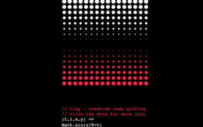
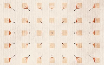
Minimalist creative coding environment
tixy.land is a minimalist coding environment by Martin Kleppe:
Control the size and… -
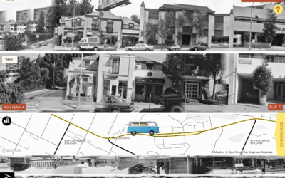
Exploration of 12 timelines along Sunset Boulevard
In 1966, artist Ed Ruscha published Every Building on the Sunset Strip, which…
-
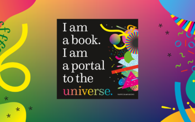
I am a book. I am a portal to the universe.
Stefanie Posavec and Miriam Quick have a new book out called I am…
-

Elevation data molded in the base of a pint glass
North Drinkware molded Half Dome in the bottom of a hand-blown pint glass…
-

Disappearing animals as a matrix of dots
Reddit user WhiteCheeks used dot density to show population counts of various animals.…
-

Stock market mountains
After seeing stoxart, I was reminded of Michael Najjar’s project High Altitude from…
-
Stock market charts turned into illustrated landscapes
stoxart is a project by Gladys where she turns stock market charts to…
-
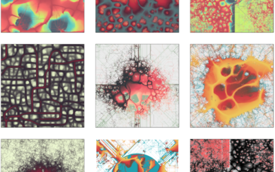
Using a slime mold simulation for generative art
Slime mold are single-celled organisms that can work together to form multicellular structures.…
-

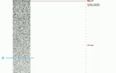
A million dollars vs. a billion visualized with a road trip
A million dollars. A billion dollars. The latter is 1,000 times more than…
-
Data visualization wallpaper
As a 100-day project, Alli Torban has been imagining what a data visualization…
Recently for Members
Second Edition
 Visualize This: The FlowingData Guide to Design, Visualization, and Statistics (2nd Edition)
 Visualize This: The FlowingData Guide to Design, Visualization, and Statistics (2nd Edition)
New tools, refined process.
Browse by Chart Type See All →


