I started the FlowingData Flickr group a little while ago, but didn’t come…
2010 January
-
Flickr Group Treats – January 2010
-
Save pens. Use Garamond font
Designers Matt Robinson and Tom Wrigglesworth looked at ink usage of some commonly-used…
-
Beatles Music in Infographics
I’m sure a lot of you love The Beatles. I’m not a huge…
-
What day is it? It’s Data Privacy Day!
Today is Data Privacy Day 2010, apparently. Was there a Data Privacy Day…
-

Understanding risk – play it safe or eat a bacon sandwich?
David Spiegelhalter is a Professor of the Public Understanding of Risk at Cambridge…
-
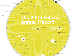
The 2009 Feltron Annual Report – OCD Made Sexy
Nicholas Felton’s personal annual report on his life is now up. For those…
-
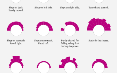
Data Underload #6 – Bed Head
Your hair distribution in the morning, based on how you slept the previous night.
-
Dropped Food. Should You Eat it?
Since you’ll be trying every single drink recipe in the engineer’s guide this…
-

Engineer’s Guide to Drinks
Seeing as the weekend is just about here, I’m sure many of you…
-

How to Make a Heatmap – a Quick and Easy Solution
A heatmap is a literal way of visualizing a table of numbers, where you substitute the numbers with colored cells. This is a quick way to make one in R.
-
Data.gov.uk Gearing Up For Launch, er, Does Launch
Update: I had scheduled this post for next week, but apparently, Data.gov.uk launched…
-
The Very First Thematic Maps
I’m admittedly not very good with historical precedent, but I think we can…
-
Thanks, FlowingData Sponsors
Thank you, sponsors. I wouldn’t be able to do what I do on…
-

Crayola Crayon Colors Multiply Like Rabbits
In 1903, Crayola had eight colors in its standard package. Today, there are…
-
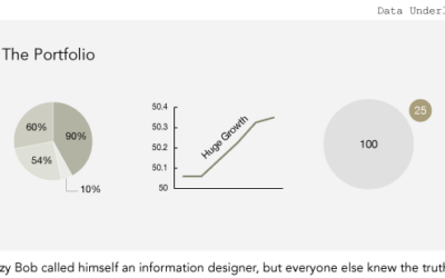
Data Underload #5 – The Portfolio
Lazy Bob called himself an information designer, but everyone else knew the truth.
-
Data Visualization Christmas Ornaments
It’s funny how data is finding it’s way into everyday objects. There was…
-
Timescapes to Compare Chopin Recordings
How do you compare music visually? You can break it down into data…
-
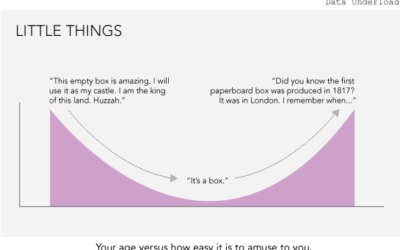
Data Underload #4 – Little Things
Your age versus how easy it is to amuse you.
-

The Geography of Netflix Rentals
Some movies are popular everywhere. Others are popular only in certain regions. The…
-
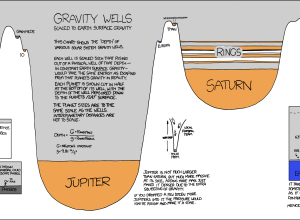
Need to Escape Jupiter’s Gravitational Pull? Good Luck
Randall of xkcd has been having fun with data visualization lately. In his…
Recently for Members
Second Edition
 Visualize This: The FlowingData Guide to Design, Visualization, and Statistics (2nd Edition)
 Visualize This: The FlowingData Guide to Design, Visualization, and Statistics (2nd Edition)
New tools, refined process.
Browse by Chart Type See All →


