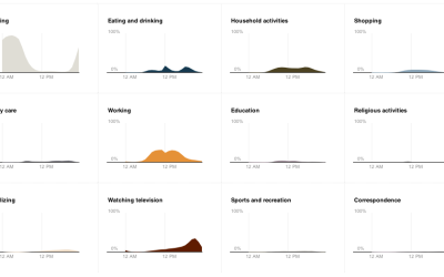
When you have several time series over many categories, it can be useful to show them separately rather than put it all in one graph. This is one way to do it interactively with categorical filters.
time series
-
Members Only
Build Interactive Area Charts with Filters
-
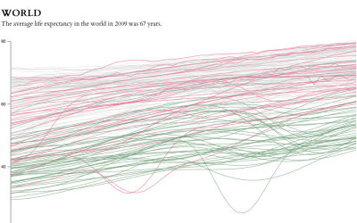
Life expectancy changes
The data goes back to 1960 and up to the most current estimates for 2009. Each line represents a country.
-
Quick time series visualization with Cube
Seeing how things change over time can be important for a business so…
-
11 Ways to Visualize Changes Over Time – A Guide
Deal with data? No doubt you’ve come across the time-based variety. This is a guide to help you figure out what type of visualization to use to see that stuff.


 Visualize This: The FlowingData Guide to Design, Visualization, and Statistics (2nd Edition)


