I’m not sure what I’d do with Ablaze.js, a JavaScript library by Patrick…
JavaScript
-
Make cool images with emergent algorithm
-
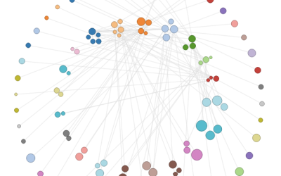
How to Make an Interactive Network Visualization
Interactive network visualizations make it easy to rearrange, filter, and explore your connected data. Learn how to make one using D3 and JavaScript.
-
Link
Peity →
jQuery plugin that converts an element’s content into a mini pie, line, or bar chart [via]
-
Members Only
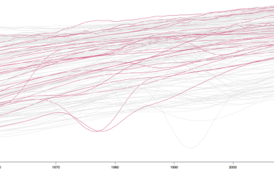
Interactive Time Series Chart with Filters
Time series charts can easily turn to spaghetti when you have multiple categories. By highlighting the ones of interest, you can direct focus and allow comparisons.
-
Link
sigma.js →
JavaScript library to easily draw network graphs
-
Live Coding Implemented
Remember Bret Victor’s live coding talk from last month? He presented an example…
-
Wind motion patterns animated
Nicolas Garcia Belmonte, author of the JavaScript InfoVis Toolkit, mapped 72 hours of…
-
Members Only
Build Interactive Area Charts with Filters
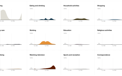
When you have several time series over many categories, it can be useful to show them separately rather than put it all in one graph. This is one way to do it interactively with categorical filters.
-
Data-Driven Documents for visualization in the browser
As we know, browsers keep getting better, and it grows easier every day…


 Visualize This: The FlowingData Guide to Design, Visualization, and Statistics (2nd Edition)


