In case you’re following the craziness going on over Europe due to that…
homeviz
-
The Ash Cloud and Airport Shutdowns
-
Swing vote effects explored with swingometer
With the 2010 UK elections coming up, the Guardian explores possible outcomes, given…
-
Best place to catch a cab? Try Bloomingdale’s
Matthew Bloch, Ford Fessenden, and Shan Carter continue the New York Times geographic…
-
Streamgraph code is available and open source
Some people love ’em and others hate ’em. Now you can play with…
-
Discuss: Flowchart on drinkable water in the world
March 22 was World Water Day, and TreeHugger posted this graphic on drinking…
-
Mapping GitHub – a network of collaborative coders
GitHub is a large community where coders can collaborate on software development projects.…
-
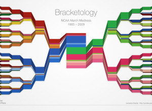
March Madness Bracketology
The Final Four is just about here. Who’s going to win it all?…
-
The periodic table to end all periodic table ridiculousness
A few centuries ago, scientists designed the periodic table to organize the elements…
-
Wear the weather as a bracelet
We all know that data is the new sexy, so it’s only natural…
-
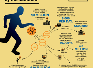
March Madness by the numbers
I didn’t fill out my bracket this year, so it’s not nearly as…
-
Statistical Atlas from the ninth Census in 1870
In 1870, Francis Walker oversaw publication of the United States’ very first Statistical Atlas, based on data from the ninth Census.
-
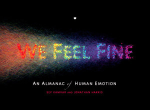
Review: We Feel Fine (the book) by Kamvar and Harris
We Feel Fine, by Sep Kamvar and Jonathan Harris, is a selection of some of the best entries from the database of 12 million emotions, along with some insights into the growing dataset.
-
How Genetics Works
Simple yet effective. Any questions? [via 9gag | Thanks, Barry]…
-
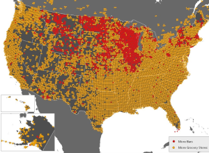
Where Bars Trump Grocery Stores
FloatingSheep, a fun geography blog, looks at the beer belly of America. One…
-
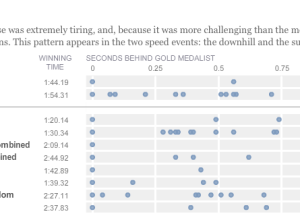
Olympic musical – how fractions of second make all the difference
Like everyone, I’ve been watching the Olympics, and it continues to amaze me…
-
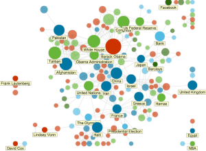
News Topics as Social Network
All news is connected in some way or another. News Dots from Slate…
-
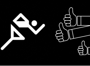
Evolution of Olympic Pictograms
Every Olympics since 1936 has had a series of pictograms (i.e. icons that look like restroom signs) that represents the events.
-
An Exploration of Biological Records
The Natural Science Museum of Barcelona has a growing database of 50,000 records…
-
Man as Industrial Palace, Animated
In 1926, Fritz Kahn illustrated man as a working factory in his famous…
-
OpenStreetMap Edits Towards Haiti Relief
ITO world, who you might remember from a year of OpenStreetMap edits, come…


 Visualize This: The FlowingData Guide to Design, Visualization, and Statistics (2nd Edition)


