This week is about helping people see data for what it is and avoiding poor choices.
audience
-
Members Only
Data with missing information
-
Members Only
Ignoring audience
Focus on the audience who matters and ignore the rest who only want to see data that validates narrow views.
-
Members Only
Unexpected Places
You spent time and effort on a data project and it ends up in unexpected places. Do you just shrug and let it pass or do you try to get a handle on the work so that it’s not misconstrued out of context?
-
Members Only
Pushing Out the Charts
In the land of what-if and what-about, it’s surprisingly easy to get stuck staring at your work, thinking about how your audience will hate it. You have to let it go.
-
Members Only
Chart Practice: Changing the Audience
Learn about who is looking at your work and how they interpret it.
-
Members Only
Explaining More, Assuming Less
You know what they say about assumptions.
-
Members Only
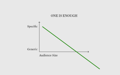
Narrow Audience
With fewer people in mind, you can visualize data with fewer trade-offs and greater focus.
-
Members Only
Eggtastic Graph
It is okay to fill the void with something fun.
-
Members Only
Visualization for One
Communicate to fewer people to reach more.
-
Members Only
Debating About Visualization – The Process 172
The discussions this week felt familiar. Probably because we’ve seen this many times, since the beginning of charts themselves.
-
Members Only
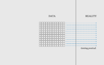
Connecting Data to Practicality – The Process 166
It’s a shift from answering “What is this data?” to “So what?”
-
Members Only
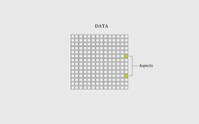
I Want to Visualize Aspects of the Data – The Process 162
When you visualize aspects of the data instead of just the data itself, what you show grows more obvious.
-
Members Only
Charting for Others (The Process 086)
There’s a new tool-agnostic course now available for members. Check it out now.
-
The Myth of ‘Dumbing Down’
For The Atlantic, Ian Bogost on communicating complex ideas to an audience:
One… -
Members Only
Visualization for Analysis vs. Visualization for an Audience (The Process #59)
The visualizations are used and read differently, which requires that you approach their design differently.
-
Members Only
Reddit Follow-up; Chart Like Nobody’s Looking (The Process #57)
Consider your audience. Yes. But at some point in the visualization creation process, you have to disregard all of the feature requests and design suggestions.
-
Visualization research for non-researchers
Reading visualization research papers can often feel like a slog. As a necessity,…
-
Members Only
Make It Mean Something or It Didn’t Happen
Visualization as template-filling content is lazy visualization that no one draws benefit from. Give people a reason to care.
-
Visualization for an audience
Jonathan Corum, the Science graphics editor at The New York Times, talks about…
-
Using an audience’s own data to highlight both play and security
This is great. Daniel Goddemeyer and Dominikus Baur made Data Futures, which collects…


 Visualize This: The FlowingData Guide to Design, Visualization, and Statistics (2nd Edition)


