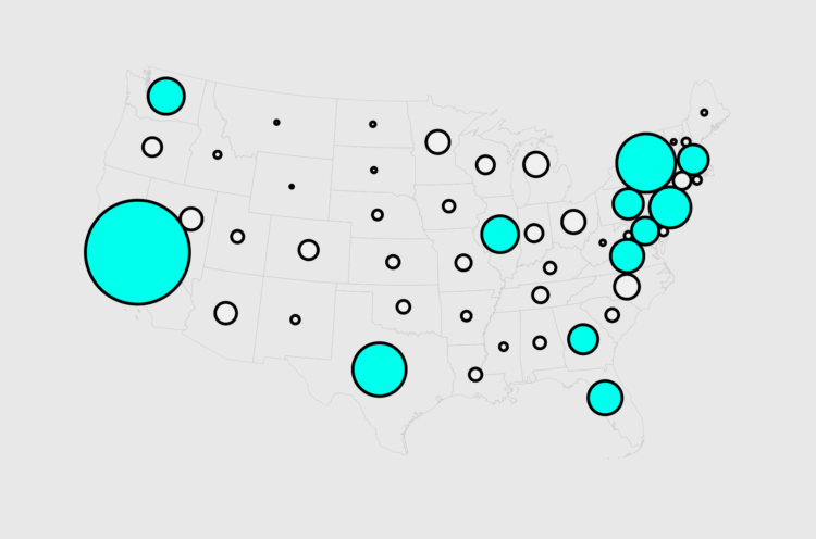
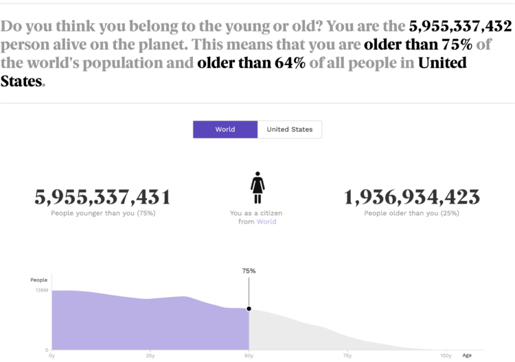
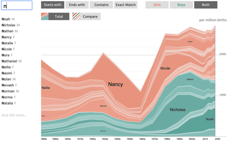
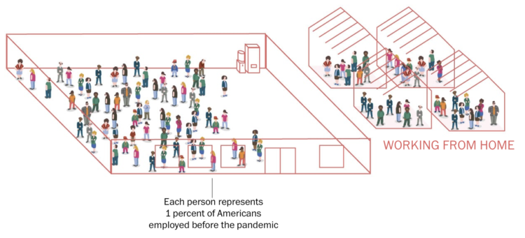
• As part of their Citizen Browser project to inspect Facebook, The Markup shows a side-by-side comparison between Facebook feeds for different groups, based on the feeds of 1,000 paid participants.

    There are pretty big differences for news sources and group suggestions, but the news stories don’t seem as big as you might think with a median 3 percentage points difference between groups. Although, the distribution shows a wider spread.

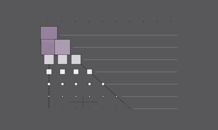
  • Alicia Parlapiano and Josh Katz, reporting for NYT’s The Upshot, plotted the average aid for different groups, outlined by the March 2021 stimulus bill. The estimates come from a new analysis by the Tax Policy Center, which contrasts sharply with the 2017 Tax Cuts and Jobs Act.

    Check out the full Upshot chart, which shows single and married households up to three children or more. There are a few visual encodings going on here with the axes, bubble size, color, and income group labels.

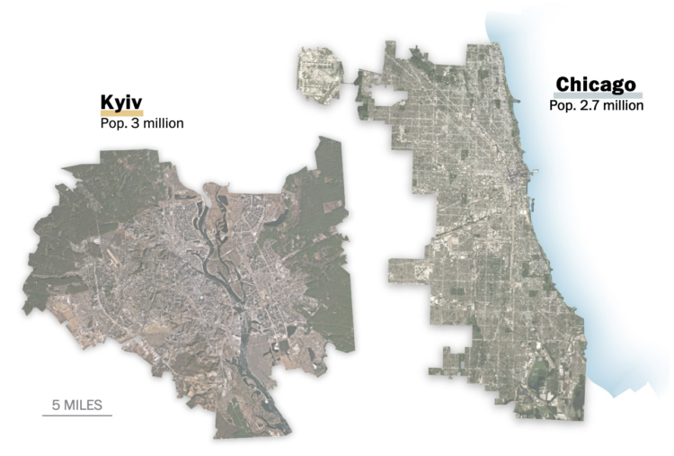
  • Seeing CO2, by design studio Extraordinary Facility, is a playable data visualization that imagines if carbon dioxide were visible. You drive a car around collecting bits of information about carbon dioxide in our environment, and along the way, you’ll see volumes of CO2 compared against well-known structures. Pretty great.

  • Members Only

    Bad charts get made. It’s inevitable. Sometimes I wonder how it happens though.

  • BirdCast, from Colorado State University and the Cornell Lab of Ornithology, shows current forecasts for where birds are headed over the United States:

    Bird migration forecasts show predicted nocturnal migration 3 hours after local sunset and are updated every 6 hours. These forecasts come from models trained on the last 23 years of bird movements in the atmosphere as detected by the US NEXRAD weather surveillance radar network. In these models we use the Global Forecasting System (GFS) to predict suitable conditions for migration occurring three hours after local sunset.

  • Chris Ume, with the help of Tom Cruise impersonator Miles Fisher, created highly believable deepfakes of Tom Cruise and posted the videos to TikTok. Ume showed the breakdown of the arduous process of training the A.I. model and editing each frame.

    The Verge talked to Ume more about the process:

    “You can’t do it by just pressing a button,” says Ume. “That’s important, that’s a message I want to tell people.” Each clip took weeks of work, he says, using the open-source DeepFaceLab algorithm as well as established video editing tools. “By combining traditional CGI and VFX with deepfakes, it makes it better. I make sure you don’t see any of the glitches.”

    The results are both entertaining and worrisome.

  • We already looked at minimum wage over time, but when it comes to geography and income, you also have to consider the cost of living for a fair comparison.

  • Speaking of A.I. and fiction, Adam Epstein for Quartz reported on how Wattpad, the platform for people to share stories, uses machine learning to find potential movies:

    Wattpad uses a machine-learning program called StoryDNA to scan all the stories on its platform and surface the ones that seem like candidates for TV or film development. It works on both macro and micro levels, analyzing big-picture audience engagement trends to identify the genres picking up steam, while also looking at the specific stories that got popular quickly and calculating what made them so appealing.

    The tool can break stories down to their vocabularies and sentence structures (a story’s “DNA,” if you will) and then compare those to other stories to deduce what really makes a work of fiction popular. It also looks at how often users comment on stories and, when they do, what exactly they’re saying. Its goal is to examine all these clues to uncover the precise combination of story elements—genre, emotion, grammar, the list goes on—that hooks audiences to the point they’ll follow its journey onto a visual medium.

    Maybe I’m just getting old, but this sounds terrible.

  • Pamela Miskhin, in collaboration with The Pudding, wrote a love story. It’s not just any love story though. The text is based on Mishkin’s own experiences and input from GPT-3, the language prediction model that produces text that sounds like it came from a human.

    The result resembles a cross between choose-your-own-adventure and Mad Libs.

  • The Royal Statistical Society published ten lessons governments should takeaway from this year, which should naturally apply to standard data practice:

    1. Invest in public health data – which should be regarded as critical national infrastructure and a full review of health data should be conducted 
    2. Publish evidence – all evidence considered by governments and their advisers must be published in a timely and accessible manner
    3. Be clear and open about data – government should invest in a central portal, from which the different sources of official data, analysis protocols and up-to-date results can be found
    4. Challenge the misuse of statistics – the Office for Statistics Regulation should have its funding augmented so it can better hold the government to account
    5. The media needs to step up its responsibilities – government should support media institutions that invest in specialist scientific and medical reporting
    6. Build decision makers’ statistical skills – politicians and senior officials should seek out statistical training
    7. Build an effective infectious disease surveillance system to monitor the spread of disease – the government should ensure that a real-time surveillance system is ready for future pandemics
    8. Increase scrutiny and openness for new diagnostic tests – similar steps to those adopted for vaccine and pharmaceutical evaluation should be followed for diagnostic tests
    9. Health data is incomplete without social care data – improving social care data should be a central part of any review of UK health data
    10. Evaluation should be put at the heart of policy – efficient evaluations or experiments should be incorporated into any intervention from the start.

    See the full report here.

  • There was a lot of uncertainty in the beginning of the pandemic, so the forecasts varied across sources. There were also many forecasts. Youyang Gu provided on of those forecasts, and it predicted well. Ashlee Vance reporting for Bloomberg on the Covid-19 forecasting work of Youyang Gu:

    The novel, sophisticated twist of Gu’s model came from his use of machine learning algorithms to hone his figures. After MIT, Gu spent a couple years working in the financial industry writing algorithms for high-frequency trading systems in which his forecasts had to be accurate if he wanted to keep his job. When it came to Covid, Gu kept comparing his predictions to the eventual reported death totals and constantly tuned his machine learning software so that it would lead to ever more precise prognostications. Even though the work required the same hours as a demanding full-time job, Gu volunteered his time and lived off his savings. He wanted his data to be seen as free of any conflicts of interest or political bias.

    Reading this, it felt a little bit like cherry-picking the forecast that was best, but I don’t know enough to decide. It does seem to highlight though some of the limitations of larger organizations that don’t always have the best point of view.

  • For Reuters, Julia Janicki and Simon Scarr, with illustrations by Catherine Tai, show why bats make ideal hosts for viruses. They went with the old nature journal aesthetic, which I appreciate.

    One reason bats have started outbreaks is longevity, shown in the chart above, which compares mass against lifespan. Bats live a surprisingly long time for their size. Plus, they can fly.

  • Members Only

    Every month I collect new visualization tools and learning resources to help you make better charts. Here’s the good stuff for February 2021.

  • RAWGraphs, a tool conceived by DensityDesign in 2013, got a 2.0 update in a collaborative effort between DensityDesign, Calibro and Inmagik:

    RAW Graphs is an open source data visualization framework built with the goal of making the visual representation of complex data easy for everyone.

    Primarily conceived as a tool for designers and vis geeks, RAW Graphs aims at providing a missing link between spreadsheet applications (e.g. Microsoft Excel, Apple Numbers, OpenRefine) and vector graphics editors (e.g. Adobe Illustrator, Inkscape, Sketch).

    Load your dataset, and make a wide range of charts with the point-and-click interface. The options try to update smartly depending on your data and visualization choices.

  • This is quite a dive by Moises Velasquez-Manoff and Jeremy White for The New York Times. They look at the potential danger of melting ice from Greenland flowing into the Gulf Stream.

    An animated map of currents and temperature, reminiscent of NASA’s Perpetual Ocean from 2011, shows what’s going on underwater. The piece flies you through as you scroll with a familiar view as if you’re in space looking down.

    Keep reading though, and you’re taken underwater 800 feet below the surface. It’s like seeing the currents from a fish’s point of view.

  • As schools begin to reopen, The New York Times illustrates why classrooms should open a window for ventilation. Lower viral concentrations swirling around means reduced exposure.

    The 3-D model to show airflow was already something, but keep scrolling to see the cross-sections. Then scan the QR code on your phone to see the simulated data with augmented reality.

  • Minimum wage has increased over the years, but by how much depends on where you live.

  • Oftentimes we see “algorithms” referenced in various contexts, but the definition of an algorithm is often unclear. For MIT Technology Review, Kristian Lum describes what an “algorithm” means these days:

    In statistics and machine learning, we usually think of the algorithm as the set of instructions a computer executes to learn from data. In these fields, the resulting structured information is typically called a model. The information the computer learns from the data via the algorithm may look like “weights” by which to multiply each input factor, or it may be much more complicated. The complexity of the algorithm itself may also vary. And the impacts of these algorithms ultimately depend on the data to which they are applied and the context in which the resulting model is deployed. The same algorithm could have a net positive impact when applied in one context and a very different effect when applied in another.

  • For Reuters, Sarah Slobin and Feilding Cage imagine life back at the office with an interactive game. Navigate through different office scenarios while maintaining social distance:

    To understand what that might feel like, we spoke to some experts on work and workspaces who predicted that social distancing measures and hybrid work models are here to stay. Walk through our simulations below to experience what going back to the old/new office might be like. Make sure to avoid contact with others along the way!

    I haven’t worked in a proper office in many years, and it never appealed to me, but it sounds pretty nice these days.

  • The Centers for Disease Control and Prevention released a report that said life expectancy decreased by a full year in 2020. While the calculation is correct, the interpretation and message from that number is more challenging. For STAT, Peter B. Bach provides context to the measurement:

    Don’t blame the method. It’s a standard one that over time has been a highly useful way of understanding how our efforts in public health have succeeded or fallen short. Because it is a projection, it can (and should) serve as an early warning of how people in our society will do in the future if we do nothing different from today.

    But in this case, the CDC should assume, as do we all, that Covid-19 will cause an increase in mortality for only a brief period relative to the span of a normal lifetime. If you assume the Covid-19 risk of 2020 carries forward unabated, you will overstate the life expectancy declines it causes. […]

    Bach wonders if the CDC should have released the report at all, if most people were just going to misunderstand it. That seems like the wrong direction though. Life expectancy is a useful metric, and if you know there are a lot of chances for miscommunication, you try your best to explain the numbers with the audience in mind.