• Membership
  • Newsletter
  • Projects
  • Learning
  • About
  • Member Login
  • Spike maps in R

    October 8, 2021

    Topic

    Coding  /  package, R

    Spike maps use the height of spikes to encode data geographically. The format provides a similar effect to frequency trails where the layering looks 3-D-ish, except spikes are typically centered on an area instead of running parallel.

    Anyways, like most visualization methods with a name, there is an R package for spike maps by Timothée Giraud.

    If D3.js is your jam, there’s also a solution for that. You can also take the no-code route with Datawrapper.

  • Members Only

    Data Visualization Freelance Advice, from Someone Who Doesn’t Freelance and Has No Clue What He is Talking About – The Process 160

    October 7, 2021

    Topic

    The Process  /  freelancing

    This is the best freelance advice ever written.

  • Comparing abortion limits in the U.S. against other countries

    October 7, 2021

    Topic

    Infographics  /  abortion, Washington Post

    The Washington Post, in an effort that I’m sure took more energy and time than it looks, compared U.S. abortion laws against those in other countries:

    In the last three decades, countries around the world have made it easier to legally get an abortion. In some parts of the United States, however, it’s gotten harder. Just this month, Mexico’s supreme court ruled to decriminalize the practice. Argentina’s Senate legalized abortion in December. Meanwhile, New Zealand, Thailand and Ireland have all taken steps to ease abortion restrictions in recent years.

    Hm.

  • Visualizing time-based data

    October 6, 2021

    Topic

    Statistical Visualization  /  Observable, questions, time

    Zan Armstrong, Ian Johnson, and Mike Freeman for Observable wrote a guide on analyzing time series data. Using an energy dataset, they show how asking different questions can lead to different findings and visualizations:

    These are stories about analyzing data that changes over time. While most of us don’t dig into data about energy day-to-day, we hope the feel of this data and these questions will be familiar to anyone who regularly faces questions like “what changed?”, “what happened?”, “was that normal?”, “what is typical?”, and “did things go as expected?” We hope that this will spark an idea about how to look at your own data in a new way.

    I will never tire of the multiple-views-from-the-same-dataset teaching device.

  • Heatmap of average IMDb ratings for all the shows

    October 5, 2021

    Topic

    Statistical Visualization  /  imdb, Jim Vallandingham, ratings, television

    Inspired by a graphic on Reddit, Jim Vallandingham expanded the format for all the shows. Search for a show and get a heatmap for average ratings by season and episode. See how your favorite show went into the dumpster at the end or withstood the test of time. Nice.

    The data comes from IMDb Datasets, which seems like a fun time series dataset to poke at.

  • How Facebook disappeared from the internet

    October 4, 2021

    Topic

    Statistical Visualization  /  Cloudflare, facebook

    Cloudflare describes how things looked from their point of view the day that Facebook, along with its other properties, went down. From the Border Gateway Protocol, which defines routing information:

    A BGP UPDATE message informs a router of any changes you’ve made to a prefix advertisement or entirely withdraws the prefix. We can clearly see this in the number of updates we received from Facebook when checking our time-series BGP database. Normally this chart is fairly quiet: Facebook doesn’t make a lot of changes to its network minute to minute.

    But at around 15:40 UTC we saw a peak of routing changes from Facebook. That’s when the trouble began.

  • Visual guide for protecting your home from wildfire

    October 4, 2021

    Topic

    Infographics  /  3-d, Washington Post, wildfire

    Aaron Steckelberg and Tik Root for The Washington Post provide a visual guide on how to protect your home from wildfire. It starts with an ember floating carefree in the air, and then the tour highlights actions you can take.

    Can’t wait for the guides on how to protect your home from flooding and/or how to dress for extreme temperatures.

  • Your location for sale

    October 1, 2021

    Topic

    Statistics  /  location, privacy, The Markup

    Companies collect and aggregate location data from millions of people’s phones. Then that data gets sold in a multibillion-dollar market. Jon Keegan and Alfred Ng for The Markup report on who’s doing the collecting and where your data goes:

    Once a person’s location data has been collected from an app and it has entered the location data marketplace, it can be sold over and over again, from the data providers to an aggregator that resells data from multiple sources. It could end up in the hands of a “location intelligence” firm that uses the raw data to analyze foot traffic for retail shopping areas and the demographics associated with its visitors. Or with a hedge fund that wants insights on how many people are going to a certain store.

    “There are the data aggregators that collect the data from multiple applications and sell in bulk. And then there are analytics companies which buy data either from aggregators or from applications and perform the analytics,” said Tsiounis of Advan Research. “And everybody sells to everybody else.”

    It just makes you feel all warm and fuzzy inside.

  • Members Only

    Backwards Visualization Critique – The Process 159

    September 30, 2021

    Topic

    The Process  /  criticism

    At least it gave us something to look forward to.

  • Data Underload  /  age, work

    Age and Occupation

    Whether it’s because of experience, physical ability, or education level, some jobs tend towards a certain age of worker more than others.

    Read More
  • Mapping climate change in the Arctic

    September 29, 2021

    Topic

    Maps  /  Arctic, climate change

    UnstableGround is a project from the Woodwell Climate Research Center that focuses on climate change in the Arctic:

    Climate change is transforming the Arctic, impacting people and ecosystems across this vast region. But because our climate system is connected globally, what happens in the Arctic doesn’t stay in the Arctic.

    Discover how Arctic landscapes are changing and learn about the consequences for communities across the globe.

    A stories section uses maps, charts, and photographs to communicate the ongoing research.

  • A Succinct Intro to R

    September 29, 2021

    Topic

    Coding  /  R, Steve Haroz

    Before you get into analysis and visualizing data with R, you need to know the basics. Steve Haroz wrote a guide on getting started:

    This book is a short introduction to the R language. It covers the basics of R that are not covered by analysis and visualization guides like R for Data Science. Consider it a quick way to get up to speed on R before diving into the analysis and visualization aspects.

    This example-focused guide assumes you are familiar with programming concepts but want to learn the R language. It offers more examples than an “R cheat sheet” without the verbosity of a language spec or an introduction to programming.

  • This is a good Venn diagram.

    September 28, 2021

    Topic

    Infographics  /  humor

    [via]

  • Assessment of the Covid-19 dashboards

    September 27, 2021

    Topic

    Statistical Visualization  /  Bloomberg, coronavirus, dashboard

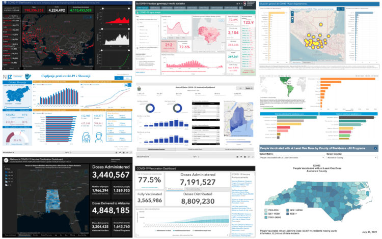
    Researchers evaluated 158 Covid-19 dashboards, assessing design, implementation, and usefulness. Marie Patino for Bloomberg CityLab reports:

    “All of these dashboards were launched very early in the pandemic,” said Damir Ivankovic, a PhD student at the University of Amsterdam. “Some of them were developed literally overnight, or over three sleepless nights in certain countries.” With Ph.D. researcher Erica Barbazza, Ivankovic has been leading a set of studies about Covid-19 dashboards with a network of researchers. For an upcoming paper that’s still unpublished, the pair have talked to more than 30 government dashboard teams across Europe and Asia to better understand their dynamics and the political decisions at stake in their creation.

    In 2020, suddenly governments at all levels required an online dashboard that showed data at least near real-time, but there were constraints with software, design, and data sources, along with people to implement. So groups worked with what they had.

    On the other end, everyone checking these dashboards on the daily were getting their own lessons in interpreting trends, missing data, and variation.

  • Sand mining viewed from above

    September 24, 2021

    Topic

    Infographics  /  mining, Poyang Lake, Reuters, satellite imagery

    Poyang Lake is China’s largest freshwater lake, but sand mining has changed its depth and structure, which messes up the ecosystem. Simon Scarr and Manas Sharma for Reuters used satellite imagery to show the scale and disruption of the mining activities.

    The ships look like little bugs slowly eating away at the coastline.

  • Members Only

    Visualization Tools and Learning Resources, September 2021 Roundup

    September 23, 2021

    Topic

    The Process  /  roundup

    Here’s the good stuff for September.

  • SVG pattern repository

    September 23, 2021

    Topic

    Software  /  patterns, SVG, Thomas Michael Semmler

    For when you want to fill SVG polygons with patterns instead of or in combination with color, Thomas Michael Semmler has a copy-and-paste collection. It’s just the basics, but it’s a convenient reference that could provide a starting point at the least.

  • Americans are dying too much

    September 23, 2021

    Topic

    Statistics  /  Atlantic, Derek Thompson, mortality

    Derek Thompson for The Atlantic highlights recent research comparing mortality in America against rates in Europe:

    According to a new working paper released by the National Bureau of Economic Research, Americans now die earlier than their European counterparts, no matter what age you’re looking at. Compared with Europeans, American babies are more likely to die before they turn 5, American teens are more likely to die before they turn 20, and American adults are more likely to die before they turn 65. At every age, living in the United States carries a higher risk of mortality. This is America’s unsung death penalty, and it adds up. Average life expectancy surged above 80 years old in just about every Western European country in the 2010s, including Portugal, Spain, France, Italy, Germany, the U.K., Denmark, and Switzerland. In the U.S., by contrast, the average life span has never exceeded 79—and now it’s just taken a historic tumble.

    Find the full NBER paper here.

  • How to Make Print-ready Graphics in R, with ggplot2

    You don’t have to use illustration software to polish your graphics. If keeping everything in R is your thing, this tutorial is for you.

  • A flag planted for every Covid-19 death

    September 22, 2021

    Topic

    Data Art  /  coronavirus, flags, physical, Suzanne Brennan Firstenberg

    In fall 2020, Suzanne Brennan Firstenberg planted a flag for each American who died from Covid-19. There were over a quarter of a million flags at the time. The art installation is back at the National Mall, but this time there are over 660,000 flags. The scale is just…a lot.

  • Page 74 of 392
  • <
  • 1
  • ...
  • 71
  • 72
  • 73
  • 74
  • 75
  • 76
  • ...
  • 392
  • >

Analyze, visualize, and communicate data usefully, beyond the defaults.

Become a member →

Recently for Members

May 15, 2025
Step Chart, Enhanced

May 8, 2025
When the data is not what it seems

May 1, 2025
Finding the Right Charts

April 24, 2025
Visualization Tools, Datasets, and Resources – April 2025 Roundup

April 17, 2025
Breaking Out of Chart Software Defaults

Browse by Chart Type See All →

Packed Bubble Chart Pictogram Histogram Stacked Bar Chart Unit Chart Parallel Coordinates Horizon Graph Calendar Bar Chart Race Dot Density Map

Browse By Topic

  • Visualization

    Seeing data

  • Maps

    Seeing geographic data

  • Infographics

    Explaining data

  • Networks

    Connecting data

  • Statistics

    Analyzing data

  • Software

    Working with data

  • Sources

    Getting data

  • Design

    Making data readable

Get the Book

Visualize This: The FlowingData Guide to Design, Visualization, and Statistics

Available now.

Order: Amazon / Bookshop

Made by FlowingData

  • The Process

  • Data Underload

  • Chart Everything

  • Guides

  • Books

  • Shop

  • About
  • Contact
  • Newsletter
  • LinkedIn
  • Instagram
  • Bluesky
  • RSS
Copyright © 2007-Present FlowingData. All rights reserved.