Is the economy going to turn around any time soon? How does this…
Results for amanda cox
-
Is the Economy Getting Ready to Turn Around?
-
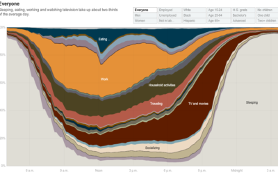
How People in America Spend Their Day
From Shan Carter, Amanda Cox, Kevin Quealy, and Amy Schoenfeld of The New…
-
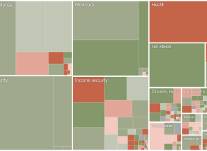
Obama’s Budget Proposal and Incorrect Forecasts
President Obama announced his 2011 budget proposal. How does it compare to last…
-
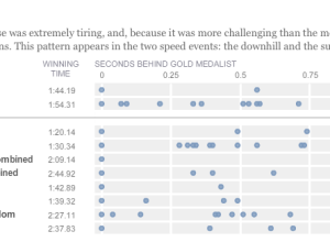
Olympic musical – how fractions of second make all the difference
Like everyone, I’ve been watching the Olympics, and it continues to amaze me…
-
5 Best Data Visualization Projects of the Year – 2009
It was a huge year for data. There’s no denying it. Data is…
-

5 Best Data Visualization Projects of the Year
Data visualization continues to grow online and in the real world. It exists…
Recently for Members
Second Edition
 Visualize This: The FlowingData Guide to Design, Visualization, and Statistics (2nd Edition)
 Visualize This: The FlowingData Guide to Design, Visualization, and Statistics (2nd Edition)
New tools, refined process.
Browse by Chart Type See All →


