So great and well-deserved.
Results for amanda cox
-
Amanda Cox is new editor of The Upshot
-

Voting habits for various demographic groups
Voter turnout and political leanings for various demographic groups play an important role…
-

Working with R at the New York Times
Amanda Cox from the New York Times was on the Data Stories podcast.…
-

10 Best Data Visualization Projects of 2015
These are my picks for the best of 2015. As usual, they could easily appear in a different order on a different day, and there are projects not on the list that were also excellent.
-
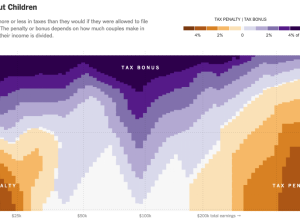
Married couple tax bonuses and penalties
Using calculations by Nick Kasprak from the Center on Budget and Policy Priorities…
-
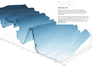
3-D chart for economy’s future
People like to poke fun at 3-D charts, mostly because they don’t work…
-
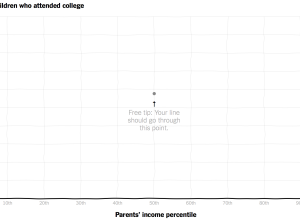
Compare your curve to reality for income versus college attendance
Those who grow up in poorer families are less likely to go to…
-
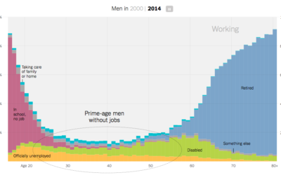
Increasing rates of men who don’t work
Recent data from the Census Bureau suggests the rate of non-working men has…
-
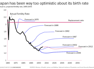
Japan fertility rate forecasts versus reality
It’s hard to predict the future, especially when humans are involved. Oftentimes, there…
-
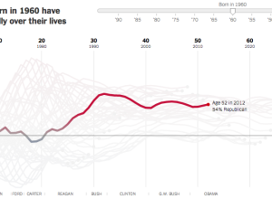
Birth year and political leanings →
A statistical model, from Yair Ghitza of Catalist and Andrew Gelman of Columbia…
-
Views of white Americans
In light of the Donald Sterling brouhaha, Amanda Cox for The Upshot put…
-

The Upshot, a data-centric site from The New York Times launched
We heard a little bit about The Upshot last month. Now we get…
-
Price of Damien Hirst spot paintings →
Damien Hirst is an artist known for a number of works, one of…
-
A bar chart would be better
There’s a strand of the data viz world that argues that everything could…
-
Data and visualization year in review, 2013
Visualization continues to mature and focus more on the data it represents than on novel designs and size. Let’s have a look back.
-
Pope face composite
With Pope Benedict XVI’s resignation, 116 cardinals from various regions have to come…
-
Link
OpenVis Conf →
Still building the speaker list, but Amanda Cox is the keynote speaker, so it should be worth it just to hear her talk.
-
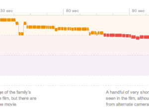
A dissection of movie trailers →
Shan Carter, Amanda Cox, and Mike Bostock for The New York Times, analyzed…
-
Link
Why Amanda Cox should be in charge of audio →
Process for finding the right sound just for a few seconds of audio
-
Link
Interview with Amanda Cox →
Her workflow at NYT
Recently for Members
Second Edition
 Visualize This: The FlowingData Guide to Design, Visualization, and Statistics (2nd Edition)
 Visualize This: The FlowingData Guide to Design, Visualization, and Statistics (2nd Edition)
New tools, refined process.
Browse by Chart Type See All →


