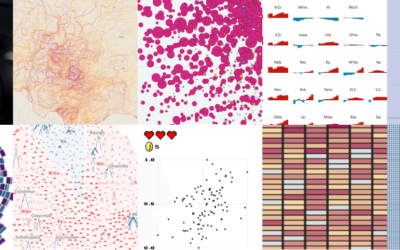
Every month I collect tools and resources to help you make better charts. This is the good stuff for August 2024.
Results for amanda cox
-
Members Only

Visualization Tools and Resources, August 2024 Roundup
-
Members Only

Visually Inefficient
Trading optimized visual efficiency in charts for joy and interest.
-
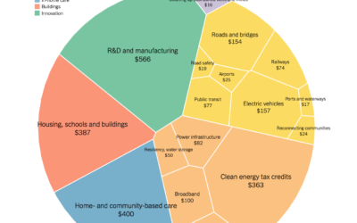
Comparison of Biden infrastructure plan and updated bipartisan plan
Aatish Bhatia and Quoctrung Bui for NYT’s The Upshot made the comparison using…
-
Members Only

A Bar Chart Would Be Worse – The Process 155
Bar charts are the simple answer. Maybe you’re not looking for simple though.
-
Bar Chart Alternatives
Open to access this content…
-
Members Only
Visualization Tools and Learning Resources, April 2021 Roundup
Here’s the good stuff for April 2021.
-
Members Only
The Process 118 – Maybe a Bar Chart Really Would Be Better
As visualization practitioners, we tend to sway towards the novel, but bar charts are still good.
-
Weight gain lines
From Kim Warp for The New Yorker. Ha. Ha. It’s funny because it’s…
-
Amanda Cox promoted to New York Times data editor
Amanda Cox is the new data editor for The New York Times:
As… -
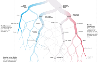
Predicting whether you are Democrat or Republican
The New York Times is in a quizzy mood lately. Must be all…
-
Members Only

Big Money You Can Relate To (The Process #76)
This week, a few projects went up on the internets about money and spending, each with different goals and approaches. In this issue of The Process, we look at each more closely.
-
Members Only
Failure to Communicate (The Process #47)
It’s about purpose. It’s about who your work is for. It’s about what you’re trying to show.
-
Members Only

Visualization Tools, Datasets, and Resources – March 2019 Roundup (The Process #34)
Every month I collect practical resources, new tools, code, and datasets. Here’s the good stuff for March.
-
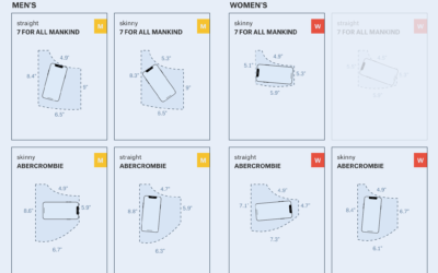
A visual analysis of jean pockets and their lack of practicality
Frustrated with the size of pockets on women’s pants, Jan Diehm and Amber…
-
Members Only

Making Data “Come Alive”, Needs More Cowbell
“How do I make my data come alive? I want it to sing. I want it to dance.” Here are some ways to achieve that.
-
Members Only
Tools I Am Thankful for That Make Data Work Easier
In the spirit of the holidays, here are the tools I am most thankful for. Without them, work would be much more tedious and painful.
-
Members Only
Better than Default
Defaults are generalizations to fit many datasets, which means you usually get barebone charts. For analysis, all well and good. However, data graphics for presentation require more care after the initial output.
-
Members Only

Uses for Animation in Charts and Animating Your Own Data
Important question: Is animation in visualization even worthwhile? Well, it depends. Surprise, surprise. In this issue, I look at animation in data visualization, its uses, and how I like to think about it when I implement moving data.
-

Why People Make Bad Charts (and What to Do When it Happens)
It’s important to consider the reasons so that we don’t overreact. Otherwise, we’re just berating, pointing, and laughing all of the time, and that’s not good for anyone.
-
Best Data Visualization Projects of 2016
Here are my favorites for the year.
Recently for Members
Second Edition
 Visualize This: The FlowingData Guide to Design, Visualization, and Statistics (2nd Edition)
 Visualize This: The FlowingData Guide to Design, Visualization, and Statistics (2nd Edition)
New tools, refined process.
Browse by Chart Type See All →


