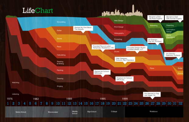
Ben Fogarty uses a stacked area chart to represent his life. To us outsiders looking in it’s not much more than that, but to Ben I am sure there is a story in every peak and valley. It’s like a “this is your life” slideshow in data.
This is the drive behind your.flowingdata. I don’t think YFD is even remotely close yet to developing a personal narrative, but it’s something to shoot for. I can imagine a lifetime of data replaying and watching it unfold like a movie. That’d be amazing. Then again, I might also end up like Jerry in Act 3 of Episode 88 in This American Life. Fingers crossed for the former.
[via WeLoveDataVis]


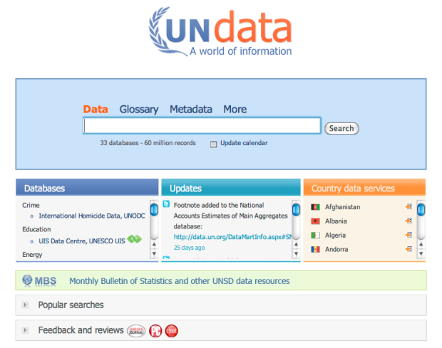

 There’s a lot of data on the Web, but it’s all very scattered. At the same time, there’s a lot of data sitting on people’s hard drives that we don’t have access to. There are various reasons why people don’t share, but mainly, they just don’t see the point.
 Visualize This: The FlowingData Guide to Design, Visualization, and Statistics (2nd Edition)