
Here’s the good stuff for the month.
Here’s the good stuff for the month.
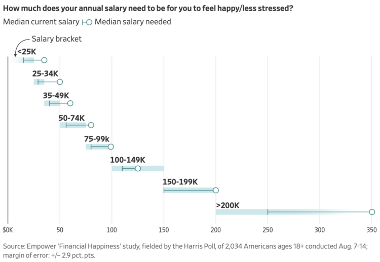
For the Wall Street Journal, Joe Pinsker reports on income and happiness, or more specifically, on the raises people said they needed to be happy. The more people have the more they need.
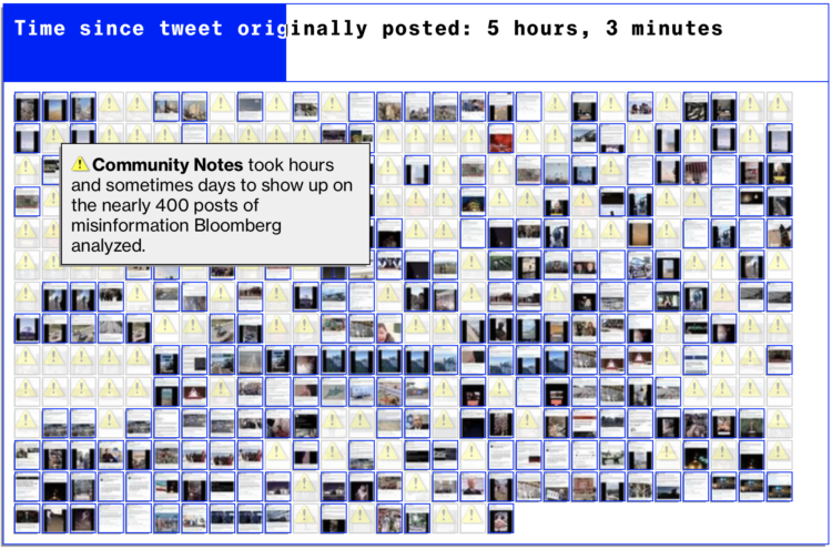
Twitter has a Community Notes feature that attempts to flag posts that contain misinformation. This might work well in theory, and the notes are often informative, but it works slowly and is often not enough to stop the spread of misinformation in a viral tweet. Bloomberg shows the spread through the lens of a single tweet.
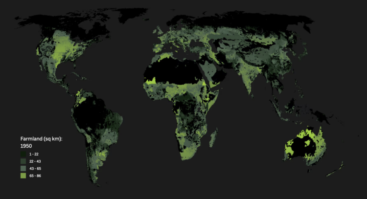
For Associated Press, Christina Larson and Nicky Forster examined the growing population and the land required to feed all the people. A map shows spreading farmland over the centuries and at some point there won’t be enough land to grow food if we continue what we’ve been doing.
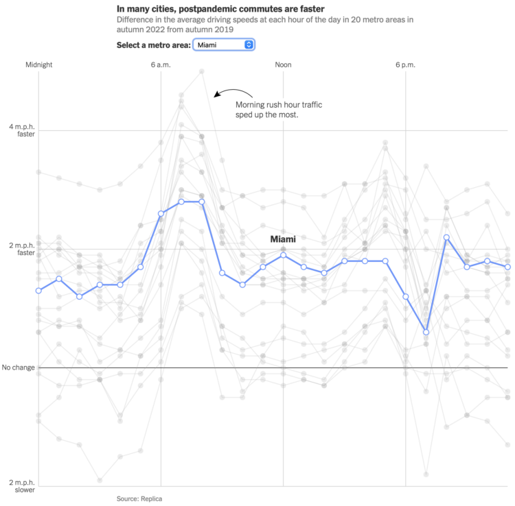
Using GPS data processed by Replica, Lydia DePillis, Emma Goldberg, and Ella Koeze, for The New York Times, show how commutes have changed post-pandemic. The roads in major cities are a little bit less congested and the traffic moves a bit faster.
The line chart above shows average speeds in 2022 relative to 2019. So you can see in most places people driving faster and more so during rush hour.
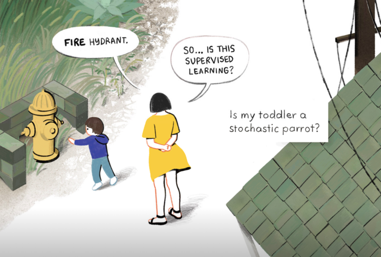
For The New Yorker, Angie Wang draws parallels between toddler learning behavior and training large language models, but more importantly, where they diverge.
They are the least useful, the least creative, and the least likely to pass a bar exam. They fall far below the median human standard
that machines are meant to achieve.They are so much less than a machine, and yet it’s clear to any of us that they’re so much more than a machine.
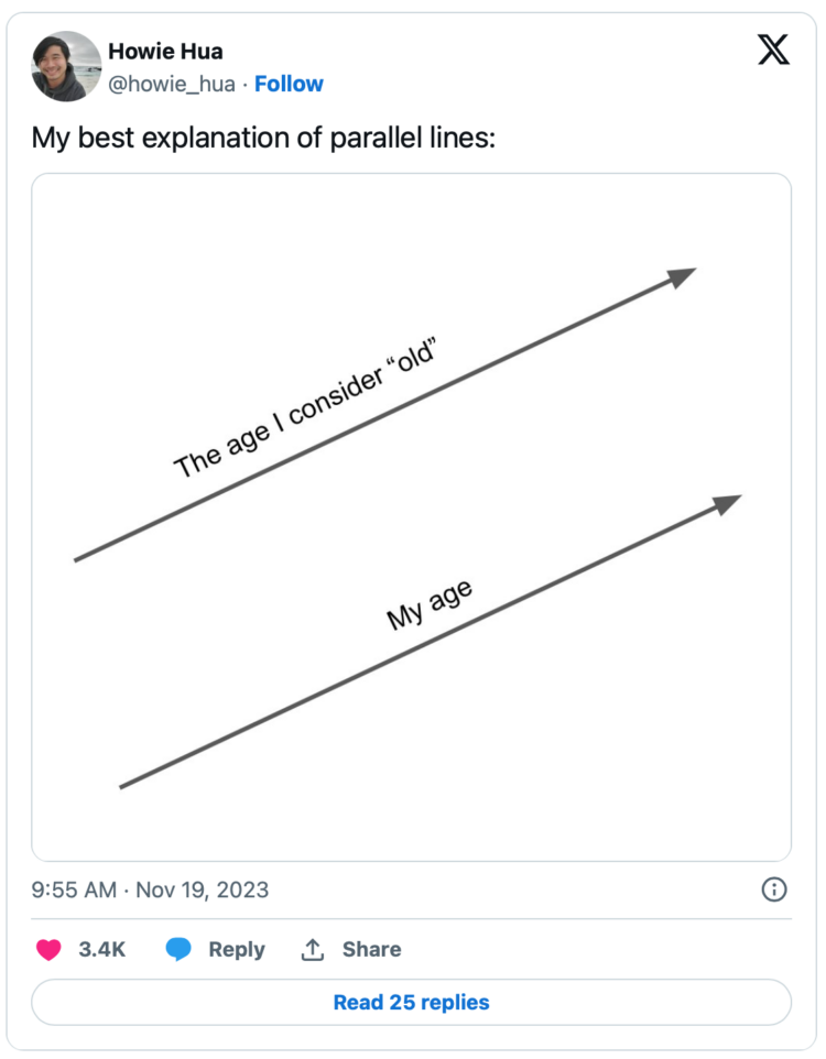
This doesn’t have labeled axes, so I assume it only shows a zoomed in portion of the earlier years. The slope of the top line starts to level out at older ages, because my lines are about to cross.
See also: Closeness lines over time.

Tipping seems to be in a confusing spot right now. On the one hand, customers want to support workers, but on the other, tip suggestions seem to be rising towards uncomfortable rates and in places where people don’t usually tip. Pew Research surveyed 12,000 U.S. adults to see how we’re all feeling about the current state of tipping.
About 15% of working Americans make at least $100,000 of income per year as of the 2021 American Community Survey. As you’d expect, many who fall in that 15% spent more years in school and spend more hours at work.
But you can also earn a six-figure income without working all the time. What about those people? What do they do?
Emma Pierson and Kowe Kadoma, for Fred Hutchinson Cancer Center, have a short and free course on Coursera on practical steps for building fair algorithms:
Algorithms increasingly help make high-stakes decisions in healthcare, criminal justice, hiring, and other important areas. This makes it essential that these algorithms be fair, but recent years have shown the many ways algorithms can have biases by age, gender, nationality, race, and other attributes. This course will teach you ten practical principles for designing fair algorithms. It will emphasize real-world relevance via concrete takeaways from case studies of modern algorithms, including those in criminal justice, healthcare, and large language models like ChatGPT. You will come away with an understanding of the basic rules to follow when trying to design fair algorithms, and assess algorithms for fairness.
It’s geared for beginners and no coding is required.
As more charts shift to smaller screens, we have to find ways to save space but keep the data readable. There are options.
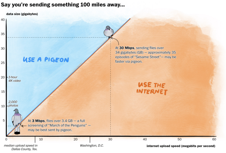
In some rural areas, upload speeds are crawlingly slow, which can make it difficult to send things on the internet. In some cases, a carrier pigeon might even be faster. For The Washington Post, Janice Kai Chen did the math so you know which one to use:
Racing pigeons clock an average of 40 miles per hour and typically race up to 400 miles, roughly from D.C. to Boston, according to the American Racing Pigeon Union. With the boost of a tailwind, pigeons have been recorded going as fast as 110 mph and as far as 1,000 miles.
At certain data volumes and distances, the pigeon is a quicker option for large swaths of rural America, where internet speeds can lag far behind the national average.
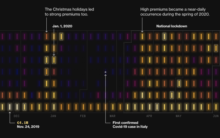
During Covid lockdowns, power companies in Italy charged premiums to cover increased prices for electricity, but it appears that isn’t the full story. For Bloomberg, Vernon Silver, Eric Fan, and Sam Dodge analyzed costs and premiums over time:
Even so, it’s clear – from executives’ celebratory comments during earnings calls as well as simple mathematics – that the dispatch market’s higher prices helped companies do far better than merely avoiding losses. In 2020 alone, dispatch premiums totaled €1.2 billion – or 238% more than companies would have received at the day-ahead price.
It looks like the power costs might partially be an excuse to charge more premiums. Maybe. Either way, I’m into the glowing aesthetic on the calendar heatmaps.

Health insurers reject claims often, and if this happens, you can file an appeal. However, before you file the appeal, it can help to see the records insurers used. ProPublica made a letter generator to make it easier to get these records.
A claim file is a collection of the information your insurer used to decide whether it would pay for your medical treatment or services. Most people in the U.S. facing a denial have the right to request their claim file from their insurer. It can include internal correspondence, recordings of phone calls, case notes, medical records and other relevant information.
Information in your claim file can be critical when appealing denials. Some patients told us they received case notes showing that their insurer’s decision was the outcome of cost-cutting programs. Others have gotten denials overturned by obtaining recordings of phone calls where company staff introduced errors into their cases.

When you look up directions with a mapping application, there are algorithms that run to find the shortest route. Jan Pánek made an interactive map that animates the search with various algorithms. Click the map for an origin and destination, and then watch it play out.

The map sold for $239,000 at a Christie’s auction, but it was misdated and is a couple of centuries older than previously thought:
It’s the fourth oldest surviving portolan chart of Europe, the oldest being the Carta Pisana from the late 13th century, which is held by the national library of France. The asking price now is $7.5 million, another category of collecting altogether and one that will likely remain framed on Clausen’s office wall until a university or museum decides to take ownership of it.
Excuse me while I pivot this site to historical chart collection.

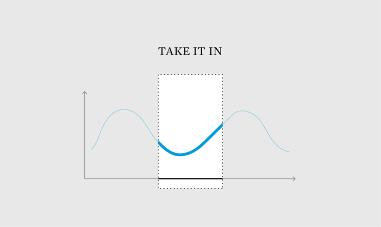
In the land of what-if and what-about, it’s surprisingly easy to get stuck staring at your work, thinking about how your audience will hate it. You have to let it go.

muted.io is a set of visual tools to help you learn music theory. Learn about notes, chords, and scales through a playful and colorful interface.
Google Fonts now provides two open source fonts by Dmitry Ivanov that let you make simplified, small to medium line and bar charts based on data: Linefont and Wavefont. These might come in handy when you want to embed small charts in body text.
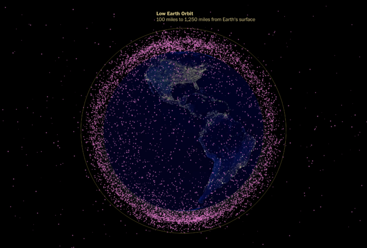
The Washington Post looked at the many satellites orbiting our planet. A globe shows a dot for each satellite, which are mostly there to show that there are a lot. I always appreciate dot transitions.
 Visualize This: The FlowingData Guide to Design, Visualization, and Statistics (2nd Edition)
New tools, refined process.


