• Martin Wattenberg, one of the creators of Many Eyes, in reply to “Why is a numbers guy like you so interested in large textual data sets?”

    The entire literary canon may be smaller than what comes out of particle accelerators or models of the human brain, but the meaning coded into words can’t be measured in bytes. It’s deeply compressed. Twelve words from Voltaire can hold a lifetime of experience.

    Martin Wattenberg = smart guy.

  • A few days ago, FlowingData’s subscriber count shot up to 3,100+ subscribers, moving past the three thousand mark for the first time. I just wanted to take this chance to thank everyone for reading. Thank you. FlowingData wouldn’t be the same without you, and I’m really happy with the community that’s developing around this modest, little blog of mine, or maybe I should say of ours.

    Thank you for reading, thank for commenting, thank you for linking here, and thank you for sending me post ideas. I appreciate it ALL. FlowingData is well on its way to 5,000.

  • BedPost – I put this up earlier for the FlowingData personal visualization project, but for those who missed out, Kevin recently put up a sign up form so that you get a notification for when the grown up activities tracker is ready for public use.

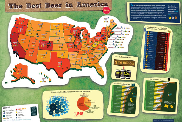
    Bible Belt Got Back – We see fatness by state in this fun map by CalorieLab. The map title says percentage of obese adult population, but I think it really meant percentage of adult population that is obese. [Thanks, tarheelcoxn | via The Daily Dish]

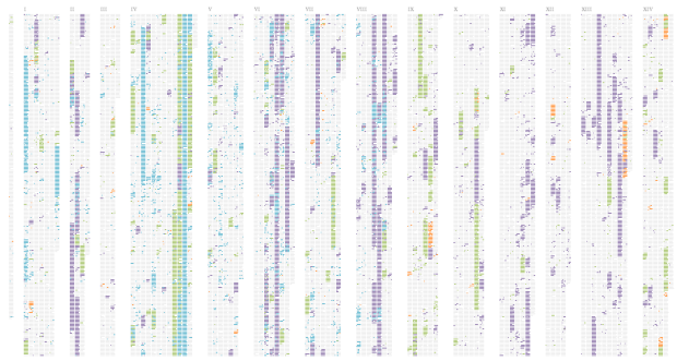
    Movie Color Spectrum – I couldn’t find more details for this, but from what I gather, we see the dominant colors of selected movies that range from rated G to NC-17. Notice a pattern as we start from happy go-lucky movies for children to the uh, more grown up movies? [Thanks, Tim]

    Pew Study on Religion – USA Today uses horizontal stacked bar charts to show results from the Pew Forum on Religion and Publilc Life. What do you think – easy or hard to read? Do all the charts make the data more clear?

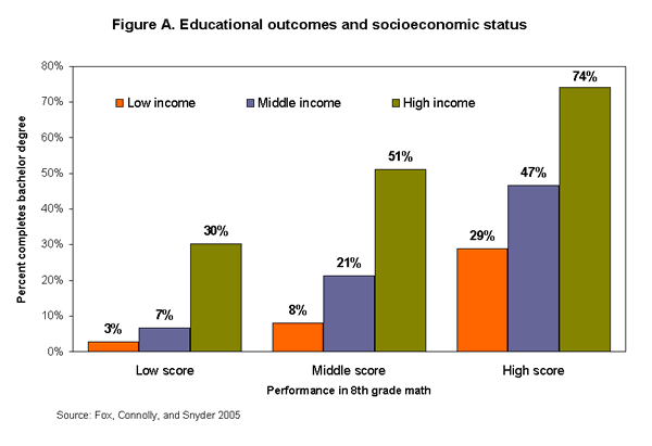
  • I’m on my way back home from the workshop Integrating Computing into the Statistics Curricula in Berkeley (and this time I managed to get through the line without getting yelled at). During one of the labs, there was an assignment called Deconstruct-Reconstruct which was a great way to learn how to improve statistical graphics. Basically, we picked apart (deconstruct) a graphic from Swivel and then created a better version (reconstruct).

    Your Mission, If You Choose to Accept it…

    As I was making my own version, I thought to myself, “I bet FlowingData readers would do really well with this exercise.” Let’s see if I’m right. Can you deconstruct-reconstruct the above graphic? Here are questions worth considering:

    • What is the graphic (trying) to show?
    • Does the graphic achieve its goal?
    • Are there other data that could make the plot more informative?
    • How can we improve the bar chart?

    I’ll put my version a little later…This post will self-destruct in ten seconds…

  • I’m starting to hear about Charles Minard‘s map of Napoleon’s march time and time again – almost to the point of exhaustion. Is the map really that awesome, or is it just because Edward Tufte said so? Here is my question to all of you:

    Is Minard’s map the best statistical graphic ever drawn?

    I have my own thoughts about this, but more importantly, I want to know what you all think. If you don’t think it’s the best ever, what is? If you do think it’s the greatest of all time, what’s second best?

  • I bookmark stuff with del.icio.us almost every day, and it’s become indispensable, because I mark items to write about later here on FlowingData. So it’s always interesting to see new ways to browse my bookmarks and tags. Favthumbs takes a straightforward approach and displays your bookmarks as thumbnails, but the implementation is surprisingly smooth and useful.

    There are two views – grid and carousel. The carousel should remind you of the iTunes cover flow, which has been making the rounds through the Web lately while the grid view provides a resizeable mosaic.

    You can also filter your bookmarks by tag. Very nice. What do you think – useful or no?

  • Radiohead’s most recent music video, House of Cards, was made entirely without cameras. Instead the setup involved a rotating scanner, lasers, and lots of 3D data. The music video is all of that 3D data rendered.

    No cameras or lights were used. Instead two technologies were used to capture 3D images: Geometric Informatics and Velodyne LIDAR. Geometric Informatics scanning systems produce structured light to capture 3D images at close proximity, while a Velodyne Lidar system that uses multiple lasers is used to capture large environments such as landscapes. In this video, 64 lasers rotating and shooting in a 360 degree radius 900 times per minute produced all the exterior scenes.

    Check out the “making of” video for a better explanation that I can provide. I like the part when they talk about distorting the data on purpose because, uh, well that’s something we usually try not to do.

    Here’s the final result. There are some really beautiful scenes where the “camera” pans a landscape and it sorta blows away in a billowy wind like a house of cards.

    [Thanks, Jason]

  • The G-Econ (Geographically-based Economic data) group has worked on making economic data publicly available via Gross Cell Product (GCP). In other words, they’ve collected data for each 1×1 degree latitude by longitude cell on the globe. Above is a cell-by-cell globe mapping world population. Here’s one that shows world rainfall.

    Check out more of these pretty world maps posted to the G-Econ Flickr photo set.


  • Photo by TR4NSLATOR

    As I write this, I’m waiting for my connecting flight to New York on the way to Berkeley for the workshop on Integrating Computing into the Statistics Curricula. I’m taking JetBlue, which I normally only have good things to say about, but right now I’m very displeased with their service. Here’s why I might consider a different airline next time and the design lesson I got out of it.
    Read More

  • With all the new technologies we’ve come to rely on, it’s easy to forget just how much data we’re automatically logging on our own devices or some central server in the boonies.

    GPS is one such example. Some of us can’t imagine going out of town without it. What you might not know is that while that GPS device tells you where to turn left, it is also storing where you go in its memory. Scotland Yard has started using this data to solve crimes:

    Scotland Yard analysis of the [GPS] devices has helped solve dozens of investigations into kidnappings, grooming of children, murder and terrorism. Information about a suspect’s whereabouts at particular times, their journeys and addresses of associates can all be discovered – if they have been using a GPS. The devices retain hundreds of records of locations and routes in their memory.

    So all you criminals out there, make sure you use GPS whenever possible. We all know your actions are a desperate cry for attention.

    [Thanks, Tim]

  • Like what you see? Subscribe to the feed to stay updated on what’s new in data visualization.

    When I saw Toby’s Walmart growth video a while back, I was intrigued by what other time-location data Freebase had. A few commented on how it’d be interesting to map the spread of Starbucks along with Walmart and other businesses. I agreed. So I looked, but as it turns out, there’s not a whole lot of opening dates for business other than Walmart. In fact, about 2/3 of the Walmart locations don’t even have dates. Sigh. Maybe another day. Instead, I used the Walmart data as a learning exercise.
    Read More

  • A little over a week ago, I was in Bremen for the Data Viz VI conference. Read that Data Viz 6 – not Data Viz V.I., as I thought through the first three days.

    I asked, “Is this the first one of these?”

    “What do you mean? This is the sixth one. That’s why it’s called Data Viz SIX.”

    “Ah, ok, I did not get that.”

    Anyways, Adalbert and company put together an excellent conference, and I’m glad I was lucky enough to attend. It was the absolute best statistical conference I’ve ever been to. That’s saying a lot, because it’s the only statistical conference I’ve ever been to. But seriously, it was a good conference.

    Looking Backward, Looking Forward

    Michael Friendly opened up with the almost obligatory talk on the history of statistical graphics and where the field is headed. Anyone who’s opened up a Tufte book will have seen a lot of the examples he’s used (e.g. Napoleon’s march and John Snow’s map), but the history behind some of the graphics was interesting. Sometimes statistical graphics tend to lose that back story and becomes all about the values, so it’s always nice to hear the human part of datasets.

    Visual Analytics Tools for Analysis of Movement Data

    My ears perked up when I saw “analysis of movement of data” in Gennady Andrienko’s talk. I work with a lot of GPS data. I was reminded of the many ways to split up spatio-temporal data – by geographic section, by chunks of time, etc. It’s easy to get caught up in the literal GPS traces on the map, so the talk was a good reminder. I do, however, wish Andrienko used more dynamic examples and branched out from Google Maps as the primary mapping tool. This was probably because his work is more computation-heavy than focused on interaction. Because of that, I was left wanting more than I got.

    GGobi for Exploratory Data Analysis

    I had the chance to chat a bit with the group behind GGobi, an exploratory tool that lets you “tour” multidimensional data via different projections. (That is one nice group of people, let me tell you.) Off the top of my head, there were four separate talks from the group, showing the various applications GGobi can be applied to. It’s kind of hard to explain in brief, so I’d encourage you to check out the free software from the GGobi site. If anything, it’s fun to see your data move ala John Tukey.

    Parallel Coordinates – Good or Bad?

    Al Inselberg promoted parallel coordinate plots (PCP) as the ultimate of statistical graphics. I got the sense that not everyone feels the same way. I remember during my second quarter as a graduate student, I proposed PCPs for a project. I was quickly rebuffed with a no way, those are horrible, and I simply moved on. After getting a personal demo from Inselberg though, I might have to take another look. Although, PCPs are certainly no panacea.

    Collaboration Wanted

    Still, my main take away from Data Viz VI was the need for collaboration between design, computer science, and statistics. As we’ve seen on FlowingData, there’s a lot of great visualization coming from all three camps, but I wish there were more collaboration between all. As Di pointed out, this can sometimes be difficult because statisticians need certain tools (i.e. R) to be tightly coupled with whatever visualization they’re developing. But outside the pure analytical tool, I see a sweet spot at the epicenter of statistics, design, and computer science, which is certainly something to get excited about.

  • For those who want more out of the commonly-used mapping APIs from Google, Yahoo, Microsoft, etc, but don’t want to get too heavy on the programming, Mapstraction is for you. Mapstraction is a javascript mapping abstraction library that lets you easily use different mapping APIs all at once (or switch between them).

    This means you can use functionality from one API and apply it to another, or you can just put a whole bunch of synced maps on one page like above. Other features include geocoding, polylines, marker filters, and GeoRSS and KML, so go for it. Go map crazy.

    [via ReadWriteWeb]

  • The New York Times shows how presidential candidates have spent more than $900 million so far with this bubbly graphic by Lee Byron, Hannah Fairfield and Griff Palmer. The area of a circle represents the amount of money spent in any particular category. For example, the biggest chunk of funds ($337 million) was spent on media and consulting.

    I know what a lot of you are thinking and are maybe even about to write something in the comments – “Bubbles suck at showing amount. Bars are much easier to read.” Some might even be thinking about a pie chart in lieu of the bibbly bobbilies. Here’s what I have to say: the bubbles are fun, so mission accomplished. That is all.

  • The Girl Effect – “the idea that adolescent girls are uniquely capable of raising the standard of living in the developing world” – is portrayed in this beautiful video using animated typography. I think the music plays a pretty big role in making this work too.
    Read More

  • It’s July 4th weekend which means lots of burgers and hot dogs across America. It also means it’s time for Nathan’s annual hot dog eating contest on Coney Island. From 2001 through 2006, 144-pound Takeru Kobayashi dominated the competition, but last year Joey Chestnut brought the crown back to the states with 66 hot dogs and buns (HDBs) in 12 minutes. Who will take the crown this year? Will Kobayashi reclaim the title or will Chestnut keep it in America? Oh the suspense.

    Take a look at the history of the event – dating all the way back to 1916.

  • Earlier this month, I announced FlowingData’s summer project for personal data visualization. It’s been a lot of fun seeing what all of you have sent in; it’s like tidbits out of your lives that you’ve decided to share with me. Really fun. Thank you everyone who’s sent stuff so far.

    A Few More Details

    For those who haven’t put in your entry yet, the deadline is September 1, 2008, so you’ve still got time. For those who already sent me something, remember, you can send me as many as you like. There’s a $40 Amazon gift certificate at stake here – plus personal introspection and a new understanding of your behaviors and patterns.

    Your entry can be pictures, graphs, pencil sketches, Illustrator sketches, Flash or Processing projects, or whatever you like. The only real requirement is that it’s about you or what’s happening around you. I eagerly await your flowing data. Email me your entries with “summer project” in the subject line.

    Recent Reader Entries

    For some inspiration, here’s a subset of the several recent reader entries that I’ve enjoyed so far.

    Tim has been keeping track of his aches and pains:

    Stacy and Joel recently had a get together (which sounded like a lot of fun), and everyone drew their connections to the others at the party:

    Kevin sent a snapshot of his profile from his in-development web application, BedPost. He’s keeping track of um, well, you can just read it:

  • In the time that it takes you to watch this movie, the US government will have spent $500,000 towards the war in Iraq. At least that’s what this Atari-sounding clip says. Watch as millions of dollars are put into perspective – 84 brand new schools, a flag pin for every man, woman, and child in America, and a hummer plus 10 years of gas.
    Read More

  • The colmeia group recently installed their Caffeine Viewer project where they hacked their coffee maker to log their “insane coffee consumption” in real-time. Every time a person presses a button on the coffee maker data are logged, but there’s a slight twist – the data are available to everyone via the caffeinated API. That’s some serious self-surveillance. There are also a few visualizations, but mainly, they invite others to create their own.
    Read More