• Membership
  • Books
  • Projects
  • Learning
  • About
  • Member Login
  • Twitter data buffet is back in business

    April 28, 2010

    Topic

    Data Sources

    Almost a year and a half ago, Infochimps, the data repository slash marketplace, released a giant scrape of Twitter data representing 2.7 million users, 10 million tweets, and 58 million connections. Twitter soon requested that they take it down while they figured out how they wanted to handle licensing, privacy, etc.

    That was in 2008, before Twitter really started booming. Fast forward to now. Twitter and Infochimps have figured out what they want to do, and the Twitter census data is back up. It’s no longer a measly 2.7 million users anymore though. The population has grown to 35 million.
    Read More

  • Review: indiemapper makes thematic mapping easy

    April 28, 2010

    Topic

    Maps, Reviews, Software

    It’s finally here. Indiemapper brings easy and flexible thematic mapping online. I’ve been looking forward to this app ever since I got a glimpse of what was to come over a year ago, through the eyes of Indieprojector. The guys at Axis Maps have taken the core functionality of advanced GIS, simplified the work flow with a well-designed interface, and made it it super easy to create beautiful maps.
    Read More

  • Discuss: Powerpoint is the enemy?

    April 27, 2010

    Topic

    Discussion, Misc. Visualization

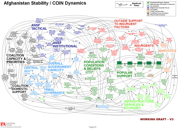
    In reference to the above, Gen. Stanley A. McChrystal, leader of the American and NATO forces in Afghanistan, joked during a meeting, “When we understand that slide, we’ll have won the war.” The rest of the NYT article goes on to describe the suck that is Powerpoint.

    Is Powerpoint really that bad though? I know we like to poke fun sometimes, but is it a limitation of the software, or is it users’ lack of design skills? I mean there’s a site dedicated to beautiful slide decks. Browse through those, and you start to think maybe it’s the latter.

    So we have a chicken-and-the-egg problem. Do people just not know how to use Powerpoint or does Powerpoint push people to the bad side? Sound off in the comments below.

    [Thanks, Julia]

  • Tax brackets over the past century

    April 27, 2010

    Topic

    Statistical Visualization  /  Stephen Von Worley, taxes

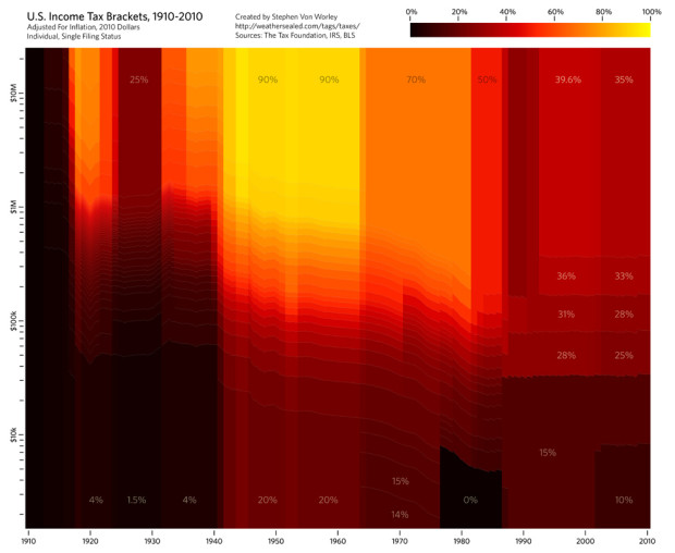
    Stephen Von Worley’s Weather Sealed is one of my new favorites. In his most recent graphic, income tax brackets for individuals are displayed.
    Read More

  • Air traffic rebooted in northern Europe

    April 26, 2010

    Topic

    Maps

    Air traffic has returned to normal levels in northern Europe, and planes fill up the sky once again. Ito world, who has been doing some great stuff lately, visualizes the reboot of air traffic. We start to see some planes on April 18, and by April 20, everything is back to normal.

    There are some holes in the data over France and the Atlantic but you get the idea.

    [Thanks, Hal]

  • Conversational Twitter threads visualized

    April 26, 2010

    Topic

    Network Visualization

    Add another piece to the ever-growing list of Twitter visualizations. What makes Moritz Stefaner’s Revisit different is that it focuses on the conversational threads between Twitter users over time. Tweets (symbolized by authors’ avatars) are stacked vertically and organized by time horizontally. Tweets that have more attention via @mentions are closer to the middle.
    Read More

  • Data Underload

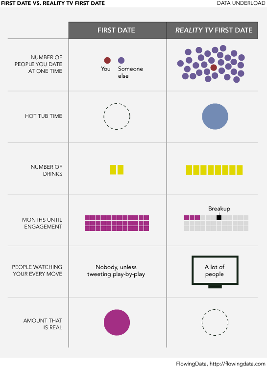
    Data Underload #19: First Date vs. Reality TV First Date

    Want more? Catch other Data Underloads.…

    Read More
  • Trustworthiness of beards

    April 23, 2010

    Topic

    Infographics  /  beards, humor

    Matt McInerney of pixelspread describes the trustworthiness of the people behind their facial hair. You better be careful when I’m around. I’m questionable, border-line unsavory. Don’t worry though. I’m not a werewolf – and I don’t have the ability to grow a Hitler. How trustworthy are you?

    See the full version here. [Thanks, @b_beesley]

  • R is an ‘epic fail’ – or how to make statisticians mad

    April 22, 2010

    Topic

    Software, Statistics

    Statisticians are mad and out for blood. Someone called R an epic fail and said it wasn’t the next big thing.

    I know that R is free and I am actually a Unix fan and think Open Source software is a great idea. However, for me personally and for most users, both individual and organizational, the much greater cost of software is the time it takes to install it, maintain it, learn it and document it. On that, R is an epic fail. It does NOT fit with the way the vast majority of people in the world use computers. The vast majority of people are NOT programmers. They are used to looking at things and clicking on things.

    How dare she, right? Here’s the thing. She’s right. Wait, wait, hear me out. For the general audience – the people who use Excel as their analysis tool – R is not for them. In this case, the one that appeals to non-statistician analysts, R, as they say, is an epic fail (and that is the last time I will say that stupid phrase).

    However, R wasn’t designed to enable everyday users to dig into data. It was designed to enable statisticians with computing power. It’s a statistical computing language largely based on S, which was developed in the 1970s by the super smart John Chambers of Bell Labs. The 1970s. Weren’t people using slide rules still? Or maybe it was the abacus. Can’t remember. Oh wait, I wasn’t born yet. In any case, there’s really no need to get into the whole R-for-general-audience conversation — just like we don’t need to talk about why The SpongeBob SquarePants Movie lacked emotional depth.
    Read More

  • A guide to geostatistical mapping with open-source tools

    April 22, 2010

    Topic

    Maps, Software

    Mapping with R and other free and open-source programs feels clunky and hacked-together at times. The plus-side is that it’s all for free, and once you find the time to wrap your head around it, you can get quite a bit done. Tomislav Hengl provides a free e-book, A Practical Guide to Geostatistical Mapping, that can hopefully help you with such tools (namely R, SAGA GIS, and Google Earth). You can also buy the paperback version on Lulu.

    [Thanks, Ryan]

  • Local neighborhood infographics

    April 21, 2010

    Topic

    Infographics

    Good Mag put on an infographic contest not too long ago that asked people to design around the idea of neighborhood. Any neighborhood would do, just as long the focus was on local. As you might expect, most of the entries were more design than data, but hey, that doesn’t mean they’re not worth looking at.
    Read More

  • A flowchart to decide what typeface to use

    April 21, 2010

    Topic

    Infographics  /  flowchart

    A typeface can make or break your graphic. Use Comic Sans, and no one will take you seriously ever again. Luckily, graphic designer Julian Hansen put together this flowchart for a school project to help you figure out what typeface to use. Most of you will probably be interested in the infographic branch.
    Read More

  • World data released ‘is a dream come true’

    April 20, 2010

    Topic

    Data Sources

    In another step towards open data and all that jazz, the World Bank released World Development Indicators 2010 today, which is meant to serve as a progress report of the world.

    The WDI provides a valuable statistical picture of the world and how far we’ve come in advancing development,” said Justin Yifu Lin, the World Bank’s Chief Economist and the Senior Vice President for Development Economics. “Making this comprehensive data free for all is a dream come true.

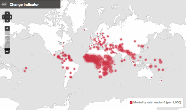
    More importantly though, this comes with the launch of the freely available online database and public API to 1,000+ indicators. There used to be a big fee for this data. I can’t speak for the API, but the website is well-designed. It has profile pages for each country, links to download the indicators in Excel and XML, and hey, are those graphs implemented in HTML5? I spy <canvas> tags.
    Read More

  • Clothing color palette

    April 20, 2010

    Topic

    Data Art, Self-surveillance

    Jacobo Zanella makes a color palette every day, based on the clothes he’s wearing.

    I observe the colors of the shoes and clothes I wear that day, how much skin is exposed, etc., and reproduce that observation digitally, through RGB combinations. No software or programming is involved in the making of the graphs.

    String them all together, and you’ve got multi-colors on top (shirts), a lot of black and blue towards the bottom (pants), and whites and grays all the way on the bottom (shoes).

    Too bad he’s not logging it programmatically. That could be an interesting view (well, for him).

  • Cartographies of Time: A History of the Timeline

    April 19, 2010

    Topic

    Infographics

    I don’t often give in to impulse buys, but I just ordered Cartographies of Time, and I’m pretty sure it’s going to be well worth the thirty bucks.
    Read More

  • Gay marriage timeline

    April 19, 2010

    Topic

    Maps

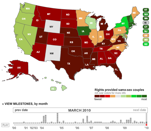
    The Los Angeles Times reports on the chronology of gay rights in the United States. States are colored from fewest to most rights for same-sex couples. “Fewest” means the state bans marriage and legal rights. “Most” means gay marriage is legal in the state. Press play, and watch the changes from 2000 to present. Just disregard the clashing red and green color choices.

  • Data Underload  /  sleep

    Data Underload #18 – Sleep Schedule

    According to WebMD, for 1- to 4-week-olds: “Since newborns do not yet have…

    Read More
  • The Ash Cloud and Airport Shutdowns

    April 17, 2010

    Topic

    Maps  /  homeviz

    In case you’re following the craziness going on over Europe due to that pesky volcano in Iceland, The New York Times provides a tracker for airport closures. The train stations must be packed more than ever before right now.
    Read More

  • FlowingData is brought to you by…

    April 16, 2010

    Topic

    Sponsors

    A big thank you to FlowingData sponsors who help keep the lights on here. As you might have noticed, I’ve been trying something new in the sidebar, and I was lucky enough to have these great groups come along for the ride.

    Check out what they have to offer. They make it easier for you to understand your data.

    InstantAtlas – Enables information analysts and researchers to create highly-interactive online reporting solutions that combine statistics and map data to improve data visualization, enhance communication, and engage people in more informed decision making.

    Tableau Software – Combines data exploration and visual analytics in an easy-to-use data analysis tool you can quickly master. It makes data analysis easy and fun. Customers are working 5 to 20 times faster using Tableau.

  • Friday, I’m in love…

    April 16, 2010

    Topic

    Miscellaneous

    Shirt available on Threadless. I seriously need some infographic tees. Too bad the shirt project isn’t still going on. Suggestions, anyone? [via @alternatekev]

  • Page 345 of 393
  • <
  • 1
  • ...
  • 342
  • 343
  • 344
  • 345
  • 346
  • 347
  • ...
  • 393
  • >

Analyze, visualize, and communicate data usefully, beyond the defaults.

Become a member →

Recently for Members

June 5, 2025
Caring Data

May 29, 2025
Visualization Tools and Resources, May 2025 Roundup

May 22, 2025
Conflicting points of view over the same data

May 15, 2025
Step Chart, Enhanced

May 8, 2025
When the data is not what it seems

Second Edition

Visualize This: The FlowingData Guide to Design, Visualization, and Statistics (2nd Edition)

New tools, refined process.

Order: Amazon / Bookshop

Browse by Chart Type See All →

Scatter Plot Word Cloud Streamgraph Radar Chart Pictogram Horizon Graph Baseline Chart Pyramid Chart Density Plot Small Multiples

Browse By Topic

  • Visualization

    Seeing data

  • Maps

    Seeing geographic data

  • Infographics

    Explaining data

  • Networks

    Connecting data

  • Statistics

    Analyzing data

  • Software

    Working with data

  • Sources

    Getting data

  • Design

    Making data readable

Made by FlowingData

  • The Process

  • Data Underload

  • Chart Everything

  • Guides

  • Books

  • Shop

  • About
  • Contact
  • Newsletter
  • LinkedIn
  • Instagram
  • Bluesky
  • RSS
Copyright © 2007-Present FlowingData. All rights reserved.