• Listening to music is overrated.

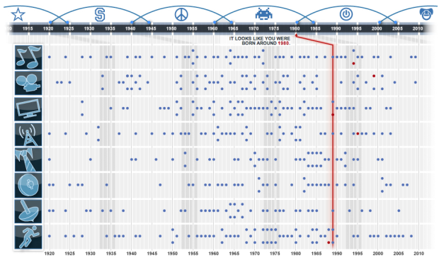
  • your.flowingdata got a couple of cool updates recently. One is based on your interactions with others on Twitter and the other helps you find relationships in your actions.

    Twitter Mentionmap

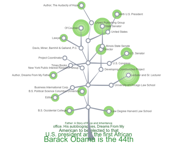
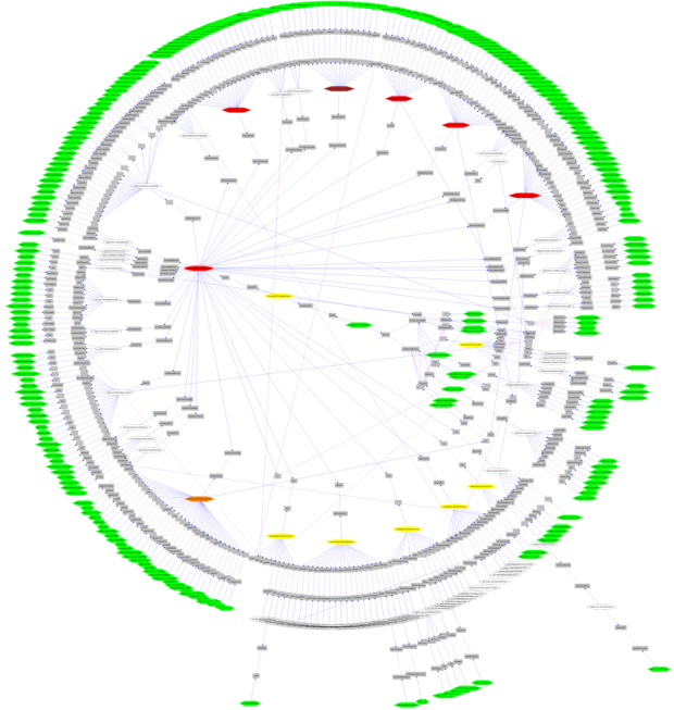
    The first is the Twitter Mentionmap created by Daniel McLaren. It’s a network visualization (above) that lets you explore how you (or other Twitter users) interact with others.

    It’s not focused on the data that many of you are used to seeing on YFD, but it’s always been my plan to bring in other data sources. So when I saw Daniel post the original Mentionmap, I jumped at the chance to get a version for YFD. It seemed like a good first step to branching out. Get it? Network, branching out. Oh nevermind.

    By the way, Daniel used his constellation framework to build this. It’s called asterisq. It’s worth a look if you’re looking to visualize network data. Daniel can also help you with customization and design.
    Read More

  • I bet you wake up every morning wishing, “I wish there was an easier way to decide what cereal to eat! There’s so so many choices that I get a headache just thinking about it.” Well say goodbye to headaches. You wish is now reality. From Eating the Road is this flowchart to help you figure out life’s greatest challenge: what cereal to eat.

  • The end of 2009 is looming, and it’s about time to make this year’s picks for best visualizations. I was sifting through the archives the other day. The selection is going to be tough. I need your help.

    What was the best visualization of 2009?

    It can be something I’ve posted or not; it can be serious or humorous; interactive or for print; art or analytical; map or chart. To jog your memory, here is some of the visualization stuff we’ve seen this year, and here are my picks for last year for reference.

    So what do you think?

  • What if you could see all the individual bits of information scattered across the Web in one view and then interact with it in a meaningful way? This is what Microsoft Live Labs’ new Pivot experiment tries to do.

    Pivot makes it easier to interact with massive amounts of data in ways that are powerful, informative, and fun. We tried to step back and design an interaction model that accommodates the complexity and scale of information rather than the traditional structure of the Web.

    The goal is to let users make connections between pages, data points, photos, etc that go beyond links, with what the developers call collections. The below video is a demonstration and explanation:

    Pivot’s ability to display lots of thumbnails and then reorganize and zoom in on them is the tool’s foundation. The transition between each view involves a flutter of thumbnails, which sort of provides a link between data arrangements. The browsing behavior looks a lot like that of Photosynth, a Live Labs project that lets you browse giant bundles of photos.

    Jeffrey Heer et. al. wrote a paper on these transitions a while back. I can’t really say whether it works or not. I suspect it’s more about a fun factor once you get into higher volumes of data than it is about making connections. That’s not to say it’s not important, of course. After all, most of the Web is about entertainment in some form or another.

    All in all, it’s an interesting concept, and it will be fun to see where the Live Labs team takes the project.

    Pivot is currently by invitation only, but I have a handful of invites (10 to be exact) for you guys. Download Pivot from here, and then use this activation code: 3C5D 19BD B7DA 3186. Come back here and let us know what you think in the comments.

    [Thanks, Jeff]

  • You’ve seen the NameExplorer from the Baby Name Wizard by Martin Wattenberg. It’s…

  • Nebul.us is an online application, currently in private beta, that aggregates and visualizes your online activity. Enter your information for Twitter, Facebook, Flickr, etc and install a plugin in Firefox to record your browsing behavior. Get something that looks like the above, sort of a donut-polar area chart hybrid. Nebul.us calls it a cloud.
    Read More

  • The gift-giving season is here, and you’re probably wondering what to get everybody. You can only give so many neck ties, and you gave gift cards to Best Buy last year. So here’s some help. Here are some gifts that will rock the socks off any data geek.

    FlowingPrints – Obviously an excellent choice. I’m a little biased, yes, but still great :). Use the code gimme50off to get 50% when you buy two prints or more. Deal ends this Friday.

    The Visual Miscellaneum – This book covers a wide variety of topics with lots of pretty infographics. Read my glowing review.

    Data Flow: Visualizing Information in Graphic Design – More design-focused than the above with many many examples from various visualization people and designers. Read my review here.

    The Visual Display of Quantitative Information – It’s Edward Tufte’s first book. Always a crowd-pleaser.

    Beautiful Data: The Stories Behind Elegant Data Solutions – Exactly what the title says. It’s a collection of essays from experts in the data arena, except for the first chapter. That was written by some lamebrain.

    Processing: A Programming Handbook for Visual Designers and Artists – Maybe your data geek is just getting into visualization. Processing is a great place to start, and this book provides plenty of guidance.

    WallStats – The most recent 2010 infographic poster for where you tax dollars go. Get 50% off two or more posters when you use the code flowingdata.

    Ambient Devices – Get all data all the time with these devices. The orb is my favorite.

    Got any more data gift ideas? Let us know in the comments.

    Visit datavisualization.ch for more ideas on how you can surprise your data fiend this season.

  • It was World AIDS Day last week and UNAIDS published the latest estimates on the number of people around the world who are living with HIV. Xaquin G.V. provides four cartograms (i.e. value-aread maps) to show the numbers. In the final result (above) each square represents 10,000 people with HIV, and regions are color-coded by percentage of people with the virus.
    Read More

  • This, by Mike Arauz, is just too funny not to post. Sorry, Tiger.

    [Buzzfeed via WeLoveDataVis]

  • As we all know, David McCandless of Information is Beautiful, launched his new book The Visual Miscellaneum. You can read my review here.

    David was kind enough to provide a handful of copies to all of you. How to enter? Just leave a comment at the bottom of this post, and then come back on Monday to see if you’re a winner. If leaving a comment isn’t your thing, because it’s just too crazy hard, you can buy it here. It’s well worth it, and would also make an excellent gift.

    Good luck!
    Read More

  • David McCandless, author of The Visual MIscellaneum, delves into the usefulness of the H1N1 (swine flu) vaccine. There was quite a bit of research involved, as there’s a crud load of material about H1N1 (naturally).

    My wife’s an ER doc, and she says it’s not that big of a deal, seeing as way more people die from the flu, but here’s full graphic. You can decide for yourself.

  • Statistical graphics are often… kind of bland. But that’s fine, because they’re usually for analysis, and the wireframe does just fine. The time eventually comes though when you need to present your analytical visualization in a paper or some slides, and you’re no longer the primary reader.

    In their NYT op-ed on health care calculations, Andrew Gelman, Nate Silver, and Daniel Lee had some graphics of their own that needed some NYT flavor and design treatment.
    Read More

  • How has consumer spending changed over the past 25 years? Do we spend more on some things and spend less on other than we did in the early 80s? In this interactive, based on data from the Bureau of Labor Statistics, you can explore just that.
    Read More

  • November was another good month. We passed the 25k-subscriber mark for the first time, which to be honest, kind of freaks me out when I think about it, but at the same time it’s of course really cool.

    Thanks all for spreading the word, and continuing to tweet, email, and bookmark. A big thanks to those who leave comments on FlowingData too. Your contribution makes this place that much better.

    In case you missed them, here are the top posts from November based on a combination of pageviews, comments, and links.
    Read More

  • There’s this branch in computer science and statistics for vision research. Normally, if you ever hear about it in the news it’s in the context of spotting terrorists in security tapes or facial recognition checkpoints (you know, like what they have in movies in front of giant steel doors). That is of course not the only application.

    Google (and many others) has been playing around with this stuff for a while. Most recently, they released Google Image Swirl in their labs section, which utilizes computer vision to find similar images.

    Above is my search for happy cat. The initial search result is what you’re used to. It’s a matrix of thumbnails. Click on one of them, and you’ll get similar images clustered as a network graph.

    Google Image Swirl: the new way to find if someone is plagiarizing your work.

    [via information aesthetics]

  • I’m no doubt still under massive food coma at this time, but in case you’ve regained consciousness or don’t live in the US, check out this collection of maps from The Morning News. Can you guess what each is supposed to show? If you can guess even one of them correctly, I’ll be impressed.

    [Thanks, William]

  • Straight to the point. It’s Black Friday. Here’s the deal. Get 1 print for the price of 3. No wait, switch that. Get 3 prints for the price of 1 when you buy the series.

    Use this code to take advantage: bfridayfps20

    This deal ends on Sunday. Get some prints for yourself or as a gift to your data geek friend or dog today.

    Remember: your order will help more prints go to local education.

    What is FlowingPrints?

    For those new to FlowingData, FlowingPrints is a pet project of mine to put data, well, in print. For this first series, I collaborated with two designers to create three original views of education in America – through data. Check ’em out now. They’ll make your walls ridiculously smart.

  • Food-wise, Thanksgiving is different across the country. In some places you’re going to get a lot of chitterlings and collard greens, while in others, turkey and mashed potatoes. Personally, I’m a big fan of the 10-course Chinese feast, but to each his own.

    The New York Times (Matthew Ericson and Amanda Cox), map what’s cooking in your neck of the woods based on searches on Allrecipes. The top search, concentrated in the southeast, was sweet potato casserole. I have no idea what that is, but it must be delicious.
    Read More