As the 2024 Summer Olympics wrap up, medal trackers will fade from homepages for a couple years. You’ve probably seen a list or five by now where each row represents a country and four columns show the counts for gold, silver, bronze, and the country’s total. It’s a straightforward view that shows what most people are looking for.
However, I like the wrinkles that add a little something to the counts. The premise is that countries can rank differently based on criteria other than total medals, which highlights smaller countries or maybe just gives you a way to toot your own country’s horn.
Bloomberg’s table, shown above, lets you sort by each medal, but also per million population and $100 billion GDP. For example, Grenada, Dominica, and Saint Lucia bubble to the top when you consider their small populations.
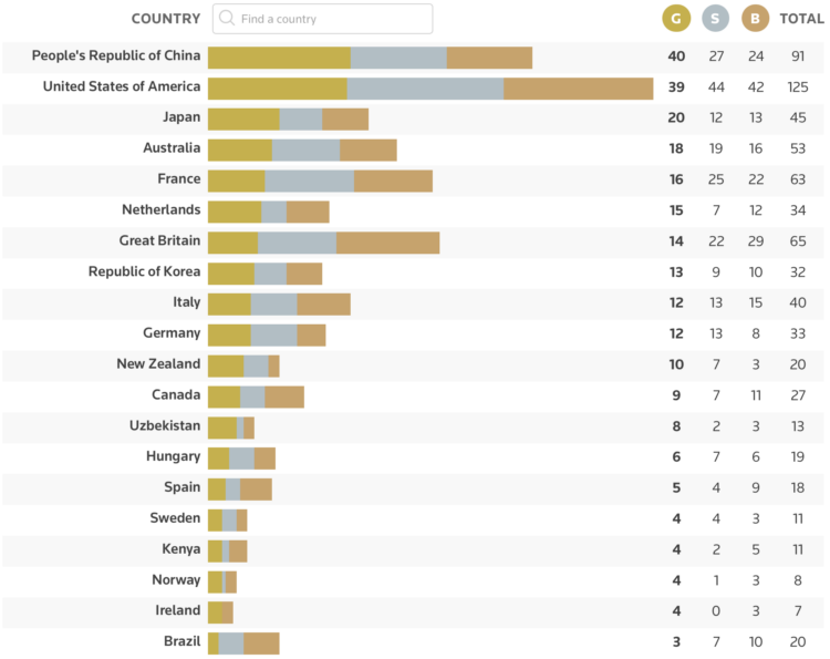
Reuters sorts by total gold medals alongside stacked bars to show the relative distributions:
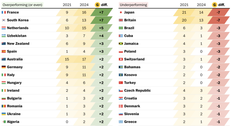
The Washington Post provides a few angles on the same page. There’s a table you can toggle to sort by total or gold medals only, which looks as you’d expect. I like the comparison against the Tokyo Olympics to see if there was an improvement this year. They call it over- and under-performance, but I think I’d just say better or worse than last time.
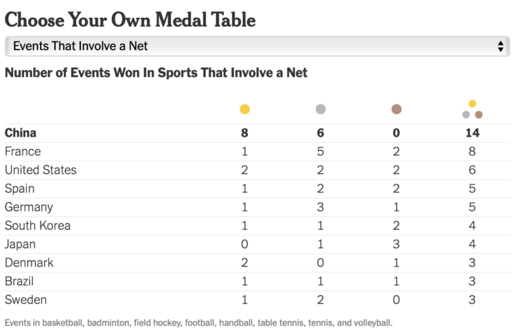
My favorite view is still this Josh Katz classic for NYT’s Upshot, which they’ve updated each Olympics since 2018. Apply the importance of each medal yourself and create your own rankings. I suspect the heatmaps might go over the head of a healthy proportion of readers, but I’m glad they bring it back.
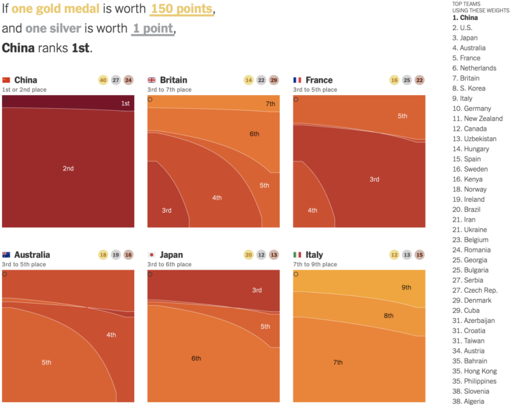
Update: The Upshot also made a list with a dropdown to order countries 23 different ways, in case you can’t decide how to judge who won the Olympics.


 Visualize This: The FlowingData Guide to Design, Visualization, and Statistics (2nd Edition)


