
Mike Bostock visualizes mobile patent lawsuits, improving on a graphic from Thomson Reuters that wasn’t so good. Dashed lines are resolved suits and green ones are licenses to the company.
Read More
Mike Bostock visualizes mobile patent lawsuits, improving on a graphic from Thomson Reuters that wasn’t so good. Dashed lines are resolved suits and green ones are licenses to the company.
Read More
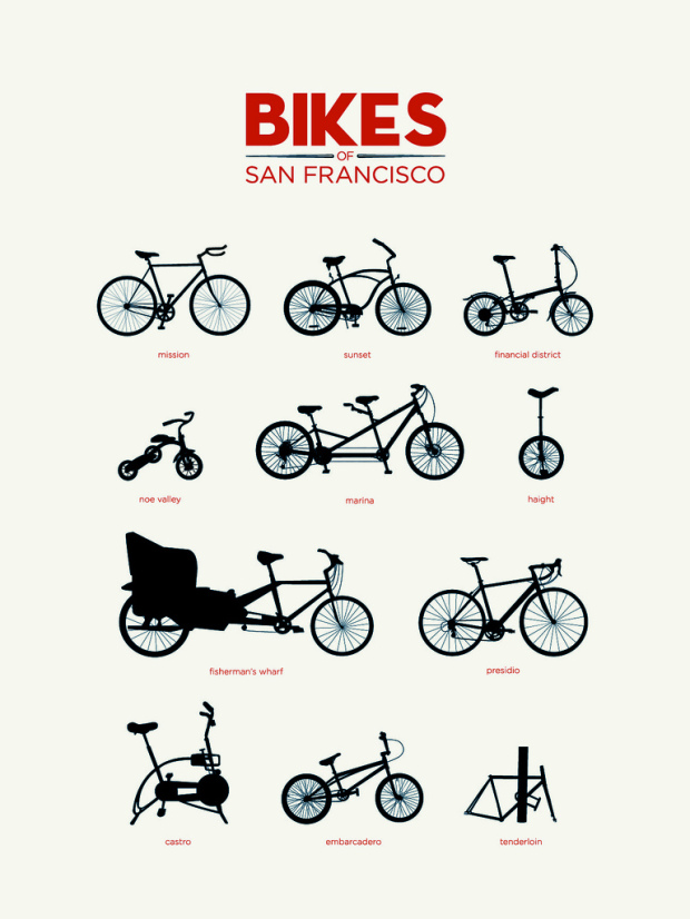
Tor classifies areas in San Francisco by bicycle. I’d say that’s about right.
Also available in print.
Statistics isn’t just for finding out how our world works and how companies can improve their business. No. It’s also for useful stuff, like, you know, gambling. Great interview with Edward Thorp [pdf], who’s best known for bringing card counting in blackjack to the masses.
I received my PhD in mathematics and then went out into the university world to teach. As it happened, I’d always had an interest in applications from all of my science play in my high school years. One idea I’d had during those days was the physical predicting of roulette. That idea had stuck with me, so as I was getting my PhD, I was working on that problem, just on the side for fun. That gave me an outlook toward gambling games that later paid off in the market. Although conventional wisdom held that you couldn’t beat these games, the outlook was that that wisdom was not necessarily true and, in fact, was probably wrong. Gambling games, which were perceived to be efficient — in the financial-world sense of the word — might not be. In fact, I was convinced that wasn’t the case in roulette. So I came to this orientation that the conventional wisdom wasn’t right. That led me not only to build a wearable computer for roulette in conjunction with Claude Shannon of the Massachusetts Institute of Technology, but also to investigate card-counting in blackjack. I happened to see an article on blackjack strategy published in a statistical journal that was fairly close to even. After I used it just for fun, I came back and figured out a way to construct a winning strategy for the game.
[Edward Thorpe via @pkedrosky]
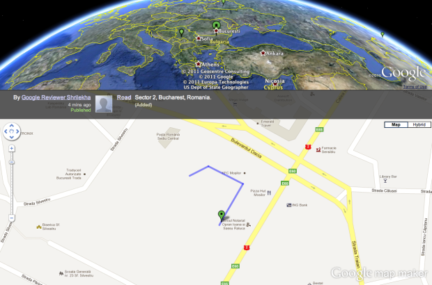
Google Map Maker is a simple tool that lets you draw your own map and share that map with others. The Pulse view lets you see how people are making use of that tool in real-time. On top is the Google Earth view. On the bottom is a zoomed in view of the actual edit. Just press play, and see how people around the world are using Map Maker.
It’s a simple map that is of the same likeness as the Zappos sales map and the even older Twittervision, but somehow it’s still fun to peek in to see what people are doing.
[Google Map Maker via @johnmaeda]
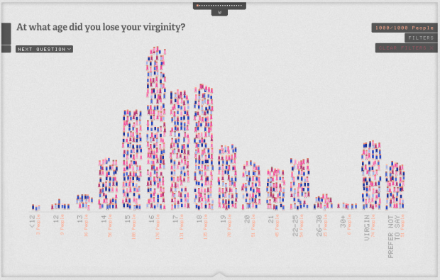
The bedroom is a private place, and what goes on in the bedroom usually stays in the bedroom. However, the Sexperience 1000 (by Mint Digital and Lingobee), using data from the “Great Britain Sex Survey,” provides a statistical picture of what people do or have done.
Read More

The two differ in who uses them, how they are used, and who consumes them. They have the same goal. It’s to better understand data. You’d think that common bond would draw statisticians and information visualization researchers together for ample collaboration, but that isn’t the case. You see, each group doesn’t quite understand what the other is doing, and that’s where intermingling gets tricky.
Read More
I’m visiting the US Census Bureau this week, so there’s a good chance there will be a few days I don’t post anything. Hopefully not though. I have a couple of things scheduled. But in case I go radio silent for a few days, you’ll know why. It’ll be back to normal next week.

The food nutrition label is on almost every food item, but it can be confusing in the sense that it doesn’t tell you much about whether something is good or bad for you. The UC Berkeley School of Journalism hosted a challenge for designers and food experts to rethink the label:
We are confused about what and how to eat and so we’re eating too much of the wrong things. In fact, we’re eating too much of everything. Two-thirds of American adults are overweight or obese. The obesity rate among preschoolers has doubled since 1970. Type 2 diabetes has become an epidemic. We want to make it easier to choose healthy food.
Visual designer Renee Walker won with her rework shown above. The rectangles on top of each label represent main ingredients, and bars on the bottom provide a quick thumbs or thumbs down for a breakdown of fat content, carbohydrates, etc. Icons of spoons and scoops are used to supplement serving size since no one knows what 182 grams looks or feels like.
Practically speaking, it’s hard to imagine anything like this on the back of a Snickers bar any time soon. It requires a certain amount of space to be useful. The sentiment, however, is good and there are useful bits that could be used in a redesign in the future.
How would you improve the existing nutrition label?
[Rethink the Food Label | Thanks, Jeffrey]
In an interview with Enrico Bertini, Moritz Stefaner, whose work you’ll probably recognize, talks about his experiences as a freelancer and how he got started. Some of the highlights include how to get your name out there, important skills, and the demand for people who know data, visualization, and aesthetics. At nearly an hour long, there’s a lot of good information in there.
The main takeaway: get started now, play with data, hone your skills, and the work will come.
Maryalene LaPonsie describes some novel job called Data Scientist (although we’ve known about it for a while) and their role in competitive intelligence:
Competitive intelligence is poised to offer data scientists increasing job opportunities in coming years. SCIP reports that the market for business intelligence is worth approximately $2 billion annually, and Garrison says that many corporations now operate their own competitive intelligence divisions.
Plus there’s a shortage of an estimated 140,000 to 190,000 people who are qualified for the openings available (not all in business). What you need to know to get hired:
As part of a relatively new field, data scientists may come from many different backgrounds. Garrison says that employers are often looking for two things when considering a job applicant. “The first part is the technical background,” he says. Companies may want professionals with an industry background who are familiar with its specific jargon and trends. “If you want to work for a pharmaceutical company, you might need a degree in biochemistry,” he explains. Other jobs may require only a general degree in business.
In other words, you need to know statistics and know or be able to learn about the subject matter. Programming skills are a plus. Actually, programming is required. I don’t know any data scientists who don’t have that skill. I hear there’s some book to help you get started though.
[AOL Jobs via @alexlundry]
When you’re picking a hotel to stay at in an area you don’t know well, the place you end up at can be arbitrary. With most travel sites, you get a list of hotels with ratings, which is helpful, but still feels confusing at times. Sites like Hipmunk aim to make the search easier. Most recently Google launched a new experiment called Hotel Finder.
Read More
Joan R. Ginther has won the lottery four times, each time with million dollar payouts. Either she’s the luckiest woman in the world, or her wins have to do with her statistics PhD. I suspect the latter. (And I need to get my hands on a lottery dataset.)
[Thanks, Ryan]
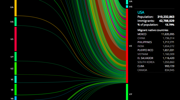
Hundreds of thousands of people immigrate every year, with some countries seeing higher rates than others. To compare and to gain a better sense of the number of people moving around, Carlo Zapponi created peoplemovin.
Read More
Using data from the USPS Postmaster Finder and the USGS Geographic Names Information System, geography graduate student Derek Watkins maps the opening of new post offices from 1700 to 1900. As you know, the mail must go through. No matter if it rains or snows. The mail must go through. So it’s also a great way to see expansion of the US.
Some interesting spots: In 1776, after the revolution, new offices open along the east coast; in 1848, during the gold rush, offices sprout up on the west coast; in the 1870s, offices along the railroad open up.
 One of the best parts since the launch of Visualize This has been the pictures that people have sent me of the book in the wild. It makes it feel all the more real.
To have some fun with it, let’s have a little contest. Take a picture of the book in your hands, on your desk, or wherever you like really, and send it to [email protected] by this Friday, August 12, 2011. If you have a digital version, feel free to take a picture of your iPad or Kindle with the book open. I’ll put all the pics together in a mosaic or something.
Then I’ll choose five winners at random, and you can pick any print book you like from the Wiley Tech library (minus box sets). Good luck!

Personal data collection can be a tough sell at times, but with the Nike+, which lets you record your runs, thousands have taken part in measuring their performance and digitally racing with others. For the most recent Nike+ campaign, interactive collective YesYesNo mapped a year’s worth of runs from the Nike+ site and invited people to plug in their own runs.
Read More
 Jonathan Stark, a mobile application consultant, is running an interesting social experiment with his Starbucks card:
Jonathan’s Card is an experiment in social sharing of physical goods using digital currency on mobile phones. I stumbled on the idea while doing research for a blog post about Broadcasting Mobile Currency.
Based on the similarity to the “take a penny, leave a penny” trays at convenience stores in the US, I’ve adopted a similar “get a coffee, give a coffee” terminology for Jonathan’s Card.
Simply save the picture of Jonathan’s Starbucks card onto your smartphone and use it to buy your coffee. If you like, add money to the card so that someone else can buy a coffee.
The best part is that Stark provides a simple API that returns the balance on the card every minute. When do people buy coffee? How do people give and take? Are people more likely to give when there’s a large balance or when there’s nothing left? Lots of fun things to look at.
[Jonathan’s Card via @kn0thing]
FlowingData’s readership continues to grow (which is great), but that also means it takes more to keep the lights on here. A big thank you to FlowingData sponsors for helping me make sure FlowingData stays up and running smoothly. Check ’em out. They help you do good stuff with data.
IDV Solutions Visual Fusion — Business intelligence software for building focused apps that unite data from virtually any data source in a visual, interactive context for better insight and understanding.
Tableau Software — Combines data exploration and visual analytics in an easy-to-use data analysis tool you can quickly master. It makes data analysis easy and fun. Customers are working 5 to 20 times faster using Tableau.
Column Five Media — Whether you are a startup that is just beginning to get the word out about your product, or a Fortune 500 company looking to be more social, they can help you create exciting visual content – and then ensure that people actually see it.
InstantAtlas — Enables information analysts and researchers to create highly-interactive online reporting solutions that combine statistics and map data to improve data visualization, enhance communication, and engage people in more informed decision making.
Want to sponsor FlowingData? Send interest to [email protected] for more details.
 Visualize This: The FlowingData Guide to Design, Visualization, and Statistics (2nd Edition)
New tools, refined process.


