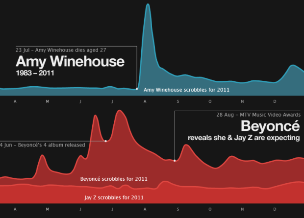
Some little birds told me that they received their “coming soon” notifications from Amazon about Visualize This. Exciting. (Thanks, pre-orderees :). I just got the PDF of the book not too long ago, but I can’t wait to get the physical copy resting in my hands. Paper! In anticipation of the upcoming release, I’ve posted some previews of what you can expect.
Read More
-
-
A lot of fun and interesting projects seem to spring up when you force students to sit down and work (or else they fail), and with summer break just about in full swing, many of these projects are going up online now. For example: Professor Golan Levins’ students’ projects at Carnegie Mellon:
Thirty students, spanning eight departments, created personal research investigations into arts-engineering, freestyle computing, and new media practice. These projects explored experimental interfaces, information visualization, games, real-time audiovisuals, computationally generated forms, interactive robotics, 3D scanning and depth imaging, crowd-sourcing, physical computing, and many other topics.
The above image is a shot of James Mulholland’s take on the family tree.
Read More -
Trulia Insights sure has been having fun lately. In their most recent dig into housing trends, the team maps international searches for American homes.
Read More -
Terrance Chang shows us flight patterns at San Francisco International Airport using long-exposure photography so that over time, you can see where airplanes take off from and land.
It’s true. Anything that moves at night and emits light is bound to be interesting via long-duration shutter speed (e.g. a Roomba, fireflies, and WiFi networks).
Catch the full set of photos here, which are also available as prints.
Gold star if you can think of other interesting paths or phenomena that’d look amazing via long-exposure.
-
This seems obvious, but apparently there are people who are unsure of what to do with Twitter and social norms. Now you know. Thanks, Good Magazine for your clear guide.
[GOOD | Thanks, @unchillbill]
-
Digital artist Jer Thorp discusses the algorithm and tool used to arrange 9/11 victims’ names based on who they were with when they died. The process started with the collection of data.
Read More -
In an effort to decrease obesity and improve general health, the US government announced their newest guide to food proportions: the food plate. This of course is a departure from the food pyramid that has been around in one form or another since the 1990s. Instead of slivers or sections on a pyramid, we now have a pie chart type of thing. Well, more like a Simon.
So here’s the question: Does the plate work better than the pyramid?
Read More -
Slate puts together a rough analysis of RottenTomatoes actor and director career ratings. They plot average ratings for films in general, actors, and directors, which aren’t all that useful, but the Career-o-matic is fun to play with. Punch in a name and see the ratings over time.
[U]se Slate’s Hollywood Career-o-Matic tool below to map the career of any major actor or director from the last 26 years. You can also type in more than one name to plot careers side by side. For example, Paul Thomas Anderson vs. Wes Anderson vs. Pamela Anderson. Mouse over the data points to see which movies they represent.
Poor M. Night Shyamalan is on the decline.
[Hollywood Career-O-Matic | Thanks, Laura]
-
As I’m sure you know, Sony has been having all sorts of data breach problems lately — namely a million passwords from the Sony Pictures site, 77 million accounts from the PlayStation Network, and nearly 25 million user accounts from Online Entertainment. I was curious how these recent attacks compared to the largest known data loss incidents, so I headed over to DataLossDB. Sony now holds spots #4 and #10 for largest breaches of all time. That can’t be good.
Read More -
A little over a week ago, Sony was hit yet again with another security breach — this time over one million passwords, that were stored in plain text, were released into the wild. Software architect Troy Hunt took a closer look at the dataset and found just how predictable people’s passwords are.
Read More -
Industrial architect Hyun-Seok Kim, known for eccentric yacht designs, uses Voronoi diagrams as his latest inspiration:
Still at the design stage, the 125-meter vessel is adorned with a complex lattice exterior that its designer, South Korean industrial architect Hyun-Seok Kim, says is based on an algorithmic diagram by Georgy Voronoy, a math professor who lived under the Russian empire during the late 1800s.
I can’t wait for the subsequent bar, pie, and treemap yachts. They will be glorious.
-
-
Mike Knuepfel, a student in NYU’s Interactive Telecommunications Program, uses key frequency, according to Wikipedia, to build a keyboard sculpture. Taller keys equals higher frequency.
Conclusions – This was just a first go at trying to create a data driven 3d sculpture. I wound up scaling the keys a little bit too much in the vertical direction. The weight of the tall keys caused the towers to tilt at an angle. I plan on showing this prototype to a few people that will hopefully give me more ideas for new data sets to look at. I want to try and use the CNC for future data driven sculptures. I also want to try and include color into the sculpture somehow.
Not bad for a first run. My proposed next step: Sculpturize the entire computer. You’ve got your keyboard. Next use some tracking software for mouse button clicks, and then use this software to track the mouse pointer for a sculptured monitor.
-
Men and women are different. You know that. But do they tweet differently? Tweetolife is a simple application that lets you compare and contrast what men and women tweet about. Simply type in a search term or phrase and compare. For example, search for love, and 63 percent of tweets that contain that word were from women, based on the sample data collected between November 2009 and February 2010.
Read More -
Jeffrey Winter tests a hunch about links leading to philosophy on Wikipedia:
There was an idea floating around that continuously following the first link of any Wikipedia article will eventually lead to “Philosophy.” This sounded like a reasonable assertion, one that makes a certain amount of sense in retrospect: any description of something will typically use more general terms. Following that idea will eventually lead… somewhere.
Winter’s curiosity led to this simple mashup. Type in some terms in the search bar and see where those topics lead to. Lo and behold, they all reach philosophy somehow. The above was my own search for economy, poop, science, Forrest Gump, hamburger, and Chicago. Philosophy: the Kevin Bacon of Wikipedia.
-
UX designer and consultant, Hunter Whitney, describes a good mindset as you start digging into data, with the end target of visualization. “Why might you want to collect data about something and are you sure you know what you really need? … How are the data stored? … How are they summarized (statistically) and modified? … How are the charts displayed, formatted, and presented in the context of the full interface?”
[UX Magazine | Thanks, Elise]
-
Pete Warden, for O’Reilly Radar, compares current data responsibilities with those of harbor masters from the Victorian era. Warden warns:
Specialists like us who can understand and interpret data are in a privileged position. Most people have an exaggerated respect for arguments expressed as numbers or visualizations, because they don’t understand how many assumptions and simplifications go into these creations. It’s our job to remember that and balance our enthusiasm about the power of our techniques with some humility about their limits.
In other words: You should learn statistics. You don’t have to go out and get a PhD, but it’s helpful to be able to think like a statistician, so that you know the right way to think about data.
-
I wish there was a way to slow down time. Another month whirled by just like that. In case you missed them, here are the most popular posts from the past month. Thanks again for sharing, tweeting, and liking. Every bit helps this little blog of mine reach a larger audience.
- Flash vs. HTML5
- Seven year itch: When do people get married and divorced?
- Plush statistical distribution pillows
- How to map connections with great circles
- Find everywhere you can go in 15 minutes or less
- MacGyver recipe book – All 7 seasons of diversions and mischief
- Geography of hate
- A century of deaths and a lot of fake blood
- Why you shouldn’t eat farmed fish – a graphical explanation
- Better Life Index measures well-being across countries
-
GeoCommons, an open repository of data and maps, launched version 2.0 this week, which is more feature-rich and robust than the first. Two of the major updates have to do with the fast-changing data landscape: amount of data and browser technology.
Read More -
My many thanks to the FlowingData sponsors. They help me keep this site up and running, and FlowingData wouldn’t be what it is without them. Check ’em out. They help you make sense of and communicate with data.
Column Five Media — Whether you are a startup that is just beginning to get the word out about your product, or a Fortune 500 company looking to be more social, they can help you create exciting visual content – and then ensure that people actually see it.
InstantAtlas — Enables information analysts and researchers to create highly-interactive online reporting solutions that combine statistics and map data to improve data visualization, enhance communication, and engage people in more informed decision making.
Tableau Software — Combines data exploration and visual analytics in an easy-to-use data analysis tool you can quickly master. It makes data analysis easy and fun. Customers are working 5 to 20 times faster using Tableau.