A couple of infographic résumé sites, vizualize.me and re.vu, sprouted up that use your LinkedIn data to show your career stats. Just create an account, connect it to LinkedIn, and you get some graphs that show when and where you worked. It’s a visual form of your LinkedIn profile with a goal to replace the “old” and “boring” résumé that uses just text.
Is this the best way to go though, if you’re applying for a job?
Other than commissioning a couple of freelancers based on their portfolios and recommendations, I haven’t had any experience hiring people, but I imagine being turned off by such an infographic résumé if I were a HR person. The visual format is easy to scan, but because it it’s not a traditional text layout, I’d have to figure out what I was looking at first.
Or let’s say more people start submitting these sort of résumés. Then the novelty, the main advantage, wears off and they all start to look the same.
The first infographic résumé I remember was by Michael Anderson in 2008.

There were probably others before it, but this was the first that was shared a lot across the Web. It was new and creative and worked well for the type of job Anderson was looking for. Copycats followed that were less amusing than the one before.
If you were to apply for similar jobs as Anderson with an automatically generated résumé, it’d be less impressive, because the creation was a way to show a portion of his skill set, whereas you’re just pointing and clicking with these sites.
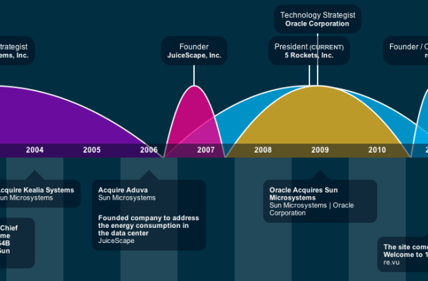
Maybe you’re looking for a different sort of job. Would those employers appreciate this sort of résumé? Again, it’s hard for me to say. But I imagine them appreciating a thoughtful cover letter with a CV with the most important stuff at the beginning than they would about bar graphs and humps (with a meaningless vertical axis) that show a space-hogging timeline. I’m all for visualizing things (especially bits of your life), but words can also be meaningful.
 Visualize This: The FlowingData Guide to Design, Visualization, and Statistics (2nd Edition)
As someone who reads thousands of resumes every year, getting one of these for anything other than a design position would annoy the hell out of me. It’s not the unusual format that is a turn off, it’s that there is so little information on them that it’s a phenomenally useless resume; it’s just a chart of job titles and the names of the places you worked. It gives me no information on what you actually did at each of these places, what your responsibilities were, or really anything else that I can use to determine whether or not you fit the criteria I’m looking for in whatever job you’re applying to. If I get hundreds of applications for a single job, you can pretty much guarantee that I will pass you by if you don’t tell me anything useful to separate you from the herd. All this does is show me that you spent (or got a website to spend!) 90% of your time making it look pretty and 10% of your time providing very little information; it makes me judge your ability to prioritize the important things, and people who cannot prioritize are not people I want to hire.
(Again, I want to emphasize that this is for non-design positions only. If you’re applying for a design-related job, this kind of thing could possibly get you further.)
I wrote about visual resume on my blog and pretty much came to the same conclusion: If you’re a designer, this might be a great way to show your skills, but if you need a website to do the design for you, maybe you shouldn’t be doing a visual resume in the first place. Like you said, Elizabeth, those resumes don’t do a great job at presenting the relevant information.
http://curiousontheroad.com/2011/09/visual-resume-designers-visualizeme-great-idea-or-gimmick/
interesting comments! I have been thinking about pushing my resume in this direction, I am a GIS analyst. Very useful for me to see what you said, as you seem like you see lots of resumes. I have a question for you though.
What if there were hyperlinks clearly visible on the infographic that took you to a simple to read word doc that revealed the specifics that you were looking for, like job duties, project accomplishments, etc..? I am guessing that it would still be over the top, or not quite applicable for positions outside design (like you said).
anyway, thanks for the response if you are able to get to it?
cheers,
ac
I wouldn’t want to work for someone as boring as Elizabeth, so the visual resume would do it’s job by filtering out the old school thinkers.
I strongly Disagree with Elizabeth.
I worked up a couple of these for myself as an exercise and showed them to some friends, one of whom has spent the last decade-plus in HR at a healthcare firm. She said she loved it specifically because it was so different from everything else that came across her desk. So I guess all we can say (based on our extensive sample size of two anecdotes) about the effectiveness of these resumes is that it depends, even for people looking at thousands of resumes per year for non-design positions.
Thanks for writing such a timely article, and as a co-founder of re.vu, we certainly appreciate inclusion in the discussion.
To add a little context to this dialogue, we have had many reactions like the one from commenter Elizabeth in this stream. What you have to remember is that this is a tool, and it’s a tool intended to help a person tell their story using visual tools and to the extent the author desires, social proof/connectivity.
If there is no fundamental story, then the tool won’t be very effective in conveying the message. As commenter Spencer points out, when executed well, it helps differentiate a candidate from the masses. When executed poorly, it can differentiate, but in a negative way.
The intent behind re.vu was to help people have access to the right tools to represent themselves in a distinct and meaningful way. Here are a couple of other examples in the case your readers are interested:
http://re.vu/BarackObama
http://re.vu/Duarte
http://re.vu/Felicia
I think re.vu has all the features which Elizabeth found missing in other visual resume applications. If used smartly, can definitely help you stand out of the masses.
Cheers,
Subodh
Thank you for sharing your perspective Subodh.
Coincidentally, I saw a visual resume for the first time a few days ago from an applicant looking for a server engineer position. It was much simpler than these: It had a vertical list of skills, with a bar next to each indicating when, over time, that skill had been used. Java continuously since 1999, HTML5 continuously from a couple years ago, and so forth. It was a supplement to a normal resume on a previous page.
I was definitely intrigued by the novelty, but I thought there were a number of ways he could improve the visualization. I had some Tufte-inspired design nits, but probably the biggest issue was that his simple format gave no evidence of the strength of those skills. I’ve “been doing” JavaScript for 8 or 9 years, but I wouldn’t list it as a major strength: I’m an online programmer and so I have to write it from time to time.
But I liked the idea enough to consider doing it for myself (with my changes in place). To add to our sample size then, I would say the novelty totally worked but since it had some flaws, that’s really what I’ve been thinking about the last couple of days.
I’m a web developer who recently did something very similar to what Derrick mentions seeing. My first page was all text (and honestly might need some work), but the second page was a simple infographic showing skills and roles over my career.
Here’s what it looked like:
http://imgur.com/37gfd
The reason I did it was because it lets the resume tell the story of my work history — rather than just a bulleted list of these items. But Derrick’s absolutely right when he says it offers “no evidence of the strength of those skills.” That can be solved (with intensity of color or thickness of the bar or by some other means), but maybe not without adding some visual complexity.
Those issues can also be clarified in the interview, should the resume earn one for you.
So, that’s the big question, the only one that matters. Did mine get me the interview? Yes!
I was worried about it when I sent it off, but it’s succeeded wonderfully. I sent it off to a couple companies, figuring it would get lost in the HR meat grinder with all the other resumes. Instead, I got pre-screening calls from both companies on that same day and have scheduled subsequent interviews for next week. Both hiring managers said it was the infographic page that grabbed their attention and prompted the call.
That said, I think the infographic is almost better-suited as an interview supplement: it gives the interviewer good ideas for the direction of the interview.
@ Elizabeth, I had the same concerns of not conveying enough information with my visual resume…however, a picture is worth a thousand words and I believe that mine worked for a meeting with my university president. My intent was to articulate the evolution of my academic maturity (grades), without stammering too much!
Appreciate your thoughts on it. And thank you for introducing the topic, Nathan. I love your book.
sorry, link: http://i.imgur.com/VGaY0.png
My first thought on this was that it makes any gaps in your resume that much more salient. Given the current job market, that’s an important consideration for a whole lot of people.
Here in London, UK, I have to read about 200 resumes a year for design-related positions. I would say that for anything other than a junior or non-managerial position, presenting your stuff like is a pretty high risk strategy.
This is because (for contract positions at least), most designers will have worked for a fairly standard set of agencies, the BBC, private and public sector employers. Work history per se doesn’t differentiate you enough for it to crowd out much more important information about how you approached the work you did, who you dealt with, what problems you solved, etc. That’s the stuff that makes you different, not where you worked. Obviously, I’m generalising, but that’s pretty much the gist of it.
So I’d say visual resumes are the ultimate manifestation of the mistaken (and in this case flat-out damaging) belief that you can make something informative simply by making it look good.
85% are visually oriented, thus this is great!. but what percentage of HR guys are visual? that is the question.
Bob Feldtman: That IS THE question. We did a survey of HR Professionals inclusive of recruiters, business partners, and hiring managers as we built our product. 2% had a negative visceral reaction to the visual format, 86% said that they would accept the format BUT that they also would want a “standard resume” for support. A big concern was that their systems for accepting candidates were all text/document based and that this format would break their systems and processes.
Hiring managers were the interesting parties in the responses. Overwhelmingly, 91% said they preferred the visual, multi-dimensional approach to what they normally saw.
Take this for what it’s worth and of course your mileage may vary.
I have never met an HR manager that was competent, skilled, analytical, or effective. HR people are the WORST people to connect applicants with jobs at their companies. People like Elizabeth, above, who review 1000s of resumes a year. Your telling me she isn’t sick of Times New Roman font, subconsciously? DUH. In sum: HR people suck.
I wrote in my blog about the same topic (http://mimacedonia.tumblr.com/post/10731938916/cv-visual-paso-atras). For me, Visual Resume isn´t the best option for recruiters.
First, like Mike Harding says: “they would accept the format BUT that they also would want a “standard resume” for support. A big concern was that their systems for accepting candidates were all text/document based and that this format would break their systems and processes.” CV is a standard document since 500 years ago and change this without a new standard it´s difficult issue for HR Industries.
And last, like Jonathan says: “visual resumes are the ultimate manifestation of the mistaken (and in this case flat-out damaging) belief that you can make something informative simply by making it look good”. I love infographics and visualization but I believe that CV haven´t a level of complexity for apply a layer of infographic.
On a related note, I love Bret Victor’s Bio http://worrydream.com/#!/Bio
Dangit Cay, you beat me to it. And I had the comment I was going to make in mind the instant I saw the title of the article in a sidebar link to it.