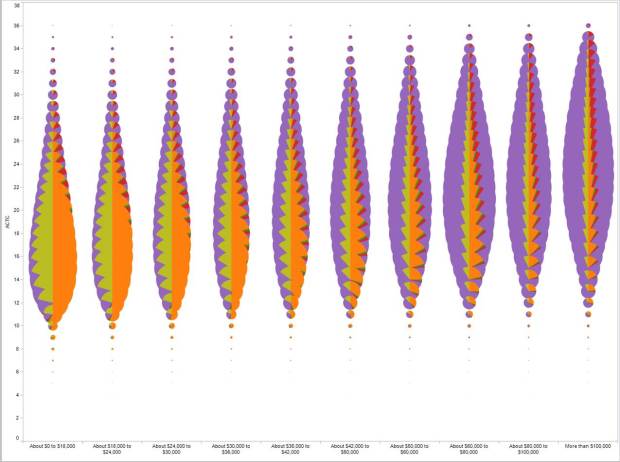
• Vertigo put together a great collection of 672 Obama headlines using Silverlight’s deep zoom capabilities. The cool thing here isn’t so much the number of headlines or the mosaic of pictures. It’s how you can interact with the newspapers’ front pages. It’s not just a mosaic of thumbnails. You can pan and zoom really smoothly with a roll of the scroll wheel and mouse drag and a click. Zoom all the way in to read the actual articles without it taking forever for high-resolution images to load.

    Take a look see at Blaise Aguera y Arcas’ TED talk for where this technology is headed:

    [via Data Mining]

  • I don’t normally put up job postings, but this opportunity is too cool not to. Stamen Design, in San Francisco, has an opening for a full-time developer to “make their ideas feasible.” If you follow visualization on the Web, no doubt you’ve come across some of their work – somewhere in between analytical and art. There’s the Digg Labs stuff, Trulia Hindsight, Twitter Blocks, Cabspotting, and plenty of other fun stuff.

    Here’s part of the job description:

    You’ll be working with a small team of designers and engineers who will be looking to you to make their ideas feasible. You’re excited by the possibility of cutting and bending data to fit it through the thin straw of the internet. You can look at a source of information and model it as resources, rows and columns, messages and queues. You have the programming experience necessary to write data processors and servers, the system administration experience to inhabit and actively guide a constantly-shifting technical environment of free & open source software, and the patience & grace to grant that PHP and spreadsheets might be appropriate tools when circumstances require the quick and the dirty.

    You must have the willingness and ability to discuss the finer points of HTTP, SQL, RESTful API’s, response formats and resource consumption. You understand that the perfect is often the enemy of the good, and your pragmatism & flexibility show themselves in functional systems. You can see the connections between technical infrastructure and the interactive design & visualization it supports.

    We’re less concerned with how long you’ve worked than with how good you are. You will need to have been paid to do good work; the skill that comes from delivering work for money can’t be learned in any other way. You maintain a state of constant learning to keep up with new work in your field, participate in communities of practice connected to your expertise, and experiment with new techniques in personal projects.

    Go here for the complete details.

    [via teczno]

  • GOOD Magazine and Atley Kasky collaborate to explore U.S. Presidents’ first 100 days in office.

    I pledge you, I pledge myself, to a new deal for the American people,” Franklin D. Roosevelt told supporters in 1932 while accepting the presidential nomination. When he took office the following year, he spent his first 100 days enacting a dizzying number of reforms designed to stabilize an economically depressed nation. Since then, a president’s first 100 days have been an indicator of what he is able to accomplish. In January 2009, the clock starts again.

    For each President, going back to FDR, a line represents his first 100 days in office. Each circle corresponds to a significant event. The profiles underneath the timelines start with a notable quote from the President’s inauguration speech (except Truman and Johnson, who were sworn in after the death of Roosevelt and Kennedy, respectively) followed by events marked with cute, little icons that show what type of event it was. The % of popular vote, days in office, and political inheritance are there too.

    Yeah, it’s a crud load of information (presented quite nicely). I hope you have a big monitor.

    [Thanks, @hungryclone]

  • Cartograms got a lot of coverage in 2004 when Michael Gastner, Cosma Shalizi, and Mark Newman used them to show the Bush/Kerry election results. Naturally, they’ve put together a similar series of (very red) maps and cartograms for the just past 2008 election.

    In case you’re unfamiliar with cartograms, they’re essentially maps with morphed areas according to some metric. The election series for example are adjusted for population, so that states are sized by population instead of physical area. The drawback of course is that after a certain point, the image starts to look a lot like a Pollock painting.

    [Thanks, Sara]

  • For those watching the clock and waiting for the weekend to hurry up and start, here’s the Diagram Diaries Flickr group. The 654 diagrams should keep you occupied for a good while. Enjoy, and have a good weekend, everyone.

  • Sprint, in a promotion to their mobile Internet service, created this amusing futuristic dashboard. “All aboard the now machine,” the computer says. “How about a big bowl of now?… Please keep your hands inside the moment…your hair has grown 5 millionths of centimeter in the last second.” It’s got tickers for eggs being produced, emails being sent, spam emails being received, recent news from The New York Times, CNN, newsvine, top Google searches of the day, and most importantly, seconds until doughnut day. That’d be a nice little screensaver – or something I’d have running 24/7 on a giant plasma.

    Oh, and yes, that is my face in the middle.

  • Following up on my post last week about using Twitter to track eating…

  • The New York Times adds another item to the list of things to watch tonight as election results start to pour in. The Times invites readers to enter one word that describes their current state of mind and who they support. You are allowed to enter a word once per hour. The result is the above self-updating word cloud as new words from readers flow from left to right. You can filter among McCain supporters, Obama supporters, or everyone. McCain supporters appear to be worried, scared, and nervous while Obama supporters are excited, hopeful, and optimistic. Both sides are anxious. What’s your current state of mind?

  • A quick reminder — it’s election day in the United States. If you’re registered to vote, take the few minutes out of your day and go put in some ticks at your nearest voting place. If not for the presidency, at least go vote for your local candidates and propositions.

  • When Google first launched their visualization API, you could only use data that was in Google spreadsheets, which was pretty limiting. Yesterday, Google opened this up, and you can now hook in data from wherever you want. What does that mean? It means that developers now have access to all the visualization API offerings like before, but it’s now a lot easier to hook visualization into data applications.

    Headed for Googley Waters

    It also means we’re about to see a boom in web applications that look very Googley. Motion charts (above) are going to spread like wildfire and ugly gauges will grace us with their presence. It’ll be similar to the Google Maps craze, but not quite as rampant. In a couple months from now, I will have a long list of online places that use the Google visualization API. It’s going to be interesting where online visualization goes from here.

    Going back to my original question, to what extent do you think the now-open Google Visualization API will affect visualization on the Web?

    [via ReadWriteWeb]

  • I’ve always thought one of the best ways to make data relate-able is to humanize it. Wouter Walmink, from studio:ludens, does this quite literally in so_many_a_second. I’m sure you’ve across statistics that state something like “this many people die of this condition per second in the world,” but that number, even though it’s a rate – something that is dynamic, feels very static.

    In so_many_a_second these rates are represented by objects in an attempt to show these types of numbers on a “human scale.” The above shows number of plastic cups used by airlines per second. Oh yes, it’s raining cups.

    Depicting the ongoing stream of events, this application tries to get the user in touch with the emotional actuality of these objective data.

    The concept itself isn’t anything new. We’ve seen stuff sort of like this before (e.g. Running the Numbers: An American Portrait, Google employee count), but the novel thing with so_many_a_second is that you can create your own flows and compare them side-by-side. It’s more than just a literal representation of numbers.

    Yes, we could efficiently place all the rates in a horizontal bar graph, but somehow, so_many_a_second makes me care more.

    [via infosthetics | Thanks, Tim]

  • FlowingData continues to grow, and FlowingData sponsors continue to help keep everything running smoothly. No doubt the site would be down a whole lot without them – especially with all the traffic bursts lately. Thank you, FlowingData sponsors:

    Tableau Software — Data exploration and visual analytics software to understand your databases and spreadsheets.

    Eye-Sys — Visualization tool that lets you easily link large amounts of data from many sources in real-time.

    If you’re interested in becoming a FlowingData sponsor, please feel free to email me, and I’ll get back to you with the details.

  • Most people make the mistake of thinking design is what it looks like… People think it’s this veneer — that the designers are handed this box and told, ‘Make it look good!’ That’s not what we think design is. It’s not just what it looks like and feels like. Design is how it works.

    — Steve Jobs, The New York Times, 2003

    I post this not because I like Apple products, but because it’s true (and because I like Apple products). I’m no designer, but as a statistician, I have tremendous respect for those who are. Have a nice weekend all.

    [via swissmiss]

  • October was another good month. Our FlowingData community grew from 5,100 subscribers to over 5,700 this month, and I of course have all of you to thank. Thank you for spreading the word about FlowingData – whether it’s via del.icio.us, Digg, StumbleUpon, email, or word of mouth, I appreciate it all.

    October was the first time we were on the front page of Digg – with the 40 essential tools and resources post. I was mesmerized as I watched FlowingData’s blog stats increase by the thousands in a matter of a few minutes. Thankfully, WestHost was able to keep FlowingData afloat during the wave.

    In case you’ve got no red bars, here are the top posts from October:

    1. 40 Essential Tools and Resources to Visualize Data
    2. Commercial Air Traffic Seen Around the World
    3. United States Poverty Rates From 1980 to 2007
    4. Great Data Visualization Tells a Great Story
    5. Code For Walmart Growth Visualization Now Available
    6. May the Tallest and Fattest Win the Presidency
    7. Comparative View of Length of Rivers and Height of Mountains
    8. Maps for Advocacy – Beginner’s Guide to Mapping
    9. Sketching Around Personal Brand Tracking (Guest post by Miguel Jiménez)
    10. Playboy Playmate Curves and the State of the Economy

    So now it’s time for a new month. What would like to see more of on FlowingData?

    P.S. Happy Halloween!

  • In this map from the Financial Times, the state of Europe’s economy is shown like a weather map. A cloud with a lightning bolt represents a “sudden change in outlook, outlook uncertain.” There’s nothing but gray skies ahead, I’m afraid. Oh, but wait, what’s that? Cyprus has some sun peaking out over the cloud: “Clouds over growth with some sunny prospects.” There is hope.

    [via The Big Picture | Thanks, Michael]

  • I’m sure this will come as no surprise to all of you, but personal data collection fascinates me. I love playing with data and when it’s about me, all the better. Daytum and mycrocosm are two applications that let you do this; although each have somewhat different goals. Daytum is sort of like a financial report for your life (ala Feltron) while mycrocosm is more of an experiment in communication and social media. They do both, however, have an underlying goal, whether implicit or explicit, of understanding yourself better. Do Daytum and mycrocosm help you understand yourself better? At some level, yes, but both have room for improvement. Here is my attempt #1 to improve on these existing systems.
    Read More

  • Philip, from infochimps, maps newspaper endorsements using data from the Editor & Publisher’s list. Circles with the blue radial gradient are newspapers that endorse Obama and John Kerry in 2004 while the red ones show McCain/Bush endorsements. The lighter blue circles are newspapers that endorse Obama, but actually endorsed George Bush in 2004. It’s a similar encoding for the John McCain endorsements except in red and the flip being John Kerry. Circle size is newspaper’s circulation.

    The only thing I found a little weird was that the Dem to Rep or Rep to Dem endorsements were represented with all blue or all red. It certainly makes the circles stand out – which was the point – but doesn’t really indicate a flip. I had to mouse over the circle to find that out.

    [via FlowingData Forums | Thanks, mrflip]

  • I just noticed that when you click on “show details” in Google Reader, you get a graph of how frequently posts come from that feed and how often you read those posts. It used to only show subscriber count (via Google Reader) and when the feed was last updated. It’s one of those things where it’s like “so… what” and it won’t influence any of the decisions I make in life in any way, but hopefully when all of you “show details” for FlowingData all the red and blue bars are aligned :).

    P.S. Greetings from Chicago. It is much too early in the morning.

  • It was just a little over a week ago that The New York Times announced their Developer Network i.e. Campaign Finance API. Yesterday, they announced something more – the Visualization Lab. In collaboration with the Many Eyes group, the Times has rolled out a Many Eyes for data used by Times writers. You can visualize, explore, and comment on data posted at the Visualization Lab in the same way that you can at Many Eyes.

    Today, we’re taking the next step in reader involvement with the launch of The New York Times Visualization Lab, which allows readers to create compelling interactive charts, graphs, maps and other types of graphical presentations from data made available by Times editors. NYTimes.com readers can comment on the visualizations, share them with others in the form of widgets and images, and create topic hubs where people can collect visualizations and discuss specific subjects.

    A Few More Steps

    I said the API was a good step forward. The Visualization Lab is more than a step. No doubt The Times heard what I said about their API and decided to roll with it since I am the head authority on everything. Yes, I’m totally kidding, in case that didn’t come across as a joke. Come on now.

    I’m looking forward to seeing how well Times readers take to this new way of interacting.

    [Thanks, William]

  • Uniqlo gathered hundreds of responses from a couple hundred Japanese women about bra size, makeup, and shopping and put it into this sort of 3-d world of short video clips. Questions appear at the top, you get a few random video responses, and then the animation zooms out to show you the rundown. I can’t say I know what exactly is going on since I don’t know Japanese, but I’m guessing… bra commercial? OK, yeah, I have no idea.
    Read More