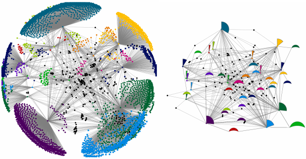
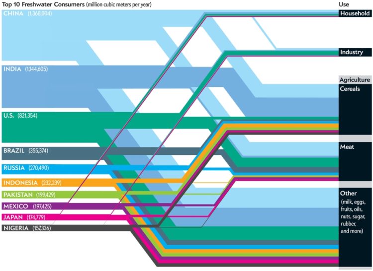
• Evan Roth from the Graffiti Research Lab, uses typographic illustration in Jay-Z’s music video for Brooklyn Go Hard. As the song plays out, we see sketches of Jay-Z drawn using Brooklyn (sort of what we saw from Jeff at Neoformix). It’s quite the work of art:

    You can download the source code for the video from Evan’s site, which is pretty cool too.

    [via Animal | Thanks, Max]

  • I started tracking what I eat and my weight using Twitter in an effort to shed 10 pounds and consume less. It’s already been (a really fast) two months since I started this experiment — I’ve lost 7 pounds so far. While there are a number of factors that can contribute to weight loss (and gain), I think the simple act of tweeting raised my awareness just enough to make me feel guilty for eating that bag of chips in the middle of the afternoon.
    Read More

  • This is a guest post by Greg J. Smith, a Toronto-based designer and researcher. Greg writes about design, visualization and digital culture on his personal blog Serial Consign.

    A few weeks ago the second edition of the Visualizar workshop wrapped up at Medialab-Prado in Madrid. In curating the event this year, organizer José Luis de Vicente selected urban informatics as the focus of research and visualization development. Partially inspired by Cascade on Wheels (a project created at the workshop last year), the Visualizar mandate was in line with contemporary thinking about the city where the street is viewed as a platform and urban space is considered a DIY enterprise. Visualizar’08 brought together a range of programmers, designers, architects, illustrators and scholars to participate in a seminar on contemporary thinking about the city and then bunker down to “rapid prototype” seven visualization projects over a two-week period.
    Read More

  • FlowingData has hit a critical point in its life where regular hosting isn’t enough, and the next step up is a big one — especially with what I have planned in a couple of weeks. FlowingData sponsors help me take this step and make sure everything keeps going smoothly. Thank you, FlowingData sponsors.

    I hope you’ll join me in thanking them by checking them out. They all have something worthwhile to offer:

    Tableau Software — Data exploration and visual analytics in an easy-to-use analysis tool.

    Eye-Sys — Comprehensive real-time 3D visualization.

    SiSense — Easy-to-use reporting and analysis. No code required.

    If you’d like to sponsor FlowingData, please feel free to email me, and I’ll get back to you with the details.

  • It’s December 1. ‘Tis the season for giving, so guess what – it’s time for a FlowingData contest! Jodi has kindly offered two free Edward Tufte books for one lucky FlowingData reader. She’s getting ready to move and simply wants to find these books a good home. The two books up for grabs:

    Both books are used, but I don’t think that matters. They still have the same pretty content as they did when they were new. You know – like a fine wine. There’s nothing better than a bottle of aged Tufte.

    How to Win

    Below is a graph that shows immigration to the United States by country of origin. Can you make a better graph using the same data source?

    Immigration by country of origin

    To the person who submits the best remake of the above immigration graph will win both Tufte books. Email me your entries to nathan [at] flowingdata DOT com with “Graph Contest” in the subject line by Friday, December 5, 8:00pm EST. Jodi and I will judge based on informativeness (is that even a word?), aesthetics, and creativity. I will announce the winner later next week as well as post everyone’s work like I’ve done in the past. The books can only be shipped to those with a U.S. mailing address, so any international entries will have to be for pride.

    Good luck. We’re looking forward to seeing what you all come up with.

    P.S. Don’t forget to thank Jodi for her generous donation!

    UPDATE: I should’ve mentioned this. You can submit up to two entries, and I will greatly appreciate it if your entries are in image format e.g. JPG, GIF or in PDF format rather than an Excel spreadsheet. Although it’s not a requirement. Lastly, as you design your improved graphs, you might want to take a look at some of the data design tips I’ve posted.

  • Neighborhood Boundaries by Tom Taylor uses Flickr Shapefiles and Yahoo! Geoplanet “to show you where the world thinks its neighbors are.” Yahoo! provides access to the Where on Earth (WOE) database, which attempts to describe locations as a hierarchy. For example – a town belongs to a city, a city to a county, a county to a state. The Flickr API stores shape files identified by the WOE ID. Here’s the punchline. The shapefiles are built using only the latitude and longitude from geotagged photos on Flickr. There’s no GIS involved here.

    Why this matters, I can’t really say. I think it’s mostly to show how much data is stored in geotagged Flickr photos. I’m no GIS expert though. Anyone care to comment on the significance?

    [Thanks, @couch]

  • Happy Thanksgiving! According to the U.S. Department of Agriculture, 45 million turkeys will be consumed today. I hope you’re contributing to the count. Dibs on wing.

  • I subscribed to GOOD Magazine a while back. They describe themselves as the magazine for people who “give a damn.” I initially subscribed because of their transparency section – a series of fun infographics on some topic – in each issue, but it turned out the articles were interesting too. GOOD also gives 100% of their subscription fees to the non-profit of your choice.

    Drawing for Free Subscription

    Anyways, I never got around to renewing my subscription, so I got a 3-for-1 email offer the other day. I get 2 free subscriptions to GOOD with my renewal, so I thought, “Hey maybe a couple of FlowingData readers might enjoy a free subscription.” Anyone? I’ll make this easy on you all. If you’d like to win a free subscription, just leave a comment on this post that promises you’ll tell one person about FlowingData. One entry per person, please.

    I’ll choose two winners at random Friday afternoon. If you win, you’ll hear from me then. If not, I’d encourage you to subscribe anyways. It’s only $20, and it all goes to charity. Make sure you leave a valid email address so that I’ll be able to contact you.

    P.S. FlowingData’s got a contest involving two free Tufte books on the way. Keep an eye out.

    UPDATE: Congratulations to our two winners drawn at random – Griffin and Brett! Thanks all for participating and helping our community grow.

  • I’m not exactly sure what I’m seeing here, but Voyage, by Andy Biggs, is an abstract RSS reader that places posts in a 3D cloud. As you click on items, you can drill down further to later posts. You can also use the up and down keys on the keyboard or the scroll wheel on your mouse. (The latter isn’t working for me right now.) For example, press up and you’ll see earlier posts from your subscribed feeds. The horizontal placement doesn’t seem to have any significance.

    It’s probably best to take Voyager for what it is. After all it was just meant to be an experiment in 3D Flash. It’s pretty to look at and fun to play with, but not so much about practicality.

    [via can’t remember]

  • Processing 1.0 was released yesterday and it “only took 162 attempts.” I strongly encourage you to check it out – especially if you’ve never heard of it. Even if you’re not into programming, there are a lot of fun-to-look-at demos. Processing is an open source programming language that aims to make it easy to animate and draw programmatically with students, artists, designers, and researchers in mind.

    Here’s the first part of the press release:

    Today, on November 24, 2008, we launch the 1.0 version of the Processing software. Processing is a programming language, development environment, and online community that since 2001 has promoted software literacy within the visual arts. Initially created to serve as a software sketchbook and to teach fundamentals of computer programming within a visual context, Processing quickly developed into a tool for creating finished professional work as well.

    Processing is a free, open source alternative to proprietary software tools with expensive licenses, making it accessible to schools and individual students. Its open source status encourages the community participation and collaboration that is vital to Processing’s growth. Contributors share programs, contribute code, answer questions in the discussion forum, and build libraries to extend the possibilities of the software. The Processing community has written over seventy libraries to facilitate computer vision, data visualization, music, networking, and electronics.

  • If you’re like most people, you don’t really know what’s going on with the economy. You know there’s something to do with loans and payments and what not, but not much else. Mint (the financial management app) and Wallstats (the guy who does the Death and Taxes poster) put together a “visual guide to the financial crisis” – or a flow chart, rather – to clear up some of those cloudy details. It goes back to 2003 after the dot-com crash up to the recent government bailout.

    [Thanks, Max]

  • Palantir, by Jack Lindamood, Kevin Der, and Dan Weatherford of Facebook, visualizes friend activity on Facebook. The three “hacked” together Palantir at Facebook’s recent Hackathon, but I’d never guess that it was put together in just one night by looking at it. There are a few different views. One shows activity in the form of towers sprouting up from the ground and another visualizes interactions between Facebook friends with floating arcs and things that look like orbiting comets. The former reminds me of a visualization some Google folks did a while back but with search terms. I can’t find a link to it now though (a little help, please?).

    Anyways, the pictures aren’t really enough to understand what I’m talking about. Watch the video for more.

    [via TechCrunch | Thanks, John]

  • Where do you think the US imports the most oil from? Most of us would probably say somewhere in the Middle East, but Jon Udell does some number crunching and shows that misconception is false. Canada supplies us with the most oil (according to the US Department of Energy).

    This realization however, isn’t the post’s punchline. It’s how easy it was for Jon to figure this stuff out. With some help from Dabble DB (an app that lets you easily use a database without too much technical fuss), Jon was able to parse the data and map it by region with a few swift clicks.

    We’re really close to the point where non-specialists will be able to find data online, ask questions of it, produce answers that bear on public policy issues, and share those answers online for review and discussion. A few more turns of the crank, and we’ll be there. And not a moment too soon.

    We’re gettin’ there.

    [Thanks, Tim]

  • Tabbloid is a free service that lets you receive your feeds in newsletter, or rather, tabloid form via email at a set time and frequency (as a PDF file). Above is my custom Tabbloid for today. This service won’t be for everyone, but sometimes a morning coffee is best spent reading over paper and not hunched over a laptop. I could also see this being useful for travelers.

    [Thanks, Tim]

  • I had to install a new caching implementation a few days ago to appease the hosting gods. Since then I’ve gotten a few emails reporting garbled text instead of an actual page. However, I haven’t been able to repeat the problem, and those nice enough to notify me said it went away after a few clicks. I tweaked a little bit and think it’s not an issue anymore, but if anyone sees garbage, please do let me know. Thanks.

  • This is a guest post by Simit Patel of InformedTrades, which offers free advice on trading stocks.

    While many investors use economic and fundamental factors to identify investment opportunities — i.e. whether a company has good management and is in a growth industry, or how it will be affected by macroeconomic conditions — ultimately the price of an asset comes down to two things: supply and demand. The demand for buying vs the demand of selling. By visualizing the movement of price assets, we can gain an understanding of the psychology of the market as a whole, and thus what direction the price will go.
    Read More

  • The U.S. election is over. The post-election analyses begin. The above map shows presidential voting at the county level. The more red a county is, the stronger the support for John McCain and similar for Barack Obama and blue. Below is cotton production in 1860. Each dot represent 2,000 bales. That’s some strong correlation. In fact, here is the election map with the cotton overlay:

    This of course is a case of strong correlation – not causation. That is to say, if you get your county to grow more cotton, it doesn’t mean that you’re increasing the probability that voters will sway towards Democrat. As Strange Maps points out, it is in fact a correlation to African-American population (of which 91% voted for Obama). There has been some migration during the post-slavery area, but families have largely settled in the areas their families before them grew up in.

    [via Strange Maps | Thanks, Albyn]

  • In the spirit of turning pie charts into food, Mary and Matt kick it up a notch with some design and 5.5 ounces of chocolate. It’s a chocolate pie chart of 70% milk chocolate, 20% dark, and 10% white. Get yours today for just 20 bucks. It looks delicious.

    [via swissmiss]

  • Jeff Clark of Neoformix has been doing some cool stuff with words lately. Above is a word portrait of Albert Einstein looking very chipper. Einstein’s entire face is composed of the word “genius” at varying shades and sizes. Inspired by Gui Borchet, briefly explains the process done in uh, Processing:

    The Word Portraits that I have been creating lately use an algorithm that analyzes a starting image and finds rectangular patches of a reasonably consistent color. These are then filled in the generated image with words or letters painted with the average color in the rectangle.

    The algorithm can of course be generalized to not just words and can be used with non-human images as well. Ginger the Cockapoo serves as the case study in which Jeff reconstructs an image of the dog with rectangles, the letter O, leaf-like shapes, and filled circles.

    Take a look through Jeff’s other postings for more word portraits of Barack Obama and George Boole – inventor of a logical calculus of truth values.

  • Remember the awesome interface in Minority Report? You know, the one where Tom Cruise is sifting through files and information as if he were directing a symphony? Oblong, whose co-founder served as science adviser on the Steven Spielberg movie, created something a lot like it. It’s called g-speak.

    Oblong Industries is the developer of the g-speak spatial operating environment.

    The SOE’s combination of gestural i/o, recombinant networking, and real-world pixels brings the first major step in computer interface since 1984; starting today, g-speak will fundamentally change the way people use machines at work, in the living room, in conference rooms, in vehicles. The g-speak platform is a complete application development and execution environment that redresses the dire constriction of human intent imposed by traditional GUIs. Its idiom of spatial immediacy and information responsive to real-world geometry enables a necessary new kind of work: data-intensive, embodied, real-time, predicated on universal human expertise.

    Here’s the impressive demo reel:

    Now here’s the Minority Report clip for comparison’s sake:

    Of course g-speak is still in development and has a lot of work ahead before it’s useful to explore “massive datasets” but it’s a good first step nevertheless. Plus, it just looks fun to play with. I wonder what it’d do if I gave it an obscene gesture.

    [via Data Mining and Engadget]