• Membership
  • Books
  • Projects
  • Learning
  • About
  • Member Login
  • High resolution biomass map, at management scale

    January 18, 2012

    Topic

    Maps  /  biomass, country

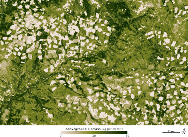
    In 2010, NASA released a map that shows world forest heights. Robert Simmon, using data from The Woods Hole Research Center, has produced an even higher resolution map, down to the management scale:

    In the end, the research team was able to construct a map with higher resolution and more precise detail than any large-scale map of forest biomass ever made. The map reveals the checkerboard patterns of logging in the old growth of the Pacific Northwest and the highly managed tree farms of the Southeast. In the Midwest, trees outline the rivers and the edges between farms, while forests re-emerge on land that was once cleared for crops. In the Mid-Atlantic and New England, lands that were stripped bare in the early years of the nation are now tree-covered again—though with many urban developments amidst the forest.

    [NASA | Thanks, Michael]

  • Watching ‘wtf Wikipedia’ as SOPA/PIPA blackout begins

    January 17, 2012

    Topic

    Network Visualization  /  PIPA, search, SOPA, Twitter

    While SOPA and PIPA are no laughing matter (join the strike), the reaction from those on Twitter who don’t know what’s going on is great entertainment. Do a search on ‘wtf wikipedia‘ for tweets from confused individuals who are trying to find information on stuff. I’m just going to leave Twitter trackers Revisit and Spot, by Moritz Stefaner and Jeff Clark, respectively, open all day. “OMG I’m doing homework and Wikipedia is blacked out wtf !!!!!!!!!!!!!!!!!!!!!”

  • Optimized dart throwing and other games

    January 17, 2012

    Topic

    Statistical Visualization  /  darts, heatmap

    If you play darts just trying to hit the bullseye, you aren’t playing for maximum output. Don’t fret though. DataGenetics is here to help with mathematical advice on how to play the game based on your skill level (Update: This is very similar to the dart work by Ryan Tibshirani, et al.):

    The optimal strategy for aiming depends on your skill as darts player. A very skillful player should aim for the middle of the triple 20; Much of the time he will hit his target, and the times he misses will be few enough that his average score will still be high.

    A very poor player should aim close to the bullseye, as just hitting the board will be an achievement (and a scoring one at that!). Aiming for the center maximizes the chances of hitting something.

    But what happens between these two extreme?

    I was a kid the last time I threw darts, and I was more interested in throwing them as high as I could in the air watching them stick into the grass. Maybe it’s time to try it the right way.

    See also optimal gameplay for Battleship, Risk, and Candyland.

    [DataGenetics via infosthetics]

  • Spot visualizes tweet commonalities

    January 16, 2012

    Topic

    Network Visualization  /  Twitter

    Twitter is an organic online location, full of retweets, conversations, and link sharing. Jeff Clark tries to show these inner workings with his newest interactive, Spot. Enter a query in the field on the bottom left, and Spot retrieves the most recent 200 tweets. You then can choose among five views: group, words, timeline, users, and source.
    Read More

  • Find out what percent you are in

    January 15, 2012

    Topic

    Maps  /  New York Times, percent

    Accompanying an article on the variations of the wealthiest one percent, The New York Times provides this interactive map to see what percent you’re in. Simply enter your household income and see how you compare in metropolitan areas with over 50,000 households.

    Nation-wide, a household income over $383,000 puts you in the top one percent. However, a lower household income of $179,000 puts you in the top one percent in Flint, Michigan. The same wage in San Diego, California puts you only in the top eight percent.

    Also: what jobs the top one percent have.

    Update: There was also a fine print version.

    [New York Times]

  • World subway paths at scale

    January 13, 2012

    Topic

    Maps  /  subway, world

    Urban planner Neil Freeman maps the world’s subway systems to scale in a minimal style resembling the scribbles or renderings of weird sea creatures by a two-year-old. I wish there were nodes to show stops, too, but the contrasts between the compact TRTA in Tokyo and RATP in Paris, and the spread out Seoul Metro and Transport for London is an interesting look.

    [Neil Freeman via @kennethfield]

  • Cinemetrics creates a visual fingerprint for movies

    January 12, 2012

    Topic

    Data Art

    As we saw with movie barcodes, each film has a uniqueness that can be broken into bits of data. Cinemetrics, by Frederic Brodbeck, provides a different view.
    Read More

  • Lego mathematics and growing complexity in networks

    January 12, 2012

    Topic

    Statistics  /  LEGO, networks

    Legos are the best toys ever invented. That’s indisputable fact. So it’s no surprise that Mark Changizi et al. at Duke University used the toys in their study of growing complexity of systems and networks. They looked at 389 Lego sets and compared the number of pieces in the set to the number of piece types, as shown above.
    Read More

  • Vehicles involved in fatal crashes

    January 11, 2012

    Topic

    Projects  /  calendar, fatal crashes, featured

    After seeing this map on The Guardian, I was curious about what other data was available from the National Highway Traffic Safety Administration. It turns out there’s a lot and it’s relatively easy to access via FTP. What’s most surprising is that it’s detailed and fairly complete, with columns for weather, number of people involved, date and time of accidents, and a lot more.
    Read More

  • Page 300 of 394
  • <
  • 1
  • ...
  • 297
  • 298
  • 299
  • 300
  • 301
  • 302
  • ...
  • 394
  • >

Analyze, visualize, and communicate data usefully, beyond the defaults.

Become a member →

Recently for Members

June 19, 2025
Making Data Relatable

June 12, 2025
Comparing multiples

June 5, 2025
Caring Data

May 29, 2025
Visualization Tools and Resources, May 2025 Roundup

May 22, 2025
Conflicting points of view over the same data

Second Edition

Visualize This: The FlowingData Guide to Design, Visualization, and Statistics (2nd Edition)

New tools, refined process.

Order: Amazon / Bookshop

Browse by Chart Type See All →

Organogram Glyph Chart Variable Width Bar Chart Donut Chart Stacked Bar Chart Moving Bubbles Line Map Parallel Coordinates Pie Chart Square Pie Chart

Browse By Topic

  • Visualization

    Seeing data

  • Maps

    Seeing geographic data

  • Infographics

    Explaining data

  • Networks

    Connecting data

  • Statistics

    Analyzing data

  • Software

    Working with data

  • Sources

    Getting data

  • Design

    Making data readable

Made by FlowingData

  • The Process

  • Data Underload

  • Chart Everything

  • Guides

  • Books

  • Shop

  • About
  • Contact
  • Newsletter
  • LinkedIn
  • Instagram
  • Bluesky
  • RSS
Copyright © 2007-Present FlowingData. All rights reserved.