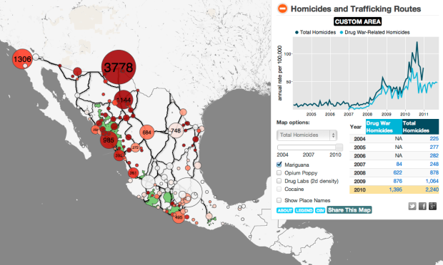
-
After a chat with his color deficient friends about how Vincent van Gogh’s paintings seem to appeal to all eyes, Kazunori Asada used visual filters to see how the paintings looked to the colorblind. The experiment produced some interesting results and musings:
Was van Gogh partially color vision deficiency (anomalous trichromat)? Perhaps using a strong color vision deficiency (dichromat) simulation was the wrong approach. How about carrying out the simulation by removing the middle portion of normal color vision, maybe then I could see van Gogh’s pictures in a better light?
The color choices for van Gogh’s popular paintings seem less out there with the filters. The greens in the sky of Starry Night, for example turn to yellows.
A colorblind van Gogh though? Probably not. Either way, don’t forget to pick your colors wisely. Asada has an easy-to-use tool to see what your own images look like to others.
-
I almost didn’t make a best-of list this year, but as I clicked…
-
-
Carl Bialik, for The Wall Street Journal, reports on PSAs and the use of scary numbers:
The Ad Council usually avoids statistics in PSAs. “We know from our experience that effective advertising has to have an emotional component and statistics-based campaigns can be very rational,” Conlon said. “We’ve also found that people tend not to believe statistics.”
And sometimes they just don’t care much about them. “When we were developing our underage drinking prevention campaign,” Conlon recalled, “we found that it doesn’t resonate with parents to learn about how many children are drinking underage. It’s too easy for them to say ‘it’s not my child.’ We found that it was much more compelling to include a statistic that was more about the consequences of underage drinking: Those who start drinking before age 15 are six times more likely to have alcohol problems as adults than those who start drinking at age 21 or older.”
The well-known Stalin quote comes to mind.
-
Stop global warming. Decrease the National Science Foundation’s R&D budget. It’s so easy. More lessons on correlation and causation found here.
-
-
Facebook logs and saves a lot of data about you and what you do on their site. This shouldn’t be surprising given the more time people spend on Facebook, the greater the cash flow, but just how much data do they store? Austrian law student Max Schrems, because European law states that citizens can do this, requested all the data Facebook had about him. He got back a CD with 1,222 PDF files.
Read More -
-
Charts and graphs are great, because they can let you see a pattern that you might not see in a spreadsheet, but they only work when you use the actual data. Fox News isn’t doing themselves any favors by putting up this chart. It shows the recently announced drop in unemployment rate to 8.6 percent as a non-change.
Read More -
Transportation check-ins on foursquare. This is from this past Thanksgiving, but relevant again with Christmas around the corner. White represents check-ins on highways and roads (really?), orange is for trains, and blue is of course is same-day check-ins at airports. I guess no one takes Amtrak cross-country anymore.
[foursquare via datavis]
-
-
Transparency International released annual data for the Corruption Perceptions Index. The Economist plotted it against the UN’s Human Development Index:
Comparing the corruption index with the UN’s Human Development Index (a measure combining health, wealth and education), demonstrates an interesting connection. When the corruption index is between approximately 2.0 and 4.0 there appears to be little relationship with the human development index, but as it rises beyond 4.0 a stronger connection can be seen. Outliers include small but well-run poorer countries such as Bhutan and Cape Verde, while Greece and Italy stand out among the richer countries.
Interesting, although I suspect that the indices have some factors in common.
[The Economist via @mikeloukides]
-
It’s always nice to hear from the people who are the best at what they do. Data visualization studio, Interactive Things has an interview series going, Substratum, that asks designers and artists the same set of questions. The most recent issue is with Amanda Cox from The New York Times and Nicholas Felton, who you know from his annual Feltron reports and now at Facebook.
Amanda Cox, the chart marker, on how her work and goals have changed over the years:
At one point — I call it my impressionist phase — I was really interested in making things abstract but interesting and beautiful. And then I had a “curves are fun” phase for a while where I was really into curved things. And then I had an “intentional simplicity” phase for a while, like, how stripped down can you make something and have it still be interesting? I don’t know what my current phase is, but it’s kind of an “aspirational reporting” phase. I’m not that great of a reporter yet, but I’m thinking a lot about how we can stop using the same information that’s already on the Internet and just remix that. I want to start working with more, deeper information, information that’s harder to surface.
This is coming from someone who has won an international award for being the best. So much to learn, I have.
-
As a resident at Eyebeam, Alexander Chen visualizes the first Prelude from Bach’s Cello Suites:
Using the mathematics behind string length and pitch, it came from a simple idea: what if all the notes were drawn as strings? Instead of a stream of classical notation on a page, this interactive project highlights the music’s underlying structure and subtle shifts.
Interaction version here. Charming.
[Alexander Chen via @blprnt]
-
-
Quick announcement: I have a handful of signed Visualize This copies available in case you’re looking for a gift for that data geek cousin or you’re up for some learning over the holidays. I only have a limited supply, so grab a copy before they’re gone. And of course, you can still get an untarnished version at the major booksellers.
-
During the riots in London this past summer, a lot of information spread quickly about what was going on. Some of that information was true and some was not so true. The Guardian explores this spread of information on Twitter, and how fact and fiction seem to reveal themselves on their own:
A period of unrest can provoke many untruths, an analysis of 2.6 million tweets suggests. But Twitter is adept at correcting misinformation – particularly if the claim is that a tiger is on the loose in Primrose Hill.
Other rumors include when rioters cooked their own food at McDonald’s (false), London Eye was set on fire (false), and Miss Selfridge was set on fire (true).
Each bubble represents a tweet and is sized by number of followers the tweeter has. The big one is usually the orignal tweet and the small ones that cluster around are retweets. Then the colors represent tweets that support, oppose, question, or comment. So when you play the animation for each rumor, bubbles swiftly pop up at the rumor peaks and then settle at true or false.
You can also use the scroll to move to a certain point in time, and roll over bubbles to see the tweets.
Really nice graphic and worth a look.
[Guardian via @jakeporway]