• Membership
  • Newsletter
  • Projects
  • Learning
  • About
  • Member Login
  • World subway paths at scale

    January 13, 2012

    Topic

    Maps  /  subway, world

    Urban planner Neil Freeman maps the world’s subway systems to scale in a minimal style resembling the scribbles or renderings of weird sea creatures by a two-year-old. I wish there were nodes to show stops, too, but the contrasts between the compact TRTA in Tokyo and RATP in Paris, and the spread out Seoul Metro and Transport for London is an interesting look.

    [Neil Freeman via @kennethfield]

  • Cinemetrics creates a visual fingerprint for movies

    January 12, 2012

    Topic

    Data Art

    As we saw with movie barcodes, each film has a uniqueness that can be broken into bits of data. Cinemetrics, by Frederic Brodbeck, provides a different view.
    Read More

  • Lego mathematics and growing complexity in networks

    January 12, 2012

    Topic

    Statistics  /  LEGO, networks

    Legos are the best toys ever invented. That’s indisputable fact. So it’s no surprise that Mark Changizi et al. at Duke University used the toys in their study of growing complexity of systems and networks. They looked at 389 Lego sets and compared the number of pieces in the set to the number of piece types, as shown above.
    Read More

  • Vehicles involved in fatal crashes

    January 11, 2012

    Topic

    Projects  /  calendar, fatal crashes, featured

    After seeing this map on The Guardian, I was curious about what other data was available from the National Highway Traffic Safety Administration. It turns out there’s a lot and it’s relatively easy to access via FTP. What’s most surprising is that it’s detailed and fairly complete, with columns for weather, number of people involved, date and time of accidents, and a lot more.
    Read More

  • New Hampshire results trackers

    January 10, 2012

    Topic

    Infographics  /  election, New Hampshire, trackers

    The New Hampshire results trackers are out in full force tonight. Ordered by my inclination to leave open in the background: Chicago Tribune, The New York Times, The Washington Post, The Guardian, MSNBC, and CNN. Take your pick.

  • Geometry of pasta

    January 10, 2012

    Topic

    Visualization

    From Pasta by Design by George L. Legendre, it’s exactly what you think it is. More pasta and equations at The New York Times. I may never see Fusilli the same way again. [via]

  • Pie step comment bubble 3D thing

    January 10, 2012

    Topic

    Ugly Charts

    This graphic by commenting platform DISQUS, arguing that higher quality online discussions come from those using pseudonyms, splits the percentage of comments by identity into pseudonyms, anonymous, and real names. Is it a bubble chart? A pie? A coincidental bowl of jello? Actually, it looks like the height of each section represents the three values, so it’s a misshapened bar chart of sorts. Oi.

    It’s trying so hard to look good that it comes across clunky and awkward.

    If anything, they should have focused on the quality signals data on the left. Wouldn’t that have been more interesting? Have at it in the comments.

    [DISQUS via @miguelrios]

  • Designing Google Maps

    January 10, 2012

    Topic

    Maps  /  Google, process

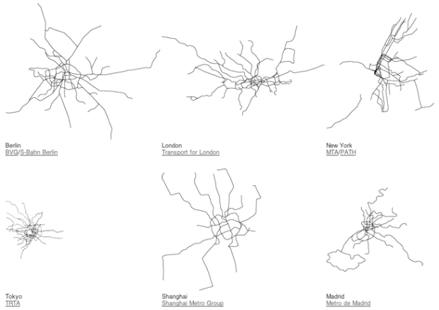
    Google Maps is one of Google’s best applications, but the time, energy, and thought put into designing it often goes unnoticed because of how easy it is to use, for a variety of purposes. Willem Van Lancker, a user experience and visual designer for Google Maps, describes the process of building a map application — color scheme, icons, typography, and “Googley-ness” — that practically everyone can use, worldwide.

    We have worked (and driven) around the world to create a “map” that is a collection of zoom levels, imagery, angles, and on-the-ground panoramas all wrapped into one. Through these varied snapshots of our world, we are attempting to sew together a more seamless picture of the Earth—from its natural beauty to the surprising (and often absurd) details that make it our unique home. As our work progresses, new technologies give us the opportunity to get away from the limitations and complexity of standard cartography to provide a much more approachable and easy-to-understand map, loaded with data and information.

    Remember when we had to refresh the page to see more of map?

    [Core77 via @awoodruff]

  • Map of Reddit

    January 9, 2012

    Topic

    Maps  /  hypothetical, Reddit

    Reddit user Laurel Quade mapifies the wonderful world of Reddit. Each country represents an area of interest, and “cities” are sized by inhabitants. I’m not familiar enough with the communities to know how accurate it is, but judging by the comments, I’d say pretty good.

    [Redditland via @adamsinger]

  • Predicting the future of prediction

    January 9, 2012

    Topic

    Statistics  /  Boston, prediction

    Tarot cards don’t cut it anymore as a predictors. We turn to data for a look to the future:

    “We’re finally in a position where people volunteer information about their specific activities, often their location, who they’re with, what they’re doing, how they’re feeling about what they’re doing, what they’re talking about,” said Johan Bollen, a professor at the School of Informatics and Computing at Indiana University Bloomington who developed a way to predict the ups and downs of the stock market based on Twitter activity. “We’ve never had data like that before, at least not at that level of granularity.” Bollen added: “Right now it’s a gold rush.”

    Or you could just get yourself a flux capacitor and save yourself some time.

    [Boston]

  • Teamwork and collaboration that built Watson

    January 8, 2012

    Topic

    Statistics  /  IBM, teamwork, Watson

    Team lead, David Ferrucci, recalls the early days of putting together the team that built Watson:

    Likewise, the scientists would have to reject an ego-driven perspective and embrace the distributed intelligence that the project demanded. Some were still looking for that silver bullet that they might find all by themselves. But that represented the antithesis of how we would ultimately succeed. We learned to depend on a philosophy that embraced multiple tracks, each contributing relatively small increments to the success of the project.

    As I sit here reading about egos within IBM, with the NFL playoffs in front of me, I can’t help but smirk.

    [New York Times via Simply Statistics]

  • Page 298 of 392
  • <
  • 1
  • ...
  • 295
  • 296
  • 297
  • 298
  • 299
  • 300
  • ...
  • 392
  • >

Analyze, visualize, and communicate data usefully, beyond the defaults.

Become a member →

Recently for Members

May 8, 2025
When the data is not what it seems

May 1, 2025
Finding the Right Charts

April 24, 2025
Visualization Tools, Datasets, and Resources – April 2025 Roundup

April 17, 2025
Breaking Out of Chart Software Defaults

April 15, 2025
Line Chart with Decorative Neon Accents

Browse by Chart Type See All →

Radar Chart Step Chart Small Multiples Box Plot Bar Chart Race Area Chart Timeline Variable Width Bar Chart Connected Scatter Plot Table

Browse By Topic

  • Visualization

    Seeing data

  • Maps

    Seeing geographic data

  • Infographics

    Explaining data

  • Networks

    Connecting data

  • Statistics

    Analyzing data

  • Software

    Working with data

  • Sources

    Getting data

  • Design

    Making data readable

Get the Book

Visualize This: The FlowingData Guide to Design, Visualization, and Statistics

Available now.

Order: Amazon / Bookshop

Made by FlowingData

  • The Process

  • Data Underload

  • Chart Everything

  • Guides

  • Books

  • Shop

  • About
  • Contact
  • Newsletter
  • LinkedIn
  • Instagram
  • Bluesky
  • RSS
Copyright © 2007-Present FlowingData. All rights reserved.