For the MIT Sloan Sports Analytics Conference a few weeks ago, Stanford biomechanical engineering student and Ayasdi analyst Muthu Alagappan presented his work on redefining basketball positions.
After studying players like LeBron James and Blake Griffin, many analysts are now suggesting that there are new positions, which are simply hybrids of the one’s we already had. For example, some players are now labeled “point-forwards” or “combo-guards.” But what if we were wrong about our initial five positions. Maybe a “Center” is just a label for people over a certain height, and there are actually three different types of big men in the NBA.
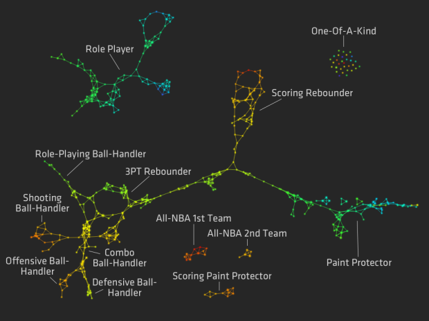
An analysis, done with data exploration tool Ayasdi Iris, provided 13 possible positions, as shown above. Nodes and edges are colored by points per minute on a blue (low) to red (high) scale.
So for example, those typically classified as centers or power forwards are classified as scoring rebounders, paint protectors, and scoring paint protectors. Dirk Nowitzki might be considered a scoring rebounder, whereas Joakim Noah is a paint protector.
The point? Hopefully teams can use this information to make better decisions about who to trade and draft. Of course, I’m sure scouts know about these fuzzy positions already, so I think the next step is to look at what positions the best teams have and had, and more importantly, how a “one-of-a-kind” player can change everything.



 Visualize This: The FlowingData Guide to Design, Visualization, and Statistics (2nd Edition)
