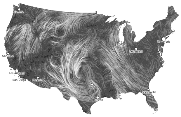
• From Autodesk Research, Citeology is an interactive that visualizes connections in academic research via paper citations:

    The names of each of the 3,502 papers published at the CHI and UIST Human Computer Interaction (HCI) conferences between 1982 and 2010 are listed by year and sorted with the most cited papers in the middle. In total, 11,699 citations were made from one article to another within this collection. These citations are represented by the curved lines in the graphic, linking each paper to those that it referenced.

    The interactive repsonds slowly to clicks and only works in Firefox for me, but it’s interesting to play around even if you aren’t familiar with CHI and HCI papers. It works better if you select one to three generations instead of all. Click on a specific paper and you get citations for that paper on the right (brown) and the papers that the selected cited on the left (blue).

    Color-coding for categories, authors, or subject could add another level of meaning to this. For example, do we see the subject evolve? Do papers that focus on a certain subject site outside of the main topic?

    [Citeology via infosthetics]

  • Food flavors across cultures and geography vary a lot. Some cuisines use a lot of scallion and ginger, whereas another might use a lot of onion and butter. Then again, everyone seems to use garlic. Yong-Yeol Ahn, et al. took a closer look at what makes food taste different, breaking ingredients into flavor compounds and examining what the ingredients had in common. A flavor network was the result:

    Each node denotes an ingredient, the node color indicates food category, and node size reflects the ingredient prevalence in recipes. Two ingredients are connected if they share a significant number of flavor compounds, link thickness representing the number of shared compounds between the two ingredients. Adjacent links are bundled to reduce the clutter.

    Mushrooms and liver are on the edges, out on their lonesome.

    [Nature | Thanks, Elise]

  • Thanks for making this a memorable year, everyone. Happy holidays!

  • After a chat with his color deficient friends about how Vincent van Gogh’s paintings seem to appeal to all eyes, Kazunori Asada used visual filters to see how the paintings looked to the colorblind. The experiment produced some interesting results and musings:

    Was van Gogh partially color vision deficiency (anomalous trichromat)? Perhaps using a strong color vision deficiency (dichromat) simulation was the wrong approach. How about carrying out the simulation by removing the middle portion of normal color vision, maybe then I could see van Gogh’s pictures in a better light?

    The color choices for van Gogh’s popular paintings seem less out there with the filters. The greens in the sky of Starry Night, for example turn to yellows.

    A colorblind van Gogh though? Probably not. Either way, don’t forget to pick your colors wisely. Asada has an easy-to-use tool to see what your own images look like to others.

    [Asada’s memorandum]

  • I almost didn’t make a best-of list this year, but as I clicked…

  • AntiMap is an open source toolset that lets you record movements with your iPhone or Android phone. Originally developed as a way for snowboarders to record their movements and play the data back like a video game, the toolset was generalized for all outdoor activities.
    Read More

  • Carl Bialik, for The Wall Street Journal, reports on PSAs and the use of scary numbers:

    The Ad Council usually avoids statistics in PSAs. “We know from our experience that effective advertising has to have an emotional component and statistics-based campaigns can be very rational,” Conlon said. “We’ve also found that people tend not to believe statistics.”

    And sometimes they just don’t care much about them. “When we were developing our underage drinking prevention campaign,” Conlon recalled, “we found that it doesn’t resonate with parents to learn about how many children are drinking underage. It’s too easy for them to say ‘it’s not my child.’ We found that it was much more compelling to include a statistic that was more about the consequences of underage drinking: Those who start drinking before age 15 are six times more likely to have alcohol problems as adults than those who start drinking at age 21 or older.”

    The well-known Stalin quote comes to mind.

    [The Numbers Guy]

  • Stop global warming. Decrease the National Science Foundation’s R&D budget. It’s so easy. More lessons on correlation and causation found here.

  • Facebook logs and saves a lot of data about you and what you do on their site. This shouldn’t be surprising given the more time people spend on Facebook, the greater the cash flow, but just how much data do they store? Austrian law student Max Schrems, because European law states that citizens can do this, requested all the data Facebook had about him. He got back a CD with 1,222 PDF files.
    Read More

  • Charts and graphs are great, because they can let you see a pattern that you might not see in a spreadsheet, but they only work when you use the actual data. Fox News isn’t doing themselves any favors by putting up this chart. It shows the recently announced drop in unemployment rate to 8.6 percent as a non-change.
    Read More