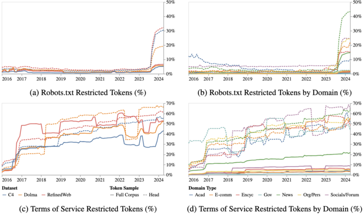
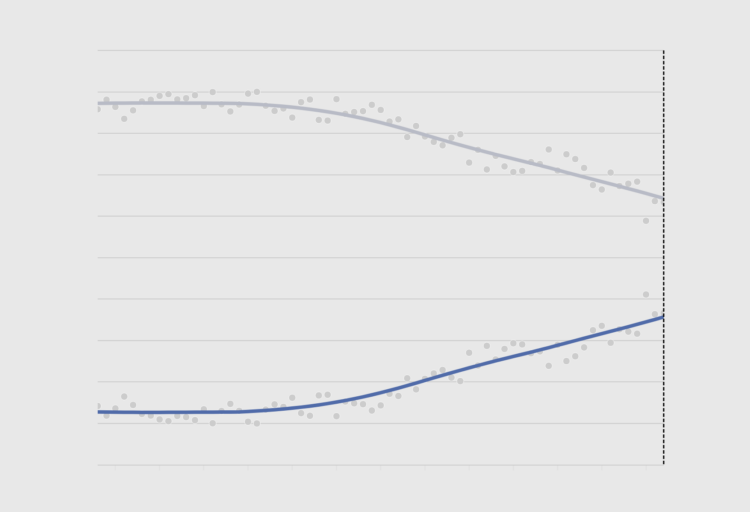
• Membership
  • Newsletter
  • Projects
  • Learning
  • About
  • Member Login
  • Maps in the wild

    March 14, 2024

    Topic

    Maps  /  decor, New York Times

    For the New York Times, Eve Kahn describes the use of maps outside of looking up directions:

    Cartographic décor can help sate fundamental human needs to feel oriented. “Maps are inherently trusted — there’s something about them that makes people feel secure,” said PJ Mode, a map scholar and collector who is donating his holdings to Cornell University. His main focus is “persuasive cartography”: maps meant to sway public opinion, for instance by advocating abolition in the early 1800s, or women’s suffrage or warmongering in the 1910s. Mr. Mode likes to quote what the writer and aviator Beryl Markham imagined that maps wanted to say to their users: “follow me closely, doubt me not. … Without me, you are alone and lost.”

  • Data Underload  /  age, marriage, relationships

    Common Age Differences, Married Couples

    Through pop culture, it sometimes seems like it’s common for there to be a wide age difference between spouses. How common are the age gaps, really? These are the age differences through the lens of the 2022 five-year American Community Survey.

    Read More
  • Racial bias in OpenAI GPT resume rankings

    March 13, 2024

    Topic

    Statistical Visualization  /  bias, Bloomberg, OpenAI, race, resume

    AI is finding its way into the HR workflow to sift through resumes. This seems like a decent idea on the surface, until you realize that the models that the AI is built on lean more towards certain demographics. For Bloomberg, Leon Yin, Davey Alba, and Leonardo Nicoletti experimented with the OpenAI GPT showing a bias:

    When asked to rank those resumes 1,000 times, GPT 3.5 — the most broadly-used version of the model — favored names from some demographics more often than others, to an extent that would fail benchmarks used to assess job discrimination against protected groups. While this test is a simplified version of a typical HR workflow, it isolated names as a source of bias in GPT that could affect hiring decisions. The interviews and experiment show that using generative AI for recruiting and hiring poses a serious risk for automated discrimination at scale.

    Yeah, that sounds about right.

  • Diversity in college admissions without considering race

    March 12, 2024

    Topic

    Statistical Visualization  /  admissions, college, SAT, Upshot

    For NYT’s The Upshot, Aatish Bhatia and Emily Badger model how colleges might promote diversity in admissions without (directly) considering race.

    A set of scatter plots show a theoretical students plotted by parent income and SAT score. Select between SAT-only admissions or a process that considers factors such as low income or school poverty to see how the percentages change.

  • Defining the greatest albums of all time

    March 11, 2024

    Topic

    Infographics  /  Chris Dalla Riva, Matt Daniels, music, polling, Pudding

    Rolling Stone published a list in 2003 that ranked the 500 greatest albums of all time. The list was updated in 2020, and there was a lot of change. For The Pudding, Chris Dalla Riva and Matthew Daniels delve into the shift and ask what makes an album the greatest.

    A lot of the differences appear to stem from who does the ranking, which makes for a good polling and statistical accuracy example.

  • Mapping the crops with the most potential in a changing climate

    March 8, 2024

    Topic

    Maps  /  agriculture, climate, food, Stamen

    The climate is changing, which means some crops will fair better or worse given new conditions. Stamen, in collaboration with Vision for Adapted Crops and Soils, mapped the potential shifts for a variety of crops.

    Be sure to see Stamen’s process post on the design choices behind the visual explorer.

  • Members Only

    Baseline Point of View

    March 7, 2024

    Topic

    The Process  /  baseline, point of view, questions

    The point of visualization is to understand what data is about, which is rarely just about the numbers and almost always about what the data represents.

  • Analysis of when movies use their own names in the dialogue

    March 7, 2024

    Topic

    Statistical Visualization  /  Alice Thudt, dialogue, Dominikus Baur, movies, title

    A title drop is when a movie mentions its own name during the film. Dominikus Baur and Alice Thudt analyzed thousands of scripts to calculate when and how often title drops occur:

    Alright, so here’s the number you’ve all been waiting for (drumroll):

    36.5% – so about a third – of movies have at least one title drop during their runtime.

    Also, there’s a total of 277,668 title drops for all 26,965 title-dropping movies which means that there’s an average of 10.3 title drops per movie that title drops. If they do it, they really go for it.

    They used barcode charts disguised as film to show when title drops occur in individual movies. A fisheye effect, which is often disorienting or decorative, comes in handy to highlight the drops.

  • Guides  /  baseline, rules

    Why Line Chart Baselines Can Start at Non-Zero

    There is a recurring argument that line chart baselines, like bar chart baselines, must start at zero, because anything else would be misleading, dishonest, and an insult to all that is good in the world. The critique is misguided.

    Line chart baselines do not have to start at zero.

    Read More
  • Tiny chip manufacturing, visually explained

    March 5, 2024

    Topic

    Infographics  /  chip, Financial Times, manufacturing, scale

    Microchips have gotten tiny. Like smaller than a red blood cell tiny. Financial Times goes Powers-of-Ten to show the scale and process of manufacturing itty-bitty microchips.

  • Where to see the total eclipse

    March 4, 2024

    Topic

    Maps  /  Bloomberg, eclipse

    There’s a total eclipse (a real one, not of the heart) happening on April 8, 2024. The next one isn’t until 2045, so if you don’t want to wait two decades, now’s your chance. For Bloomberg, Denise Lu shows where, when, and how the eclipse will go down across the United States. She covered pretty much every angle, so there’s no need for anyone else to make an eclipse map.

  • If we didn’t have leap years

    March 1, 2024

    Topic

    Infographics  /  CNN, leap year

    For CNN, Amy O’Kruk and Kenneth Uzquiano asked what would happen if we didn’t have leap years. Without the extra day every four years, we’d eventually have seasons time-shifted by half a year.

    Also, because the exact time it takes the Earth to orbit the sun is just under a quarter of a day, leap year adjustments are slightly off. We’ll have to adjust by one day every 3,333 years. I never thought about it, but it makes sense.

  • Rock map of Scotland

    March 1, 2024

    Topic

    Maps  /  geology, Harry Young, physical, Scotland

    Harry Jefferies shared his grandfather’s 30-year project:

    My grandpa who is 85 started making this rock map of Scotland in 1992. He collected rocks during amateur geology trips over 30 years. He says it had to be geologically correct and also aesthetically pleasing. He asked if I could share online as He wants to go viral so please share

    Thirty years. I’m a sucker for slow data collection and physical visualization.

  • Members Only

    Visualization Tools and Learning Resources, February 2024 Roundup

    February 29, 2024

    Topic

    The Process  /  roundup

    Every month I collect tools and resources that help you make better charts. Here’s the good stuff for February.

  • Algorithmic road trip to visit a street named after each day of the year

    February 29, 2024

    Topic

    Maps  /  algorithm, Ben Ashforth, OpenStreetMap, road trip

    [arve url=”https://www.youtube.com/watch?v=MwRbr-MjwII” /]

    Ben Ashforth set out to visit a street named after a day of the year for each date. He used OpenStreetMap to find the streets and then algorithmically routed a trip. Then he followed through and went on the trip. In a five-minute lightning talk, he describes the journey. See a photo for every day here. [via Waxy]

  • Data Underload  /  golf, McDonald's

    McDonald’s Locations vs. Golf Courses

    I read that there are more golf courses than there are McDonald’s locations in the United States, which seemed surprising. There are about 16,000 golf courses and 13,000 McDonald’s locations. How could this be? Obviously, there are a lot of McDonald’s locations, but where are all these golf courses? Some maps made it clear.

    Read More
  • Interactive LED basketball court

    February 27, 2024

    Topic

    Infographics  /  basketball, display

    [arve url=”https://www.youtube.com/watch?app=desktop&v=752_rIE53Tk” /]

    During the 2024 NBA All-Star weekend, the basketball court was essentially a giant LED screen on the second day. The company behind the panels talked about the technical side for a WTHR news segment, shown above.

    The court was fun to watch but also distracting. It draws your eyes to the ground when the action is ahead and above the rim. So the technology seems less than ideal for an actual game. Maybe good as an expensive practice and training tool? I couldn’t believe not a single shot chart was shown during the three-point contest.

  • Map of most common domesticated animals

    February 26, 2024

    Topic

    Maps  /  animals, domestic, John Johnson

    Based on data from the USDA Census of Agriculture, this map by John Johnson shows the predominant domesticated animal in each county in the United States. It nonchalantly includes humans.

  • Data Underload  /  age, rest, sleep, well-being

    Feeling Rested with Age

    How much you sleep each night matters, but more importantly, it’s about the quality and if you feel rested when you wake up. This seems to shift with age as responsibilities and sleep patterns change.

    The following chart shows how rested people felt, based on answers to the American Time Use Survey.

    Read More
  • Members Only

    Looking for a Denominator

    February 22, 2024

    Topic

    The Process  /  comparison, denominator

    To decide if values are high or low, sometimes you have to divide the numbers for a relative comparison instead of an absolute one.

  • Page 29 of 392
  • <
  • 1
  • ...
  • 26
  • 27
  • 28
  • 29
  • 30
  • 31
  • ...
  • 392
  • >

Analyze, visualize, and communicate data usefully, beyond the defaults.

Become a member →

Recently for Members

May 15, 2025
Step Chart, Enhanced

May 8, 2025
When the data is not what it seems

May 1, 2025
Finding the Right Charts

April 24, 2025
Visualization Tools, Datasets, and Resources – April 2025 Roundup

April 17, 2025
Breaking Out of Chart Software Defaults

Browse by Chart Type See All →

Unit Chart Choropleth Map Bubble Chart Dot Map Square Pie Chart Pictogram Ternary Plot Cartogram Surface Plot

Browse By Topic

  • Visualization

    Seeing data

  • Maps

    Seeing geographic data

  • Infographics

    Explaining data

  • Networks

    Connecting data

  • Statistics

    Analyzing data

  • Software

    Working with data

  • Sources

    Getting data

  • Design

    Making data readable

Get the Book

Visualize This: The FlowingData Guide to Design, Visualization, and Statistics

Available now.

Order: Amazon / Bookshop

Made by FlowingData

  • The Process

  • Data Underload

  • Chart Everything

  • Guides

  • Books

  • Shop

  • About
  • Contact
  • Newsletter
  • LinkedIn
  • Instagram
  • Bluesky
  • RSS
Copyright © 2007-Present FlowingData. All rights reserved.