• This came via Twitter from @christopferd:

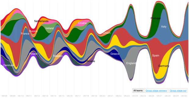
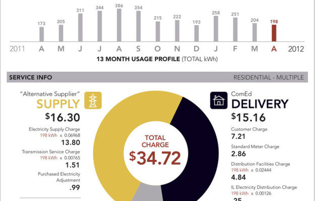
    Will @flowingdata caption my 2 yr old’s first [accidental] chart with his #thomas trains?

    How could I resist? You gotta get ’em while they’re young. I added the labels, mostly to show off my expansive knowledge of Thomas the Train Tank Engine and Friends.

  • Jer Thorp, a data artist in residence at The New York Times, shows off some of his work (like this and this) and speaks about the connection between the real world and the mechanical bits we know as data. Worth your 17 minutes.

    People often miss this point about data — that it’s a representation of the physical world — and because of that, things like uncertainty and complexity come attached to the numbers. There are also actual human beings associated with a lot of data. So while optimization, maximization, and efficiency are well and good, stories, ethics, and lessons are pretty good takeaways, too.

    Update: Don’t miss the unexpected discussion around data and capitalism.

    [Jer Thorp]

  • In this simple interactive animation by Periscopic, in partnership with UNICEF, we see the changes in urban population from 1950 up to present, through projections for 2050. Circle size represents urban population and color is an indicator for the percentage of people living in cities or towns.

    The color choice for the continuous scale is not ideal, but I think they were working within the bounds of the existing print report.

    For the map project, we were working with pre-existing content. They had produced the map for their print report, so we had to make it look as similar as possible to that. I know they didn’t use a Dorling cartogram, but I think their intention was to be similar to one. Certain sacrifices were made in order for it to fit the 2-page spread in the report. Unfortunately, the online version had to keep the same locations.

    [UNICEF | Thanks, Dino]

  • Interactive visualization continues to grow more useful and prominent in every day analysis. Jeffrey Heer and Ben Shneiderman offer a taxonomy for the budding field.

    Visualization provides a powerful means of making sense of data. By mapping data attributes to visual properties such as position, size, shape, and color, visualization designers leverage perceptual skills to help users discern and interpret patterns within data. A single image, however, typically provides answers to, at best, a handful of questions. Instead, visual analysis typically progresses in an iterative process of view creation, exploration, and refinement. Meaningful analysis consists of repeated explorations as users develop insights about significant relationships, domain-specific contextual influences, and causal patterns. Confusing widgets, complex dialog boxes, hidden operations, incomprehensible displays, or slow response times can limit the range and depth of topics considered and may curtail thorough deliberation and introduce errors. To be most effective, visual analytics tools must support the fluent and flexible use of visualizations at rates resonant with the pace of human thought.

    [ACM Queue via @krees]

  • The quantified self movement continues:

    This may sound creepy, but tens of thousands of patients around the world are already sharing information about symptoms and treatments for hundreds of conditions on websites such as PatientsLikeMe and CureTogether. This has yielded valuable results, such as the finding that patients who suffered from vertigo during migraines were four times more likely to have painful side effects when using a particular migraine drug. The growing number of self-tracking devices now reaching the market will increase the scope for large-scale data collection, enabling users to analyse their own readings and aggregate them with those of other people.

    Sure, it sounds nerdy and weird when you put it like that, but make it glow and call it fuel, and everyone goes nuts.

    [Economist]

  • Movies are a curious business. There a variety of forces that encourage people to pay for a movie ticket with an ever-increasing cost, one of those being the aggregate ratings on Rotten Tomatoes, but it’s not uncommon for well-reviewed movies to profit small and poorly reviewed movies to profit big. Krisztina Szucs takes a look at this relationship between Rotten Tomatoes score and profit.
    Read More

  • In collaboration with Lift and Near Future Laboratory, Interactive Things explores digital traces left by mobile phones in Ville Vivante. Lines and paths flow from place to place in Geneva, Switzerland, showing how the people move in and out of the city during a 24-hour period.

    It’s hard to say exactly what you’re seeing here because it does move so fast, and it probably means more if you live in or near Geneva, but speaking to the video itself, you have your highs and lows during the start and end of days. It then cycles through a handful of views, namely one that looks like wind blowing through and another where particles shoot up from the ground.

    There are also interactive views on the project site.

    Reminds me of David Wicks’ Drawing Water, which shows the flow of sources in the country.

    [Interactive Things via infosthetics]

  • The difference:

    In this animated short, the relationship between trend and variation are explained with an excellent analogy to a man walking his dog. There is much more variation in the path that the dog takes as compared with the man, but they are both headed the same way. Similarly, weather can be highly variable and climate means long term trends.

    I heard that a kitten dies every time a news anchor debunks global warming with an unexpected day of snow.

    [Spark]