• Adam Savage of Mythbusters gives a short talk on simple ideas leading to complex findings. Good. “Just thought a little bit harder” and “were a bit more curious.”

  • Essentially, all models are wrong, but some are useful.
    — George E. P. Box, Empirical Model-Building and Response Surfaces, 1987

    A favorite quote among statisticians.

  • Whoa. What did I just read?

    I think most of you know of Freakonomics, but in case you don’t, it started as a book in 2005, by economist Steven Levitt and journalist Stephen Dubner. The book examines corners of life (like cheating in sumo) through data. It’s a good read. SuperFreakonomics was the follow-up in 2009. Freakonomics has since grown up into a media company, complete with documentary, radio show, and blog. Needless to say, it’s had a lot of success.

    In the latest issue of American Scientist, statisticians Kaiser Fung and Andrew Gelman wrote a strong critique of Levitt and Dubner’s work.

    In our analysis of the Freakonomics approach, we encountered a range of avoidable mistakes, from back-of-the-envelope analyses gone wrong to unexamined assumptions to an uncritical reliance on the work of Levitt’s friends and colleagues. This turns accessibility on its head: Readers must work to discern which conclusions are fully quantitative, which are somewhat data driven and which are purely speculative.

    Fung and Gelman then cite examples that they believe erroneous.

    It’s not mean-spirited, but Gelman has a way of offending even if he doesn’t mean to, so I knew a third of the way through that this could not end well.

    Dubner replied. (Skip part II, which addresses a different issue that shouldn’t have been an issue in the first place.) He assesses — after explaining why almost everything that Fung and Gelman wrote is wrong — that they were blinded by their want to disprove.

    [O]nce they’d picked up a hammer, did everything look like a nail?

    Dubner continues:

    I can certainly understand why Freakonomics is an appealing target for someone like Gelman-Fung. As I noted earlier, there are strong incentives to attack, particularly in the public sphere, where one can get a ton of attention in a blink by assailing the reputation of someone who’s been plugging away for years. Whether in the academy, the media, the political arena, or elsewhere, public discourse these days often seems little more than a tit-for-tat game in which you wait for someone or something to achieve a certain momentum and then shout as loudly as you can that it’s “wrong!” Or, in written form: Epic fail.

    I’ve only read the first book, which like I said was really good, so I can’t really go with either side, but Dubner provides some compelling arguments, and I have a feeling most people will believe him more.

    Update: Gelman replies to the reply and Fung adds to that.

  • A couple of years ago, when you thought about online interactive maps, what came to your mind? Lots of yellow. Online maps are looking a lot different these days though, and Stamen Design has played a big role in making that happen. In their most recently released project, they offer three tile sets to use with OpenStreetMap data, and they look really good.

    All three are something to see, but the watercolor tiles will knock your socks off. They’re computer-generated, but they look hand-drawn by a skilled artist slash cartographer (which is really what the Stamen folks are).

  • For the MIT Sloan Sports Analytics Conference a few weeks ago, Stanford biomechanical engineering student and Ayasdi analyst Muthu Alagappan presented his work on redefining basketball positions.

    After studying players like LeBron James and Blake Griffin, many analysts are now suggesting that there are new positions, which are simply hybrids of the one’s we already had. For example, some players are now labeled “point-forwards” or “combo-guards.” But what if we were wrong about our initial five positions. Maybe a “Center” is just a label for people over a certain height, and there are actually three different types of big men in the NBA.

    An analysis, done with data exploration tool Ayasdi Iris, provided 13 possible positions, as shown above. Nodes and edges are colored by points per minute on a blue (low) to red (high) scale.

    So for example, those typically classified as centers or power forwards are classified as scoring rebounders, paint protectors, and scoring paint protectors. Dirk Nowitzki might be considered a scoring rebounder, whereas Joakim Noah is a paint protector.

    The point? Hopefully teams can use this information to make better decisions about who to trade and draft. Of course, I’m sure scouts know about these fuzzy positions already, so I think the next step is to look at what positions the best teams have and had, and more importantly, how a “one-of-a-kind” player can change everything.

  • Fathom Information Design, in collaboration with GE, visualizes GE annual reports from 1892 to 2011. It doesn’t sound so interesting at first, but browse the appearance of keywords, and you do get a sense of change.

    We’ve scanned 6,000 pages of GE’s annual reports to build this interactive visualization. But why? What’s the point? Not only does this provide a rich history of how GE has always been at work building, moving, powering and curing the world, but it is a true reflection of how the economy, U.S. and the world as a whole has progressed from 1892 until 2011. By diving deep into key terms, users can uncover interesting stories about innovation over the last century.

    Each column represents an annual report, and each little square represents a page. Select a keyword, and pages that use that word are highlighted. Finally, you can actually read each page of the report by clicking on a column. It expands.

    Update: Fathom provides background on what you can glean from the interactive.

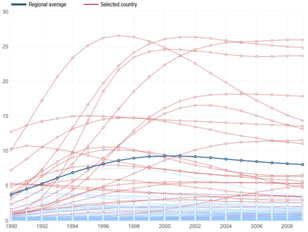
  • Carbon output. We want to reduce it, but some countries have a longer way to go than others. Pitch Interactive shows progress (or non-progress) by country in this interactive for the Climate Institute. Three indices are shown along with an overall score, which is a composite of the three, and countries are sorted by the average score from 1995 to 2008. Higher scores are better.

    The interaction makes this graphic. When you switch between indices, the countries are sorted appropriately and the time series for each country are drawn. You can also click on a country to get a closer view, which albeit is only four data points per country and index, but it’s still useful.

    The lines for each country get thicker from left to right, which was to provide a sense of progress, but I wonder if it would be worthwhile to use thickness to represent an increase or decrease from the previous year. Then again, that’s easy enough to see already, so maybe not.

  • UC San Diego student Cyrus Kiani animates 5,930 front pages from The Hawaiian Star, from 1893 to 1912. Pretty much everything on the page gets bigger — the columns, headers, and pictures — while the physical size of the page stays the same. Too bad it only goes up to 1912. It would’ve been fun to see the birth of the giant front page photo.

    (I thought I saw something like this done for The New York Times front page or online homepage, but I can’t find it.)

  • Remember Bret Victor’s live coding talk from last month? He presented an example where he would edit code on one side, and the corresponding visual would automatically update on the other side. It was instant feedback that could help in learning code. Gabriel Florit implemented the idea with D3, and it’s called water. Edit on the right and the diagram updates on the left. Try clicking on a number and then holding down the Alt key (or option on the Mac) for slider goodness.

    Also, check out Daniel Hooper’s interactive JavaScript editor, CodeBook. It’s the same idea but a slightly different implementation.

    [via Waxy]