• Membership
  • Books
  • Projects
  • Learning
  • About
  • Member Login
  • Chart Chooser helps you choose charts

    June 25, 2012

    Topic

    Statistical Visualization  /  Juice Analytics

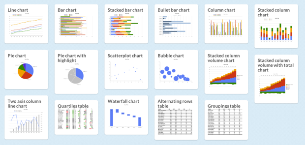
    There are a lot of charts to choose from, and if you pick the wrong one you’ll end up communicating the wrong message or make it hard for others to read your data. Luckily, Juice Analytics has you covered with an interactive Chart Chooser, based on Andrew Abela’s flowchart from a few years ago.

    There are toggle buttons on the top that let you filter based on what you’re looking for, such as a trend or relationship. For example, if you select comparison, distribution, and composition, you’re left with a bar chart. Don’t care about distribution? You can also try a stacked bar chart.

    There is a second set of buttons that let you choose between Powerpoint or Excel. Once you find the appropriate chart type, you can download the template for the software you selected. Of course, if you’re not an Office user, you can always just use it for the choice making.

  • Endangered languages project

    June 25, 2012

    Topic

    Maps  /  Google, interactive, language, Vizzuality

    Google, in collaboration with Vizzuality, are trying to catalog endangered languages before they are gone forever in the Endangered Languages Project.

    Humanity today is facing a massive extinction: languages are disappearing at an unprecedented pace. And when that happens, a unique vision of the world is lost. With every language that dies we lose an enormous cultural heritage; the understanding of how humans relate to the world around us; scientific, medical and botanical knowledge; and most importantly, we lose the expression of communities’ humor, love and life. In short, we lose the testimony of centuries of life.

    A map on the homepage gets the most attention. Each small dot represents a language, and they are color-coded by endangerment risk. Click on one to get more details about the language or add information yourself to improve the records. Zoom out and the counts aggregate for an overview.

  • Pulp Fiction presented in chronological order

    June 22, 2012

    Topic

    Infographics  /  movies, Pulp Fiction

    Smith hopes to put it print. Currently in Kickstarter mode.

  • 857 empty desks on National Mall used to represent high school drop-outs

    June 22, 2012

    Topic

    Data Art  /  education, installation

    As part of their campaign to prioritize education and get presidential candidates talking about it, the College Board setup 857 empty desks on the National Mall to represent the estimated number of high school drop-outs per hour. Although a simple physical installation, it carries a lot of weight.

    [via @Periscopic]

  • Bourdieu’s Food Space chart, from fast food to French Laundry

    June 21, 2012

    Topic

    Infographics  /  food

    In Pierre Bourdieu’s Distinction: A Social Critique of the Judgement of Taste from 1979 is a chart that shows the taste of food against economic capital and cultural capital. Gastronomica updated the chart. Mmmmm, underground super club food truck. [Thanks, Jonathan]

  • Synchronized Swimming in Data and the Water Metaphor

    June 21, 2012

    Topic

    Statistics  /  drowning

    The flood. The avalanche. The tsunami. Drowning in data. For the past few years, a couple of times a week, there’s an article about all the data we have access to and how we’re struggling to stay afloat in the growing sea of data. Big data is getting too big they say.

    The water metaphor is fine, but the fear of the data flow is irrational, so let’s run swim with the former.
    Read More

  • Analysis of chords used in popular songs

    June 20, 2012

    Topic

    Statistics  /  music

    Hooktheory, a system for learning to write music, analyzed 1,300 popular songs for how chords were used. The above shows chords that followed an E minor chord.

    This result is striking. If you write a song in C with an E minor in it, you should probably think very hard if you want to put a chord that is anything other than an A minor chord or an F major chord. For the songs in the database, 93% of the time one of these two chords came next.

    The most common chords used overall were G, F, and C.

    [via Waxy]

    Update: See also this great musical sketch by Axis of Awesome in which they sing some 40 songs that use the same four chords. [Thanks, Jan]

  • World sentiment mapped, based on Wikipedia

    June 20, 2012

    Topic

    Maps  /  animation, sentinment, Wikipedia

    Kalev H. Leetaru animated world sentiment over time, based on Wikipedia entries.

    See the positive or negative sentiments unfold through Wikipedia through space and time. Each location is plotted against the date referenced and cross referenced when mentioned with other locations. The sentiment of the reference is expressed from red to green to reflect negative to positive.

    Sentiment stays green for the most part, with the exception of major wars, and I’m not so sure that a world map is a good way to show the relationships. For example, when the animation hits 2000, the map is basically a green blob. It’s a good start though and touches on maybe the next step of the coverage maps we’ve seen lately.

  • Page 274 of 394
  • <
  • 1
  • ...
  • 271
  • 272
  • 273
  • 274
  • 275
  • 276
  • ...
  • 394
  • >

Analyze, visualize, and communicate data usefully, beyond the defaults.

Become a member →

Recently for Members

June 12, 2025
Comparing multiples

June 5, 2025
Caring Data

May 29, 2025
Visualization Tools and Resources, May 2025 Roundup

May 22, 2025
Conflicting points of view over the same data

May 15, 2025
Step Chart, Enhanced

Second Edition

Visualize This: The FlowingData Guide to Design, Visualization, and Statistics (2nd Edition)

New tools, refined process.

Order: Amazon / Bookshop

Browse by Chart Type See All →

Barcode Chart Word Cloud Area Chart Dot Plot Baseline Chart Pyramid Chart Parallel Coordinates Frequency Trails Glyph Chart Donut Chart

Browse By Topic

  • Visualization

    Seeing data

  • Maps

    Seeing geographic data

  • Infographics

    Explaining data

  • Networks

    Connecting data

  • Statistics

    Analyzing data

  • Software

    Working with data

  • Sources

    Getting data

  • Design

    Making data readable

Made by FlowingData

  • The Process

  • Data Underload

  • Chart Everything

  • Guides

  • Books

  • Shop

  • About
  • Contact
  • Newsletter
  • LinkedIn
  • Instagram
  • Bluesky
  • RSS
Copyright © 2007-Present FlowingData. All rights reserved.