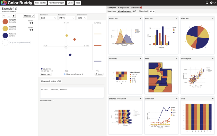
On April 8, 2024, the moon is going to completely block the sun along a designated path. For the Washington Post, Dylan Moriarty and Kevin Schaul use a strip of satellite imagery to show the totality across the United States, with events and time along the way.
-
For the past few years, Laurie Anderson has been using an AI chatbot to talk her husband who died in 2013. For the Guardian, Walter Marsh reports:
In one experiment, they fed a vast cache of Reed’s writing, songs and interviews into the machine. A decade after his death, the resulting algorithm lets Anderson type in prompts before an AI Reed begins “riffing” written responses back to her, in prose and verse.
“I’m totally 100%, sadly addicted to this,” she laughs. “I still am, after all this time. I kind of literally just can’t stop doing it, and my friends just can’t stand it – ‘You’re not doing that again are you?’
“I mean, I really do not think I’m talking to my dead husband and writing songs with him – I really don’t. But people have styles, and they can be replicated.”
One part of me feels like this isn’t the way to preserve a memory of someone who is gone, but the other part feels that I would do the same thing if I were in her situation and had the opportunity.
See also the man who trained an AI chatbot with old texts from his dead fiancee.
-
Members Only
-
For the New York Times, Eve Kahn describes the use of maps outside of looking up directions:
Cartographic décor can help sate fundamental human needs to feel oriented. “Maps are inherently trusted — there’s something about them that makes people feel secure,” said PJ Mode, a map scholar and collector who is donating his holdings to Cornell University. His main focus is “persuasive cartography”: maps meant to sway public opinion, for instance by advocating abolition in the early 1800s, or women’s suffrage or warmongering in the 1910s. Mr. Mode likes to quote what the writer and aviator Beryl Markham imagined that maps wanted to say to their users: “follow me closely, doubt me not. … Without me, you are alone and lost.”
-
Through pop culture, it sometimes seems like it’s common for there to be a wide age difference between spouses. How common are the age gaps, really? These are the age differences through the lens of the 2022 five-year American Community Survey.
-
AI is finding its way into the HR workflow to sift through resumes. This seems like a decent idea on the surface, until you realize that the models that the AI is built on lean more towards certain demographics. For Bloomberg, Leon Yin, Davey Alba, and Leonardo Nicoletti experimented with the OpenAI GPT showing a bias:
When asked to rank those resumes 1,000 times, GPT 3.5 — the most broadly-used version of the model — favored names from some demographics more often than others, to an extent that would fail benchmarks used to assess job discrimination against protected groups. While this test is a simplified version of a typical HR workflow, it isolated names as a source of bias in GPT that could affect hiring decisions. The interviews and experiment show that using generative AI for recruiting and hiring poses a serious risk for automated discrimination at scale.
Yeah, that sounds about right.
-
For NYT’s The Upshot, Aatish Bhatia and Emily Badger model how colleges might promote diversity in admissions without (directly) considering race.
A set of scatter plots show a theoretical students plotted by parent income and SAT score. Select between SAT-only admissions or a process that considers factors such as low income or school poverty to see how the percentages change.
-
Rolling Stone published a list in 2003 that ranked the 500 greatest albums of all time. The list was updated in 2020, and there was a lot of change. For The Pudding, Chris Dalla Riva and Matthew Daniels delve into the shift and ask what makes an album the greatest.
A lot of the differences appear to stem from who does the ranking, which makes for a good polling and statistical accuracy example.
-
The climate is changing, which means some crops will fair better or worse given new conditions. Stamen, in collaboration with Vision for Adapted Crops and Soils, mapped the potential shifts for a variety of crops.
Be sure to see Stamen’s process post on the design choices behind the visual explorer.
-
Members Only
-
A title drop is when a movie mentions its own name during the film. Dominikus Baur and Alice Thudt analyzed thousands of scripts to calculate when and how often title drops occur:
Alright, so here’s the number you’ve all been waiting for (drumroll):
36.5% – so about a third – of movies have at least one title drop during their runtime.
Also, there’s a total of 277,668 title drops for all 26,965 title-dropping movies which means that there’s an average of 10.3 title drops per movie that title drops. If they do it, they really go for it.
They used barcode charts disguised as film to show when title drops occur in individual movies. A fisheye effect, which is often disorienting or decorative, comes in handy to highlight the drops.
-
There is a recurring argument that line chart baselines, like bar chart baselines, must start at zero, because anything else would be misleading, dishonest, and an insult to all that is good in the world. The critique is misguided.
Line chart baselines do not have to start at zero.
-
Microchips have gotten tiny. Like smaller than a red blood cell tiny. Financial Times goes Powers-of-Ten to show the scale and process of manufacturing itty-bitty microchips.
-
There’s a total eclipse (a real one, not of the heart) happening on April 8, 2024. The next one isn’t until 2045, so if you don’t want to wait two decades, now’s your chance. For Bloomberg, Denise Lu shows where, when, and how the eclipse will go down across the United States. She covered pretty much every angle, so there’s no need for anyone else to make an eclipse map.
-
For CNN, Amy O’Kruk and Kenneth Uzquiano asked what would happen if we didn’t have leap years. Without the extra day every four years, we’d eventually have seasons time-shifted by half a year.
Also, because the exact time it takes the Earth to orbit the sun is just under a quarter of a day, leap year adjustments are slightly off. We’ll have to adjust by one day every 3,333 years. I never thought about it, but it makes sense.
-
Harry Jefferies shared his grandfather’s 30-year project:
My grandpa who is 85 started making this rock map of Scotland in 1992. He collected rocks during amateur geology trips over 30 years. He says it had to be geologically correct and also aesthetically pleasing. He asked if I could share online as He wants to go viral so please share
Thirty years. I’m a sucker for slow data collection and physical visualization.
-
Members Only
-
[arve url=”https://www.youtube.com/watch?v=MwRbr-MjwII” /]
Ben Ashforth set out to visit a street named after a day of the year for each date. He used OpenStreetMap to find the streets and then algorithmically routed a trip. Then he followed through and went on the trip. In a five-minute lightning talk, he describes the journey. See a photo for every day here. [via Waxy]
-
I read that there are more golf courses than there are McDonald’s locations in the United States, which seemed surprising. There are about 16,000 golf courses and 13,000 McDonald’s locations. How could this be? Obviously, there are a lot of McDonald’s locations, but where are all these golf courses? Some maps made it clear.
-
[arve url=”https://www.youtube.com/watch?app=desktop&v=752_rIE53Tk” /]
During the 2024 NBA All-Star weekend, the basketball court was essentially a giant LED screen on the second day. The company behind the panels talked about the technical side for a WTHR news segment, shown above.
The court was fun to watch but also distracting. It draws your eyes to the ground when the action is ahead and above the rim. So the technology seems less than ideal for an actual game. Maybe good as an expensive practice and training tool? I couldn’t believe not a single shot chart was shown during the three-point contest.