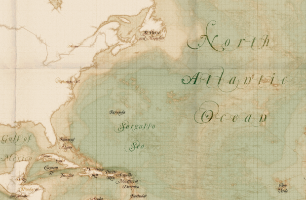
• Kalev H. Leetaru animated world sentiment over time, based on Wikipedia entries.

    See the positive or negative sentiments unfold through Wikipedia through space and time. Each location is plotted against the date referenced and cross referenced when mentioned with other locations. The sentiment of the reference is expressed from red to green to reflect negative to positive.

    Sentiment stays green for the most part, with the exception of major wars, and I’m not so sure that a world map is a good way to show the relationships. For example, when the animation hits 2000, the map is basically a green blob. It’s a good start though and touches on maybe the next step of the coverage maps we’ve seen lately.

  • Molecular astrophysicist Invader Xan drew spaceships, real and fictional, to scale.

    This, my friends, is an image showing several of the most notable spacecraft we plucky human beings have created (and are busily creating) to date. The past, the present, and the ones that never quite made it. All spacecraft shown are to scale (assuming my sources were accurate). Because I felt I needed to exercise my graphic design muscles. And because, well, let’s face it — space ships are just inherently cool, aren’t they?

    Dibs on the Starship Enterprise.

    [via Boing Boing]

  • Online maps have made it easy to find directions from point A to point B, but when you’re going on a long road trip, you want to know more about where you’re going. What will the weather be like? What is there to do at each stopped? Design and technology studio Stamen made a travel planner in work for the Weather Channel that tells you. Put in your origin and destination and when you will leave, and you get a map with weather icons along the way.

    So let’s say you’re driving from New York to San Francisco, and you’re trying to decide whether to go straight across or loop up or down a bit; this will give you a sense for whether it’s going to be rainy or sunny when you plan to be in the middle of Nebraska. You can drag around the rainy bits if you like, and also along the way maybe you’d like to stop for a bite to eat, so we’re hitting the Yelp API to give you a sense of where to go and what to see.

    Give it a try here. It’s kind of awesome.

  • In an article for Significance Magazine, economists Barry Reilly, Neil Rickman and Robert Witt explain why robbing banks stinks as a profession.

    The return on an average bank robbery is, frankly, rubbish. It is not unimaginable wealth. It is a very modest £12 706.60 per person per raid. Indeed, it is so low that it is not worth the banks’ while to spend as little as £4500 per cashier position at every branch on rising screens to deter them.

    A single bank raid, even a successful one, is not going to keep our would-be robber in a life of luxury. It is not going to keep him long in a life of any kind. Given that the average UK wage for those in full-time employment is around £26 000, it will give him a modest lifestyle for no more than 6 months. If he decides to make a career of it, and robs two banks a year to make a sub-average income, his chances of eventually getting caught will increase: at 0.8 probability per raid, after three raids or a year and a half his odds of remaining at large are 0.8×0.8×0.8=0.512; after four raids he is more likely than not to be inside. As a profitable occupation, bank robbery leaves a lot to be desired.

    Be sure to read the full article for more details on the varying gains and losses when the team is bigger and whether or not a gun is used. Spoiler: an additional member to the robbing team raises the expected haul by about £9,000, and the use of a firearm raises the expected output by about £10,000. Just don’t get arrested.

    [via Ars Technica]

  • Dave Delisle mapped the Toronto TTC Subway in the style of Super Mario Bros. 3. Adorn your walls with the print. [via Boing Boing]

  • The newest episode of This American Life is on the game of Blackjack. Years ago one summer, I was a recent college graduate with a degree in engineering and a minor in statistics, making seven bucks and some change an hour and waiting for grad school to start. My idle mind grew obsessed with card counting. It didn’t work out so well, but needless to say I found this episode fascinating.

  • Matthew Cusick uses maps as his brush and palette in a series of portraits and landscapes. Pretty.

  • 3-D pie charts are never a good idea? Ha. You just got served.…

  • MIT Technology Review profiles the Facebook Data Science Team, described as a gathering of grad students at a top school and headed by Cameron Marlow, the “young professor.”

    Back at Facebook, Marlow isn’t the one who makes decisions about what the company charges for, even if his work will shape them. Whatever happens, he says, the primary goal of his team is to support the well-being of the people who provide Facebook with their data, using it to make the service smarter. Along the way, he says, he and his colleagues will advance humanity’s understanding of itself. That echoes Zuckerberg’s often doubted but seemingly genuine belief that Facebook’s job is to improve how the world communicates. Just don’t ask yet exactly what that will entail. “It’s hard to predict where we’ll go, because we’re at the very early stages of this science,” says ­Marlow. “The number of potential things that we could ask of Facebook’s data is enormous.”