• Animator and illustrator Rufus Blacklock animated 60 years of Formula One race car design. The outline of each year’s car morphs from design to design, the engine shifts location, and the steering wheel changes shape. The video as a whole is pretty sexy.

    He also took a look at just the steering wheel’s evolution. I’m almost certain the next iteration will be non-existent in the future, where only robots race. Speaking of which, whatever happened to Robot Wars? That was good entertainment.

    [via Revolutions]

  • The Mitt Romney campaign put this venn diagram up a few days ago, aiming to show the “promise gap.” On the left is an Obama promise, and on the right is the result. In the middle, the combination of the promise and the result, is the gap. Wait, that’s not right.

  • Jonathan Corum for the New York Times mapped cloud coverage from April 2011 to April 2012.

    At any moment, about 60 percent of the earth is covered by clouds, which have a huge influence on the climate. An animated map showing a year of cloud cover suggests the outlines of continents because land and ocean features influence cloud patterns.

    So if I’m understanding it right, the continent boundaries come straight from the cloud data, provided by NASA Earth Observations. No lines are drawn underneath, which is kinda awesome. [via @datapointed]

  • The geographers at Floatingsheep are at it again, this time comparing tweets that mention beer and those that mention church.

    Given the cultural content of the “church” tweets, the clustering of relatively more “church” than “beer” content in the southeast relative to the north-east suggests that this could be a good way to identify the contours of regional difference. In order to quantify these splits, we ran a Moran’s I test for spatial auto-correlation which proved to be highly significant as well. Without going into too much detail, this test shows which counties with high numbers of church tweets are surrounded by counties with similar patterns (marked in red) and which counties with many beer tweets are surrounded by like-tweeting counties (marked in blue). Intriguingly there is a clear regional (largely north-south split) in tweeting topics which highlights the enduring nature of local cultural practices even when using the latest technologies for communication.

    I wonder if searches for “ate too much” or “out for a run” would match up with obesity trends. Hopefully their Data on Local Life and You (DOLLY) project comes to fruition.

  • The Washington Post has a fun piece that compares your age to that of Olympic athletes over the past three years.

    In the past three Summer Olympics, 64 of the U.S. team’s 1,707 athletes have been age 40 and older — and they won 23 medals. As we watch 16-year olds compete in the gymnastics events, even the 20-somethings among us look back regretfully and wonder if our glory days have passed. Here, we take a look at which sports skew young and which allow for more longevity. In which events might you still have a chance this summer?

    Enter your gender and age, and the chart updates with a slider that shows the events that you still have hope for. I don’t know about you, but I’m going for shooting.

    The initial view shows both male and female ranges in an overlapping bar chart (Is there a formal name for it?), which has been showing up a little more lately, instead of a clustered bar chart. It’s a more compact view, which can be useful when there are a lot of categories.

  • Don’t know what the Higgs Boson is (or even how to pronounce it)? PhD Comics, my personal favorite, illustrated it in this short video a couple of months ago.

  • July 4, 2012

    Topic

    Design  / 

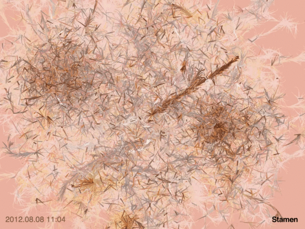
    Stamen Design is the cover story of this month’s Icon Magazine. Well deserved. On infographics and the growing number of tools to make them:

    Stamen finds inspiration everywhere, but Rodenbeck hopes that the public will stop conflating infographics with data visualization. “The rise of the infographic as a genre is a little depressing. Back when desktop publishing started, people were worried that there would be no more room for designers, that computers would do all the work for you. But this clearly didn’t turn out to be the case.” While someone without design training [or skill — E] could make use of desktop publishing to create a holiday card or office leaflet or company newsletter, the band at the top for good designers actually grew. In a similar way, he says, “infographics have become the mother’s day cards — the company newsletters — of data visualization.”

    It’s like that with anything that involves creation really. Someone makes some software so that the computer can do some of the work for you, but it’ll never be able to do all the work. R can spit out graphics, but you still have to decide what bits of the output to use and interpret what’s in front of you. People find this out and what it takes to make something worthwhile when they try to do it themselves.

    Whenever a new site pops up to make infographic creation a snap, my Twitter feed bubbles with gripes and scoffs. Once all those applications come out of beta though, I think we (the data folk) are still gonna be okay.

  • How to Make Stacked Area Charts in R

    From the basic area chart, to the stacked version, to the streamgraph, the geometry is similar. Once you know how to do one, you can do them all.