Inspired by Nelson Minar’s map of US rivers, Mike Bostock demonstrates how to generate your own TopoJSON from the same river data. As indicated by the name, the file format is a way to encode topology, and it does so in a compact way.
Read More
-
-
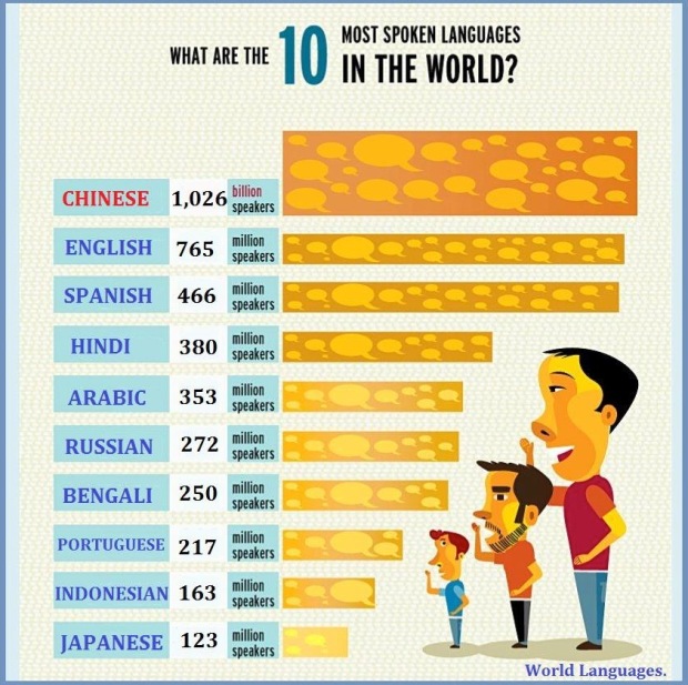
Whoa. There are a lot of things wrong with this chart. Gold star for every mistake that you find. And there are many stars to hand out.
Read More -
Here’s where to go next once you’ve covered the basics of visualization. When it’s time to actually start making things.
-
-
-
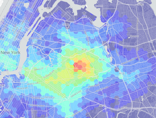
As more New Yorkers move farther away from Manhattan, transit times grow in importance. WNYC made a nice interactive map that shows how far one has to travel based on location. Simply click a location on the map and colors indicate how far it takes to get to your surroundings.
It reminds me of Trulia’s commute maps, which is the same idea but they estimate travel time for the entire country. Although I’m not sure if the data sources behind the maps are the same, the two maps seem to spit out similar results.
-
Vivien Marx in Nature Methods:
Data from an experiment may appear rock solid. Upon further examination, the data may morph into something much less firm. A knee-jerk reaction to this conundrum may be to try and hide uncertain scientific results, which are unloved fellow travelers of science. After all, words can afford ambiguity, but with visuals, “we are damned to be concrete,” says Bang Wong, who is the creative director of the Broad Institute of MIT and Harvard. The alternative is to face the ambiguity head-on through visual means.
I still struggle with uncertainty and visualization. I haven’t seen many worthwhile solutions other than the old standbys, boxplots and histograms, which show distributions. But how many people understand spread, skew, etc? It’s a small proportion, which poses an interesting challenge.
-
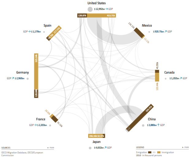
Global Economic Dynamics, by the Bertelsmann Foundation in collaboration with 9elements, Raureif, and Boris Müller, provides an explorer that shows country relationships through migration and debt. Inspired by a New York Times graphic from a few years ago, which was a static look at debt, the GED interactive allows you to select among 46 countries and browse data from 2000 through 2010.
Each outer bar represents a country, and each connecting line either indicates migration between two countries or bank claims, depending on which you choose to look at. You can also select several country indicators, which are represented with bubbles. (The image above shows GDP.) Although, that part of the visualization is tough to read with multiple indicators and countries.
The strength of the visualization is in the connections and the ability to browse the data by year. The transitions are smooth so that it’s easy to follow along through time. The same goes for when you select and deselect countries.
-
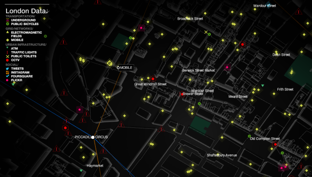
Watch_Dogs is a video game that imagines Chicago as a city where everyone and everything is linked through a central network. You play as a hacker who has access to all this information. This of course is fiction, but WeareData, also by the game makers, shows Paris, Berlin, and London, as if it were the Chicago in the game using real-world data.
Watch_Dogs WeareData is the first website to gather publicly available data about Paris, London and Berlin, in one location. Each of the three towns is recreated on a 3D map, allowing the user to discover the data that organises and runs modern cities today, in real time. It also displays information about the inhabitants of these cities, via their social media activity.
The ambient music, sound effects, and aesthetics provide a eerie feel to the view, as if you’re spying on these cities from above. Although as you click items on the map, you’ll see the data is not nearly as ominous.
-
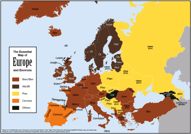
Feòrag NicBhrìde provides a handy map on how to say beer in European countries. This is important. [via Boing Boing]
-
-
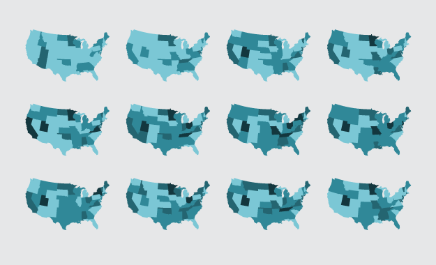
Small Maps and Grids
Maybe you want to make spatial comparisons over time or across categories. Organized small maps might do the trick.
-
We read and hear numbers in the news all the time, but it can be hard to imagine what those numbers mean. For example, big numbers, on the scale of billions, are hard to picture in our head, because we don’t typically handle that many things at one time. Most of us have never seen a billion dollars plopped in front of us. The Dictionary of Numbers, a Google Chrome extension by Glen Chiacchieri, can help you out in this department.
I noticed that my friends who were good at math generally rely on “landmark quantities”, quantities they know by heart because they relate to them in human terms. They know, for example, that there are about 315 million people in the United States and that the most damaging Atlantic hurricanes cost anywhere from $20 billion to $100 billion. When they explain things to me, they use these numbers to give me a better sense of context about the subject, turning abstract numbers into something more concrete.
When I realized they were doing this, I thought this process could be automated, that perhaps through contextual descriptions people could become more familiar with quantities and begin evaluating and reasoning about them.
Install the extension, and as shown in the video above, it injects inline descriptions next to numbers in articles. You can also use the search box. Enter “100 meters” and you get “about the height of the Statue of Liberty.” Although still rough around the edges (It seems to find descriptions for a limited index of numbers.), the Dictionary is an interesting experiment in making numbers for relatable.
-
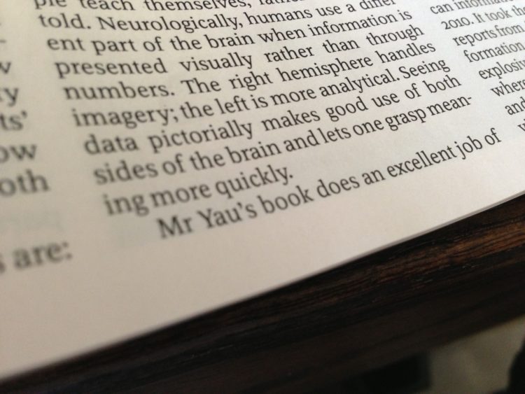
The Economist covered a handful of visualization books in this week’s issue, and Data Points was in the bunch (nice).
Read More -
Immersion by the MIT Media Lab is a view into your inbox that shows who you interact with via email over the years.
Immersion is an invitation to dive into the history of your email life in a platform that offers you the safety of knowing that you can always delete your data.
Just like a cubist painting, Immersion presents users with a number of different perspectives of their email data. It provides a tool for self-reflection at a time where the zeitgeist is one of self-promotion. It provides an artistic representation that exists only in the presence of the visitor. It helps explore privacy by showing users data that they have already shared with others. Finally, it presents users wanting to be more strategic with their professional interactions, with a map to plan more effectively who they connect with.
The base view is a network diagram where each node represents someone you’ve exchanged email with. The more emails between you and that person, the bigger the node, and people who tend to email each other (I’m guessing a count of CCs and group emails) are placed closer to each other. There’s also some clustering going on, which does a nice job of putting people in groups, such as family and work, and a time slider lets you see these relationships over time.
We’ve seen views of our inbox before and they usually just show simple time series charts and people who you email most. Immersion does a bit more and is a nice way to reflect. Even though I stopped using Gmail as my main address a couple of years ago, the college, pre-grad school, and early grad school years were obvious.
-
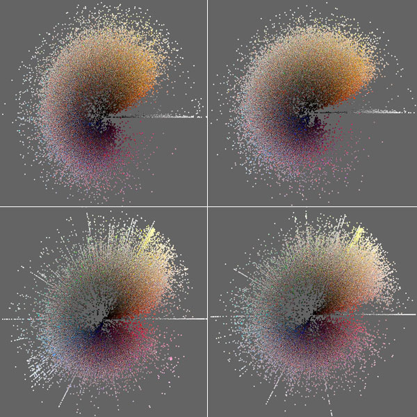
The collaborative project Phototrails is a visual exploration of millions of Instagram photos, building on previous work with ImagePlot, which lets you see a lot of photos at once.
How do we explore social medias visual data which contains billions of photographs shared by hundreds of millions of contributors? What insights can we gain from this type of massive collective visual production?
Phototrails is a research project that uses experimental media visualization techniques for exploring visual patterns, dynamics and structures of planetry-scale user-generated shared photos. Using a sample of 2.3 million Instagram photos from 13 cities around the world, we show how temporal changes in number of shared photos, their locations, and visual characteristics can uncover social, cultural and political insights about people’s activity around the world.
The charts above, starting from the top left and moving clockwise, are a sample of 50,000 Instagram photos each from San Francisco, Tokyo, Bangkok, and New York City, organized by hue and brightness.
The bottom two look a lot brighter than the top two, but I suspect that’s because hue median is used for the former and hue mean for the latter. That’s probably also why you see more distinct lines on the bottom, especially towards the edges, whereas the top spectrum is more continuous. Then you have a nice sudden break in color for the black and white photos.
-
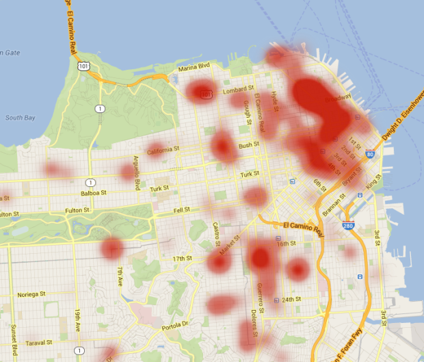
We typically think of Yelp reviews as aggregates on a restaurant or business-specific level. Search for restaurants on Yelp, and you have an overall rating for each result. But zoom out a level and aggregate over geographic areas instead of specific locations, and you get a better idea of the makeup of a city. This is what the Yelp Word Map provides.
The Yelp Word Map shows where words such as hipster, pasta, and dim sum, are used in reviews, so you end up with a visual of where the pockets in a city are.
The map above shows where pasta is often used in San Francisco reviews. Of course, the only maps that really matter though are the ones for dim sum and noodles. [via Waxy]
-
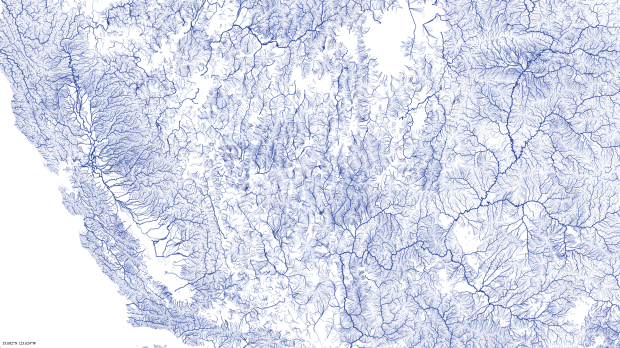
Inspired by Ben Fry’s All Streets map, which showed every road in the United States, Nelson Minar mapped every river to similar effect. As you’d expect, the geography of the United States emerges without actually mapping locations.
We saw a similar map from National Geographic, which showed the rivers of the world and took home an award for best map of 2010 at Malofiej. So Minar’s map isn’t especially new, but the good bit is that Minar posted a tutorial and his code on github, so that you can see how such a map is made.
Most of the actual cartography is being done in Javascript, in the Leaflet and Polymaps drawing scripts. This tutorial code does very little, mostly just drawing blue lines in varying thicknesses. In addition the Leaflet version has a simple popup when rivers are clicked. With the actual vector geometry and metadata available in Javascript a lot more could be done in the presentation; highlighting rivers, interactive filtering by Strahler number, combination with other vector data sources, etc.
-
FlowingData turned six years old last week. I didn’t realize it until after though as I flipped through my calendar. I missed its birthday last year too, and to my surprise, the last time I remembered was its third year. I suddenly feel like a parent who’s forgotten his child’s birthday. I don’t feel that bad though, because well, it’s a blog, not a human being. If anything it’s an extension of me, and I lost track of my age a couple of years ago.
Still though, six years is a long time on the internet.
FlowingData started as a personal site to document projects related to my early-stage research and then grew into something more. Somewhere along the timeline and over 3,000 posts and a couple of books later, it became my full-time job, which is pretty cool. The internet is awesome.
Thanks to all the sponsors over the years who helped me pay for the ever-increasing hosting bills, and a big thank you to everyone who reads and shares. And of course, thank you to those who bought books and became members. Your support is huge.
This year on FlowingData will be different from all other years of its existence, because it will be the first year that I don’t have to work on my dissertation. With these new found hours in the day, in addition to more tutorials for members, I hope to spend more time with analysis on interesting datasets and to improve my visualization skills, especially of the interactive variety. Hopefully that transfers to more interesting stuff here on FlowingData.
Six good years. The best years are ahead.
-
Shan Carter and Kevin Quealy for The New York Times updated their housing prices graphic from a couple of years ago.
Read More



 Visualize This: The FlowingData Guide to Design, Visualization, and Statistics (2nd Edition)


