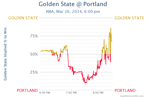
• Membership
  • Newsletter
  • Projects
  • Learning
  • About
  • Member Login
  • Map shows illegal activity in San Francisco Chinatown, from 1885

    August 19, 2013

    Topic

    Maps  /  crime, San Francisco

    From the David Rumsey map collection, the detailed map of San Francisco Chinatown shows areas of known illicit activity.

    In 1885, at the height of the anti-Chinese hysteria in California, the official Report of the Special Committee of the Board of Supervisors was issued, reporting on the “Condition of the Chinese Quarter and the Chinese in San Francisco.” This inflammatory report included the rare folding color map of Chinatown, but in the usual “small-scale” version (approx. 8½x19½ inches). This map was also issued in the San Francisco Municipal Report of 1884-85, and in Farwell’s The Chinese at Home and Abroad (see our 5807.000).

    The faded red color indicates gambling houses, green for Chinese prostitution, yellow for opium resorts, and blue for white prostitution. [via Mapping the Nation]

  • Extensive timelines of slang for genitalia

    August 16, 2013

    Topic

    Infographics  /  penis, text

    The title says it all. Jonathon Green, a slang lexicographer, has two new timelines. The first is an interactive timeline that shows slang for male genitalia going all the way back to the 1300s up to present. Colors and shapes represent different parts.
    Read More

  • Why everyone is more popular than you

    August 15, 2013

    Topic

    Statistics  /  Hannah Fry

    Mathematician Hannah Fry is back with another video. She explains why it seems like everyone in your network — on Twitter, Facebook, and in real life — is more popular than you and how we can use this idea to predict the spread of diseases. Fry’s understated presentation style totally enhances the interesting subject matter.

  • Pie charts about pies with pies

    August 15, 2013

    Topic

    Miscellaneous  /  humor, pies

    Josh Sundquist and Hannah Hart made a video about pies, the edible variety with the chart made with the edible.

    [Thanks, Lee]

  • How to Make a Connected Scatter Plot

    The combination of a time series chart and a scatter plot lets you compare two variables along with temporal changes.

  • Beach Boys vocals visualized

    August 14, 2013

    Topic

    Data Art  /  Beach Boys

    Alexander Chen visualized “You Still Believe in Me” by the Beach Boys.

    This is a visualization of Beach Boys vocals inspired by the physics of church bells. Using a mathematical relationship between a the circumference of a circular surface and pitch, I wrote code that draws a circle for each note of the song.

  • Introduction to R, a video series by Google

    August 13, 2013

    Topic

    Software  /  Google, R

    Google released a 21-part short video series that introduces R. Most of the videos are about two minutes, with none of them going over six, and each one is a on focused task or concept. So this could be a good way to start. Just open R, start a video, and follow along.

    Here’s the first video in the series. It shows you how to write a simple script and navigate:

    [via Revolutions]

  • Seeking a career in visualization

    August 13, 2013

    Topic

    Visualization  /  jobs

    Some readers asked about career choices in visualization recently, and I was about to write a response until I remembered I already did in 2008. A few group names changed and examples in some areas are easier to come by, but most of it is still valid.

    You still find a lot of jobs in journalism, business-related analytics, at design studios, research labs (academic and industry), and freelance. It seems like there are more opportunities now than there were then. There are also a lot more tech-related jobs now. In 2008, Twitter hadn’t quite hit mainstream yet and most parents weren’t on Facebook, whereas now, web companies sit on more data than they can interpret.

    There are visualization jobs pretty much wherever there is data. Which is practically everywhere.

    That said, there’s also more competition for these jobs, and high school science fair Microsoft Excel experience probably won’t be enough to get you the job you want.

    So one more important addition to the 2008 post: Learn statistics. It still surprises me how little statistics visualization people know (generally speaking of course). Look at job listings though, and most employers list it in the required skill set, so it’s a big plus for you hiring-wise.

  • Listening to Zen-like Wikipedia edits

    August 12, 2013

    Topic

    Data Art  /  sonification, Wikipedia

    It’s easy to think of online activity as a whirlwind of chatter and battles for loudest voice, because, well, a lot of it is that. We saw it just recently with the burst of emojis and what happens in just one second online. But maybe that’s because people tend to present the bits that way. Stephen LaPorte and Mahmoud Hashemi approached it differently in Listen to Wikipedia.

    The project is an abstract visualization and sonification of the Wikipedia feed for recent changes, which includes additions, deletions, and new users. Bells, strings, and a rich tone represent the activities, respectively. Unlike other projects that attempt to hit you with an overwhelmed feeling, Listen oddly provides a calm. I left the tab open in the background for half an hour.

    Listen is open source.

  • Racial dot map

    August 12, 2013

    Topic

    Maps  /  census, ethnicity, population

    Dustin Cable, a demographer at the University of Virginia’s Weldon Cooper Center for Public Service, added another dimension to Brandon Martin-Anderson population map. The racial dot map by Cable draws a dot for each person in the United States based on the 2010 census and colors by ethnicity.

    This map is an American snapshot; it provides an accessible visualization of geographic distribution, population density, and racial diversity of the American people in every neighborhood in the entire country. The map displays 308,745,538 dots, one for each person residing in the United States at the location they were counted during the 2010 Census. Each dot is color-coded by the individual’s race and ethnicity. The map is presented in both black and white and full color versions. In the color version, each dot is color-coded by race.

    It’s like a dottier version of the maps by The New York Times back in 2010. Or the originals by Bill Rankin who drew a dot for every 25 people.

    Keep in mind this is all based on freely available data from the National Historical Geographic Information System. They have data that goes back to 1790.

  • A second on the Internet →

    August 9, 2013

    Topic

    Infographics  /  Internet

    In a straightforward view of online activity, Designly shows the approximate number of tweets, likes, votes, and so forth that happen in one second. There’s a lot of stuff going on, as you might guess. The tickers for each activity are a nice touch.

  • Google search suggestions by country

    August 8, 2013

    Topic

    Statistics  /  Google, suggestions

    Google search suggestions have transformed into a never-ending source of entertainment and a candid peek into what people look for in the world. We’ve seen insecurities change with age and stereotypes of states in the US. Noah Veltman banked on the locality of suggestions for a country-specific view of the world. He shows suggestions for the same query for the United States, Canada, the United Kingdom, Australia, and New Zealand.

    For example, a search for “why is America” in each country depicts stereotypes and national curiosities about why America is so fat, rich, and better than Canada. Scroll down and you see suggestions for “how to”, “why is there”, and “why does everyone” which interestingly shows many of the same wonderings.

    Now if you’ll excuse me, I have to go eat bacon and swim in my pool of gold coins while I browse through my vastly superior Netflix selection.

  • Size comparison of everything

    August 8, 2013

    Topic

    Infographics  /  comparison

    If you’re like me, you often wonder how big the Stay Puft Marshmallow Man is relative to Godzilla or how Godzilla compares to King Kong. Wonder no more. Sixteen-year-old deviantART user Lexinator117 compared the size of everything. The giant graphic is a mix of fictional characters and objects with a handful of real-life, like the Statue of Liberty and the Mayflower.

  • Behind the Netflix recommendation system

    August 8, 2013

    Topic

    Statistics  /  netflix, Wired

    Wired has a fun Netflix interview on the behind-the-scenes work on the recommendation engine.

    If you liked 1960s Star Trek, the first non-Trek title that Netflix is likely to suggest to you is the original Mission: Impossible series (the one with the cool Lalo Schifrin soundtrack). Streaming the latest Doctor Who is likely to net you the supernatural TV drama Being Human (the UK version). Watch From Dusk Till Dawn and 300 and say hello to a new row on your homepage: Visually Striking Violent Action & Adventure. Trying to understand the invisible array of algorithms that power your Netflix suggestions has long been a favorite sport, but what’s actually going on in that galaxy of big data, those billions and billions of ratings stars? Turns out there are 800 Netflix engineers working behind the scenes at their Silicon Valley HQ. The company estimates that 75 percent of viewer activity is driven by recommendation.

    Some days you just want slouch back on the couch after a long day’s work and watch Hot Tub Time Machine.

  • Piemaster

    August 7, 2013

    Topic

    Ugly Charts  /  pie chart

    Gratuitous piesI’m not entirely sure where this came from, but it’s from someone who describes himself as “an innovation leader in delivering analytics.” Yep. The 3-D. The layering. The piemaster. [via]

  • Pangea with political boundaries

    August 6, 2013

    Topic

    Maps  /  Pangea

    What would Pangea look like if today’s political boundaries were drawn on it? Like this. [via]

  • Data Underload  /  Doctor Who

    Doctor timeline for Doctor Who

    I have yet to see a full episode of Doctor Who, “the longest-running…

    Read More
  • Useless infographics

    August 4, 2013

    Topic

    Ugly Charts  /  Guardian, useless

    The Guardian posted a small collection of useless infographics. It kind of looks like my suggestion inbox.

  • Teacher forces student to do math to unlock phone

    August 2, 2013

    Topic

    Miscellaneous  /  humor

    The title caption reads: “A classmate was caught using his phone in maths. The teacher took his phone and set a passcode. He gave him this back with his phone and said good luck unlocking it.”

    Passcode problem

    Hopefully the student was the guy who sits in the back and goofs off because the class is too easy. [via @FryRsquared]

  • BreweryMap plans your next beer road trip

    August 1, 2013

    Topic

    Maps  /  beer, road trip

    BreweryMap, a Google Maps mashup and mobile app, provides two main functions. The first is that it tells you where the nearest brewery is so that you’ll never go thirsty again. The second and far more important function is that you can punch in two addresses, and BreweryMap tells you all the breweries that are on the way from point A to point B.

    Let your fantasy become a reality. Just make sure to spread out your trips.

  • Page 234 of 392
  • <
  • 1
  • ...
  • 231
  • 232
  • 233
  • 234
  • 235
  • 236
  • ...
  • 392
  • >

Analyze, visualize, and communicate data usefully, beyond the defaults.

Become a member →

Recently for Members

May 8, 2025
When the data is not what it seems

May 1, 2025
Finding the Right Charts

April 24, 2025
Visualization Tools, Datasets, and Resources – April 2025 Roundup

April 17, 2025
Breaking Out of Chart Software Defaults

April 15, 2025
Line Chart with Decorative Neon Accents

Browse by Chart Type See All →

Baseline Chart Gantt Chart Bar Chart Race Pyramid Chart Dot Density Map Area Chart Ternary Plot Mosaic Plot Histogram Glyph Chart

Browse By Topic

  • Visualization

    Seeing data

  • Maps

    Seeing geographic data

  • Infographics

    Explaining data

  • Networks

    Connecting data

  • Statistics

    Analyzing data

  • Software

    Working with data

  • Sources

    Getting data

  • Design

    Making data readable

Get the Book

Visualize This: The FlowingData Guide to Design, Visualization, and Statistics

Available now.

Order: Amazon / Bookshop

Made by FlowingData

  • The Process

  • Data Underload

  • Chart Everything

  • Guides

  • Books

  • Shop

  • About
  • Contact
  • Newsletter
  • LinkedIn
  • Instagram
  • Bluesky
  • RSS
Copyright © 2007-Present FlowingData. All rights reserved.