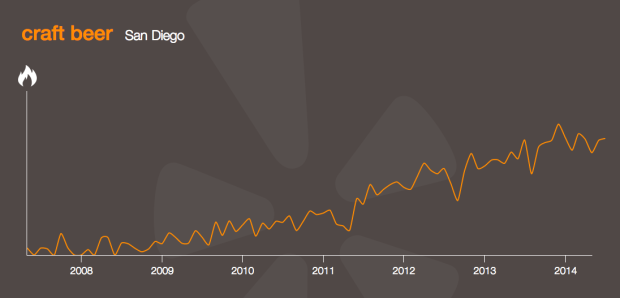
• You can now wear a MagicBand when you enter Disneyland to get a more personalized experience, and in return, the park gets to know what their customers are up to. John Foreman, the chief data scientist at MailChimp, describes the new data toy after a trip to the happiest place on Earth.

    What does Disney get out of the deal? In short, it tracks everything you do, everything you buy, everything you eat, everything you ride, everywhere you go in the park. If the goal is to keep you in the park longer so you’ll spend more money, it can build AI models on itineraries, show schedules, line length, weather, etc., to figure out what influences stay length and cash expenditure. Perhaps there are a few levers they can pull to get money out of you.

    I knew Disney imagineers kept track of park activity, such as line length and congestion areas, but this takes it to the next level. Is it weird that I’m curious how this would work at home?

  • Two Google research groups, Big Picture and Music Intelligence, got together and made a music timeline baby.

    The Music Timeline shows genres of music waxing and waning, based on how many Google Play Music users have an artist or album in their music library, and other data (such as album release dates). Each stripe on the graph represents a genre; the thickness of the stripe tells you roughly the popularity of music released in a given year in that genre. (For example, the “jazz” stripe is thick in the 1950s since many users’ libraries contain jazz albums released in the ’50s.) Click on the stripes to zoom into more specialized genres.

    As you’d expect, the initial view is a stacked area chart that represents the popularity of genres over time, which feels fairly familiar, but then you interact with the stacks and it gets more interesting and almost surprisingly fast. The best part is the pointers to specific albums as you mouse over.

  • In celebration of their 100-year anniversary, the American Film Institute selected the 100 most memorable quotes from American cinema, and a few years ago, for kicks and giggles, I put the first eight quotes into chart form. I planned to chartify all 100, but I got distracted.

    Lately though, finishing what I started became my distraction. So here it is: the 100 most memorable quotes in chart form and I can finally put it to rest. See the big version for more detail.

    Also available in print.

  • The Donald Duck family tree is huge. Who knew? Above is only a sample. See the full version here.

  • Using data from linguistics research by Kostiantyn Tyshchenko, Teresa Elms clustered European languages in this network graph. If you look closely, you might wonder why English is considered a Germanic language. Elms explains:

    So why is English still considered a Germanic language? Two reasons. First, the most frequently used 80% of English words come from Germanic sources, not Latinate sources. Those famous Anglo-Saxon monosyllables live on! Second, the syntax of English, although much simplified from its Old English origins, remains recognizably Germanic. The Norman conquest added French vocabulary to the language, and through pidginization it arguably stripped out some Germanic grammar, but it did not ADD French grammar.

  • Most people, at least those who visit sites like FlowingData, know about map projections. You have to do math to get the globe, a thing that exists in this 3-dimensional world, into a two-dimensional space. The often-noted scene from the West Wing explains a bit, some demos help you compare, and there are map games that highlight distortions.

    But, it can still be fuzzy because most of us don’t deal with the true shape and size of countries regularly. These figures from Elements of map projection with applications to map and chart construction, published in 1921, take a different route and place a face — something familiar — to show distortions. Foreheads get bigger, ears get smaller, noses change sizes, and projections are easier to understand. [via io9]

  • Religion and life expectancyThe person in this cartoon nailed it. I’m going to do the same starting this weekend, and I recommend that you do too, if you want to live longer.

    (Couldn’t find where this is from. Anyone know?)

  • Hyperakt and Ekene Ijeoma visualized migrations over time and space in The Refugee Project. The interactive is based on United Nations data, which is naturally limited in scope, because it’s difficult to count undocumented migrations, but there is plenty to learn here about major political and social events in history.

    The map starts in 1975, and with each tick of a year, the circles adjust to show outgoing numbers. Mouse over a circle, and you can see estimates for where people went, which is represented with extending lines.

    Document icons appear over major event locations which provide more context about what happened in the country. This is key. I just wish there were more of them. It’d provide an even better history lesson.

  • When you watch sports, it can sometimes feel like the stat guy pulls random numbers for the talking heads to ponder, and you can’t help but wonder who significant the numbers actually are. Benjamin Schmidt shows all the possibilities for a common statement during baseball games, and it turns out there are a lot of statements to pick from.

    Statements of the form “Jack Morris won more games in the 1980s than anyone else” are fascinating. Although they’re true, they rest on cherry-picked years that may or may not illustrate a deeper truth in context. (And we see them all the time: see my college degrees cherry-picker for another area.) For baseball, there are thousands of statements just like the ones here that you can make about any single cumulative stat over the game’s history–10,296, to be exact. Printed out, all the statements you could make with the data here would take about 15,000 pages: this visualization lets you hone in on the patches of interest.

  • In 1976, Dwight E. Robinson, an economist at the University of Washington, studied facial hair of the men who appeared in the Illustrated London News from 1842 to 1972 [pdf].

    The remarkable regularity of our wavelike fluctuations suggests a large measure of independence from outside historical events. The innovation of the safety razor and the wars which occurred during the period studied appear to have had negligible effects on the time series. King C. Gillette’s patented safety razor began its meteoric sales rise in 1905. But by that year beardlessness had already been on the rise for more than 30 years, and its rate of expansion seems not to have augmented appreciably afterward.

    Someone has to update this to the present. I’m pretty sure we’re headed towards a bearded peak, if we’re not at the top already.

  • January 7, 2014

    Topic

    Coding  / 

    Biostatistics PhD candidate Alyssa Frazee was tasked with teaching her sister, an undergraduate in sociology, how to use R. She had only one hour.

    Once you load in a dataset, things start to get fun. We learned a whole bunch of stuff from this data frame, like how to do basic tabulations and calculate summary statistics, how to figure out if you have missing data, and how to fit a simple linear model. This part was pretty fun because my sister started leading the session: instead of me saying “I’m going to show you how to do this,” it was her asking “Hey, could we make a scatterplot?” or “Do you think we could put the best-fit line on that plot?” I was really glad this happened — I hope it meant she was engaged and enjoying herself!

    This is the nice thing about R. There are so many built-in functions and packages that you can get something useful with a few lines of code, and you don’t really even have to know what a function is to get started (although you should eventually). Then you can go as far down the rabbit hole as you want.

  • Jessica Edmondson visualized the history of rock music, from foundations in the pre-1900s to a boom in the 1960s and finally to what we have now. Nodes represent music styles, and edges represent musical connections. There are a lot of them and as a whole it’s a screen of spaghetti, but it’s animated, which is key. It starts at the beginning and develops over time, so you know where to go and what to look at. Music samples for each genre is also a nice touch. [Thanks, Jessica]

  • New Year’s is a worldwide event, but as we know, it doesn’t happen simultaneously everywhere. Midnight happens in different time zones and in various languages, so Krist Wongsuphasawat from Twitter visualized the event in an animated interactive, as people tweeted happy new year around the world. Press play and see how it happened.

    The best part is that UTC+01:00 area that covers Central Europe and Western Africa. Spikes in 16 languages by my count.

  • FlowingData TutorialsThe great thing about online tutorials is that you can access them from anywhere you have an internet connection. The downside is that, unless you download all of the tutorials individually (and their code), you can’t access them when you don’t have an internet connection.

    So I saved you the trouble, and members can now download all the FlowingData tutorials as a DRM-free ebook for their iOS device (.epub), Kindle (.mobi), or any other digital device (.pdf). You can also get all the code at once in a single zipped file.

    Just go to the members-only downloads page to grab the files you want.

    I’ll update the ebook each year.

    Of course if you’re not a member yet, you’re more than welcome to sign up for instant access.

  • Alexis Madrigal and Ian Bogost for The Atlantic reverse engineered the Netflix genre generator, analyzed the data, and then made their own. Then they talked to Todd Yellin, the guy at Netflix who created the micro-genre system. It’s no accident when you see altgenres like “Visually-striking Goofy Action & Adventure” and “Sentimental set in Europe Dramas from the 1970s” in your browser.

    The Netflix Quantum Theory doc spelled out ways of tagging movie endings, the “social acceptability” of lead characters, and dozens of other facets of a movie. Many values are “scalar,” that is to say, they go from 1 to 5. So, every movie gets a romance rating, not just the ones labeled “romantic” in the personalized genres. Every movie’s ending is rated from happy to sad, passing through ambiguous. Every plot is tagged. Lead characters’ jobs are tagged. Movie locations are tagged. Everything. Everyone.

    That’s the data at the base of the pyramid. It is the basis for creating all the altgenres that I scraped. Netflix’s engineers took the microtags and created a syntax for the genres, much of which we were able to reproduce in our generator.

    Be sure to play around with Bogost’s generator at the top. It will amuse.

  • Engineering and psychology researchers in Finland investigated where we feel and don’t feel.

    The team showed the volunteers two blank silhouettes of person on a screen and then told the subjects to think about one of 14 emotions: love, disgust, anger, pride, etc. The volunteers then painted areas of the body that felt stimulated by that emotion. On the second silhouette, they painted areas of the body that get deactivated during that emotion.

    The body maps above show the results of the survey. As you’d expect, the body looks like it shuts down with depression, and it lights up with happiness, but it’s the subtle differences that are most interesting. I like the contrast between pride and anger, a difference of fists and feet.

    Check out the full paper for more details. [via NPR]

  • Luba Gloukhov of Revolution Analytics used k-means clustering to find groups of single malt Scotch whiskies. Because you know, New Year’s morning is when whisky is on everyone’s mind.

    The first time I had an Islay single malt, my mind was blown. In my first foray into the world of whiskies, I took the plunge into the smokiest, peatiest beast of them all — Laphroig. That same night, dreams of owning a smoker were replaced by the desire to roam the landscape of smoky single malts.

    As an Islay fan, I wanted to investigate whether distilleries within a given region do in fact share taste characteristics. For this, I used a dataset profiling 86 distilleries based on 12 flavor categories.

    The result is essentially a mini recommendation system for the fine liquor, and the code is there, so you can see how it works.

  • Alex Reinhart, a PhD statistics student at Carnegie Mellon University, covers some of the common analysis mistakes in Statistics Done Wrong.

    Statistics Done Wrong is a guide to the most popular statistical errors and slip-ups committed by scientists every day, in the lab and in peer-reviewed journals. Many of the errors are prevalent in vast swathes of the published literature, casting doubt on the findings of thousands of papers. Statistics Done Wrong assumes no prior knowledge of statistics, so you can read it before your first statistics course or after thirty years of scientific practice.

    The text is available for free online, and there’s a physical book version on the way.

  • The Weightless Project gives you another reason to use your Jawbone or Fitbit that you got for Christmas this year (or to dig out the one you used for a week and forgot about). For every 1,000 calories lost, a dollar is donated to food relief programs.

    Hopeful.

  • Checking out for the year. I assume most of you have already, and if not, go on, get out of here. Shoo. Happy holidays. I tip my glass in your general direction.