
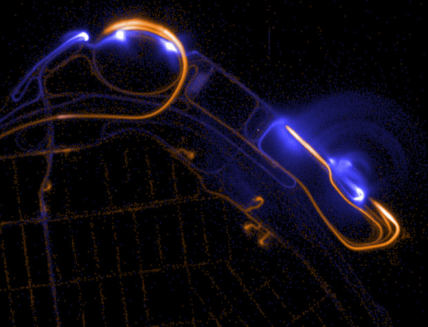
Mike Bostock, who you might recognize from such things as Data-Driven Documents or the New York Times, writes on the value of visualizing algorithms for entertaining, teaching, learning, and debugging.
Algorithms are a fascinating use case for visualization. To visualize an algorithm, we don’t merely fit data to a chart; there is no primary dataset. Instead there are logical rules that describe behavior. This may be why algorithm visualizations are so unusual, as designers experiment with novel forms to better communicate. This is reason enough to study them.
But algorithms are also a reminder that visualization is more than a tool for finding patterns in data. Visualization leverages the human visual system to augment human intellect: we can use it to better understand these important abstract processes, and perhaps other things, too.
At the very least, you’ll have fun scrolling through the animated visuals that show how various algorithms work, but read the whole thing. It’s good.

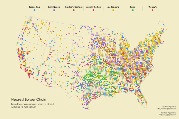


 Visualize This: The FlowingData Guide to Design, Visualization, and Statistics (2nd Edition)


